This heat map shows the density of solar panels and solar farms across the United Kingdom using Geographic Open Data (UKPVGeo). By analyzing this data and creating a heat map, we can identify areas in the UK that have a higher concentration of solar panels and solar farms, and use this information to inform policy decisions and future solar energy projects. Additionally, this map can help us to understand the impact of solar energy on the UK's energy sector and economy as a whole. Making a heat map from point data takes one click of a button in Felt, and getting data into Felt is easier than ever with our API, QGIS plug-in, or by hosted data URLs, like Google Sheets. See how here.
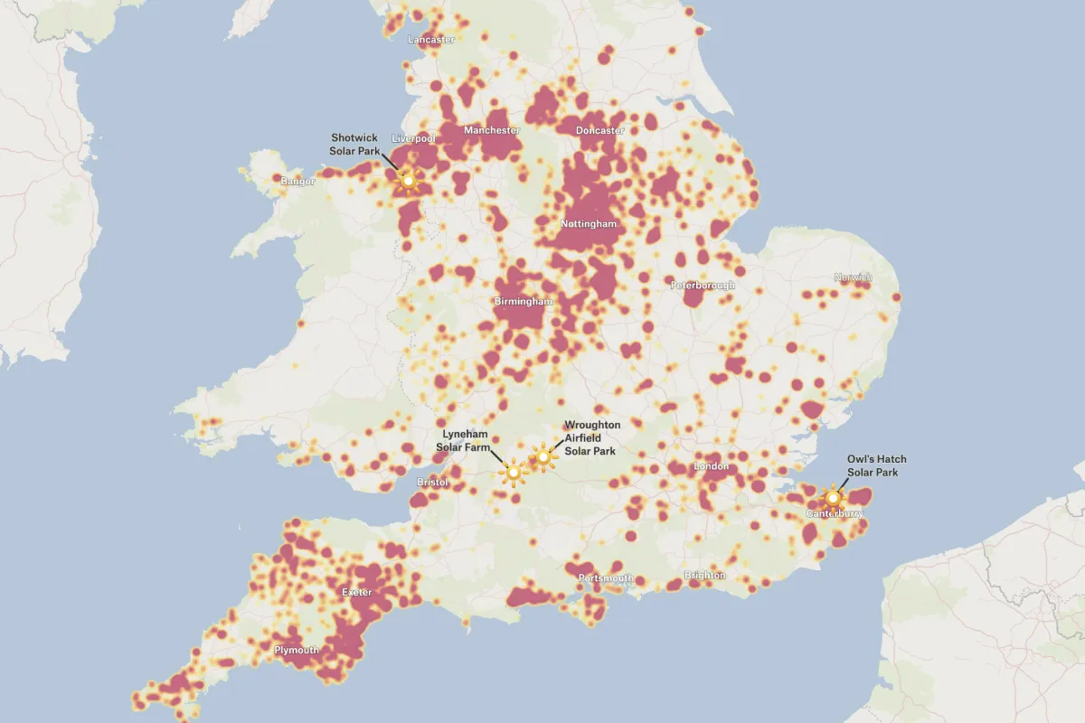
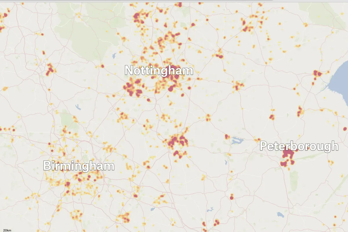
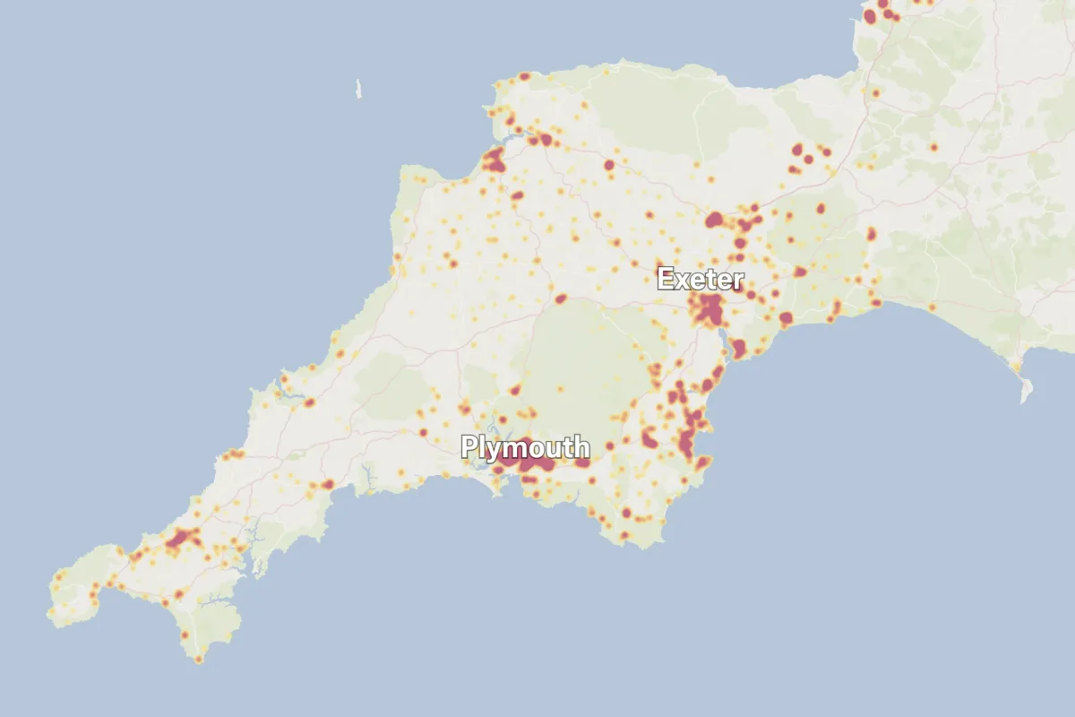
This interactive map displays the distribution and density of solar panel and farm installations across the United Kingdom, sourced from UKPVGeo data. The heat map uses a color gradient ranging from yellow (low concentration) through orange to deep red/magenta (high concentration) to show where solar installations are most densely clustered. Each dot or cluster on the map represents solar panel installations, with larger, darker concentrations indicating areas with significantly more solar capacity. The map clearly reveals that solar installations are heavily concentrated in England's major urban centers, with particularly dense clusters visible around Manchester, Liverpool, Birmingham, Nottingham, and London. The Midlands and Northwest regions show especially high adoption rates, appearing as large magenta zones on the map. Peterborough and the surrounding East of England also demonstrate substantial solar deployment, while the Southeast, including the greater London area and Canterbury regions, shows strong installation density extending toward the coast. Four major solar parks are specifically labeled on the map: Shotwick Solar Park near Liverpool in the Northwest, Lyneham Solar Farm and Wroughton Airfield Solar Park in the Southwest near Bristol, and Owl's Hatch Solar Park in the Southeast near Canterbury. These represent large-scale commercial solar farms rather than residential installations. The map allows users to zoom in and out using the scale bar at the bottom left (showing distances from 7.8 miles to 50 miles), enabling detailed examination of specific regions or broader national patterns. Users can explore regional variations in solar adoption, identify areas with high renewable energy investment, compare urban versus rural solar deployment patterns, and locate major solar infrastructure projects. The relatively sparse solar coverage in more rural areas of Wales, Scotland, and Northern England contrasts sharply with the urban concentrations, suggesting that population density, available roof space, and possibly regional energy policies play significant roles in solar panel adoption rates across the UK.
Disadvantages include land use competition with agriculture, visual impact on rural landscapes, potential effects on local ecosystems and wildlife habitats, intermittent energy production due to UK's limited sunlight (especially in winter), high initial installation costs, and concerns from local communities about property values and landscape changes. Some also cite the carbon footprint of manufacturing and transporting solar panels.
There are no official government-mandated minimum distances for safety reasons, as solar farms don't emit harmful radiation or pollutants. However, planning guidelines sometimes recommend buffer zones of 50-100 meters to address visual amenity and glint/glare concerns. Health and safety authorities consider solar farms safe to live near at any reasonable distance.
Yes, solar farms are viable in the UK despite lower sunlight levels compared to sunnier regions. The UK receives enough solar radiation to make solar energy economically feasible, especially with improved panel efficiency and government incentives. Solar capacity has grown significantly in the UK, and solar farms continue to be developed as part of renewable energy targets, though they're more productive in southern England than in Scotland.
.webp)