


Watershed, an investigative journalism non-profit led by Rachel Salvidge, faced a significant challenge in their mission to democratize environmental information. They had access to more than 120 critical environmental datasets covering everything from old landfill sites and contaminated land to forever chemical pollution and water quality data. However, this valuable information was scattered, difficult to visualize, and largely inaccessible to the communities, researchers, and organizations that needed it most.
The technical hurdle was substantial: they needed a platform that could handle datasets of all formats and sizes, visualize them elegantly, and be easily embedded across different news sources. Traditional open-source solutions like QGIS weren't meeting their specific needs for quick data loading and seamless integration across multiple platforms.
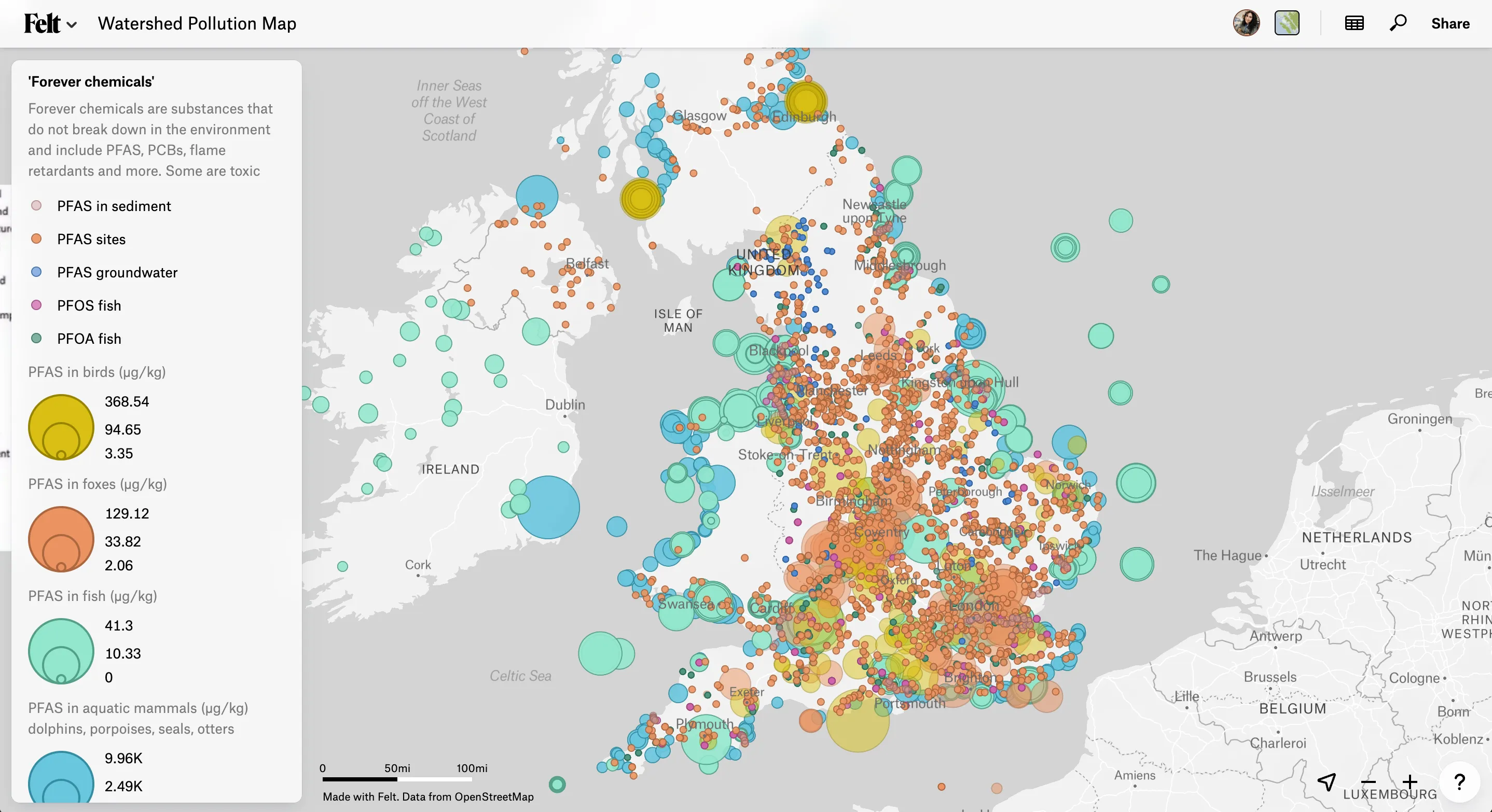
Watershed turned to Felt, the cloud-native GIS mapping platform, to tackle their complex data visualization challenges. Felt's cutting-edge technical capabilities enabled them to:
The Felt team provided invaluable support throughout the process, understanding Watershed's unique needs as a non-profit focused on making environmental information freely accessible to all. "Felt saved my team months of work visualizing data," says Salvidge, "Felt's sharing capabilities and incredibly well-designed interface meant our work could make 10x the impact. Journalists with no spatial background were able to uncover countless stories of environmental import."
The results exceeded all expectations. The Watershed Pollution Map became an immediate success, demonstrating the critical need for accessible environmental data:
The map directly enabled multiple high-impact investigative stories, with journalists from the Gurrdian and other major publications exposing alarming trends. “It’s an amazing piece of work and a great public service… It’s going to be such an asset to so many people,” - the Guardian. Organizations like CHEMTrust praised the map as "such a valuable tool" for their campaigning efforts, while the Local Story Exchange reported that the resource "blew their minds" and is being actively used across multiple regions.
Publications that came from the map's data include:
The platform became a vital research tool, with endorsements from:
The success of the Watershed Pollution Map proves that when complex environmental data is made accessible through powerful visualization tools like Felt, it can drive meaningful change across journalism, education, research, and environmental advocacy.
