37° 48' 15.7068'' N, 122° 16' 15.9996'' W
MODERN MAP MAKING HAS ARRIVED
37° 48' 15.7068'' N, 122° 16' 15.9996'' W
MODERN MAP MAKING HAS ARRIVED
37° 48' 15.7068'' N, 122° 16' 15.9996'' W
MODERN MAP MAKING HAS ARRIVED
37° 48' 15.7068'' N, 122° 16' 15.9996'' W
MODERN MAP MAKING HAS ARRIVED
37° 48' 15.7068'' N, 122° 16' 15.9996'' W
MODERN MAP MAKING HAS ARRIVED
37° 48' 15.7068'' N, 122° 16' 15.9996'' W
MODERN MAP MAKING HAS ARRIVED
37° 48' 15.7068'' N, 122° 16' 15.9996'' W
MODERN MAP MAKING HAS ARRIVED
37° 48' 15.7068'' N, 122° 16' 15.9996'' W
MODERN MAP MAKING HAS ARRIVED
37° 48' 15.7068'' N, 122° 16' 15.9996'' W
MODERN MAP MAKING HAS ARRIVED
37° 48' 15.7068'' N, 122° 16' 15.9996'' W
MODERN MAP MAKING HAS ARRIVED
Maps
Engineering
How we make your data look great at every scale with Tippecanoe
Felt doesn’t require users to tell us anything about the data being uploaded – here are some tools we use to get the display right across different scales.

Zero configuration

When you upload a file of geographic data to Felt, we convert it from its original format—perhaps GeoJSON, Shapefile, KML, GeoPackage, CSV, Excel, or GPX—into a set of vector map tiles at a variety of zoom levels, ensuring that any location in the world can be displayed quickly and efficiently at any scale. Unlike some other mapping services, we don’t require you to tell us anything else about the data you are uploading or how you want it to be processed: these questions are often difficult to answer, and we want your uploading experience to be as smooth and straightforward as it can be.

One key question that we must be able to answer for every uploaded file is, what is the appropriate scale at which to display this data? Sometimes it might be obvious from the geographic scope of the contents: a file of the borders of the countries of the world is probably meant to be displayed at a global scale; a file of the trees in one city park is probably meant to be displayed at a scale where the individual trees can be distinguished. But sometimes a broad geographic scope can be misleading or ambiguous: is a file of all the roads in the US meant to be viewed as a map of the country, or as a collection of maps of towns and cities and neighborhoods?

We take the broad view of these possibilities, and therefore we actually must answer two questions: what is the smallest scale, the highest zoom level, at which it makes sense to display this data, and how can we best generalize it to maintain efficiency and visual integrity as you zoom out to view larger areas of it at once?

Generalization and polygon dust

Some types of geographic objects have an inherent physical scale. These are typically mapped as polygons denoting their physical extent on the ground. Examples include building footprints, the land parcels that the buildings sit upon, and the cities, countries, and continents that contain them. All of these experience a kind of natural generalization as you zoom out to look at them from a distance, because small shapes eventually become so small that you can no longer see them, and large shapes become less detailed because their outlines occupy fewer pixels on the screen.

Something similar happens with linear features like roads. The road’s width is not recorded as part of its shape in the data file, only its length, but as you zoom out, short segments of roads nevertheless become so short that they can no longer be seen. They drop out visually, and cease to be represented in the map tiles, while the longer road segments that still are visible are shown more coarsely than before, because no finer detail can be shown on the screen.

But if you are looking down at the ground from an airplane at the same area you see on your laptop screen, even though you may not be able to make out individual buildings because of the great distance from your altitude, you can nevertheless see where there are buildings. They are still visible in the aggregate even though their individual shapes are lost.

Tippecanoe, the software that we use to convert geographic data to map tiles at Felt, tries to mimic this effect through what I call “polygon dust.” At any given scale, polygons that have a size larger than a pixel on the screen are treated as individual distinct objects as you would expect. But polygons that are smaller than this threshold are treated statistically, as the probability of a feature appearing in that location. Even if each of the buildings in a town is too small individually to be displayed, the cluster of buildings accumulates enough probability in the area that a few features, exaggeratedly large compared to their actual size, but only just large enough to be seen on the screen, are carried forward into the map tiles to represent the presence of the town.

Honolulu: Mostly “dust” polygons showing the extent of development but not specific buildings, plus a few large buildings representing themselves.

Dot-dropping

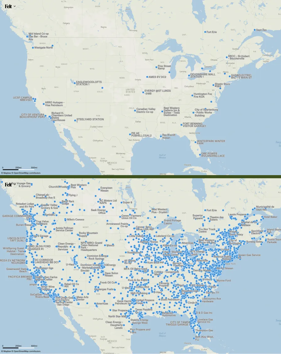
The other type of data that appears in geographic uploads has no inherent physical magnitude, even in a single dimension. These are point features, often representing street addresses, place names, businesses, photo locations, street intersections, trees, signs, or other points of interest. Because these features are represented as points, which have no size, they never naturally shrink away to nothing as you view larger and larger areas. Instead, we must intentionally drop some point features at lower zoom levels to prevent the map from becoming overwhelmingly visually dense and the data behind it too large to render efficiently.

Tippecanoe is unusual among mapping software in treating this dot-dropping as part of the automatic course of affairs for any point data being made into tiles. Other programs for making map tiles generally either try to preserve every point in every zoom level, until there are so many that it is no longer possible, or rely on the data creator to designate certain features—capitals and other particularly well-known cities, for example—as having higher priority, to be preserved when you zoom out at the expense of other, less significant point features. Tippecanoe instead tries to trick you visually: to thin out the set of points as you zoom out, but slowly enough that you won’t notice any given point vanishing until it is already buried in a cluster of other points and has lost its independent visual identity.

Tippecanoe’s default behavior, if you don’t specify otherwise, is to retain 40% of the point features at the zoom level below the maximum; 40% of those at the next lower zoom level; 40% of those at the next lower zoom level; and so on until it runs out of features or reaches zoom level 0, the zoom level that shows the entire world in one tile. (At Felt we now do specify otherwise, as will be described below.)

The distances between features

I have been talking about generalizing and dropping features as you zoom out, without saying what scale it is that you are zooming out from.

There is a fundamental tension in the choice of the maximum zoom level at which we will generate map tiles for a given upload: we want it to be as high as possible, because higher zoom levels have higher spatial precision than lower zoom levels, and we want to faithfully represent all of the locations in the uploaded data; but we also want it to be as low as possible, because each increase to the maximum zoom level roughly doubles the time it takes to create map tiles, and we want to give users access to their data as quickly as possible after they upload it.

What compromise can we make, then? The principle I have tried to establish is that the appropriate maximum zoom level is the lowest zoom level where you can tell the features apart from each other. Now let’s pick that apart.

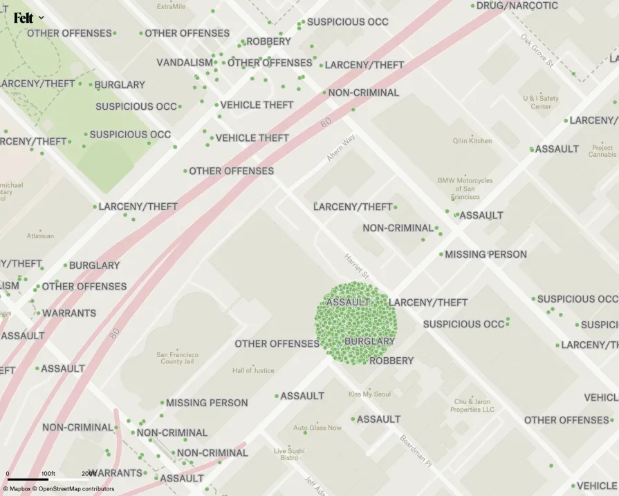
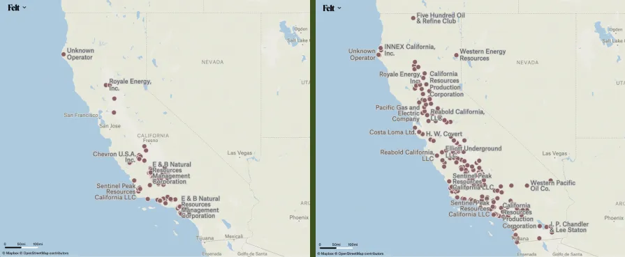
To choose the zoom level at which it will be possible to tell all the features apart from each other, we might find the closest pair of points in the input data and then calculate the distance between them. This smallest distance is often impractical, though. In many cases, the two closest points are actually directly on top of each other, for example in the case of San Francisco’s crime report data, where all the crimes whose location is unknown are geocoded with the point location of police headquarters. Even when there are no exact duplicates, the distance between the closest pair of points is often a statistical outlier rather than representative of the distances between features in the larger data set.

These crimes were not all actually reported to have taken place at the Hall of Justice.

Hilbert the Traveling Salesman

Perhaps, then, we want the average distance between each point and its nearest neighbor, rather than the smallest distance? Unfortunately, doing the nearest-neighbor calculation for every point in a large data set can be quite slow.

The cheat that Tippecanoe uses here (and in many other places) is that we don’t really need to know the nearest neighbor to each point to calculate a good-enough average distance to be able to choose a zoom level. A reasonably-nearby neighbor for each point is good enough.

The “traveling salesman problem” is the problem in computer science of trying to calculate the route through a set of points that will visit them all with the smallest total distance traveled, and a traveling salesman traversal of our data points would give us pairs of points that are nearby neighbors. In 1982, John J. Bartholdi and Loren K. Platzman observed that ordering a set of points by their distances along a Hilbert space-filling-curve produced an approximation to the ideal route that was fast and easy to calculate and was good enough for their application (daily reallocation of Meals on Wheels delivery routes), and it is good enough for our purposes too.

Major cities of the world, visited in Hilbert sequence.

I referred above to the average of those distances between pairs of points, but it turns out that in most geographic data sets, it is actually the logarithm of the distances that is normally distributed: that is, if the median distance between points is 4 miles, there will be equally many pairs that are 2 miles apart as 8 miles apart, rather than equally many that are 2 miles apart as 6 miles apart. This is because most things on the planet exist in clusters, with people clustered together in towns and cities, towns and cities clustered together in regions, and regions clustered together in continents.

So to calculate the representative distance between points in the data set, we take the geometric mean of the distances between pairs of (non-identical) points. That distance then translates into a zoom level. If the distance d is denominated in meters, the corresponding zoom level is ceil(log2(10000) - log2(d)), because the minimum distinguishable distance at zoom level 0 is approximately 10,000 meters (the circumference of the earth, divided by the 4096-unit size of the tile grid), and is cut in half with each increment to the zoom level.

This Hilbert ordering is also what allows me to refer above to “the area” that contains a cluster of buildings, and what enables the 40% of point features that are retained as you zoom out to be a spatially representative sample of the full data. Everything in Tippecanoe that is concerned with the density or locality or uniformity of feature locations is actually looking at features or pairs of features in Hilbert sequence rather than trying to do proper kernel density estimates. Tippecanoe accumulates the area of “polygon dust” buildings whose true shape is being lost in Hilbert sequence, and when it has accumulated enough area for something to be seen, it emits a placeholder at the location of the last “dust” building, confident that Hilbert locality makes that location suitably representative of the other lost features that have contributed area to it.

The distances within features

The zoom level calculation described above talks about point features, but we must also calculate an appropriate zoom level for polygon and line data. The first step of the process is still the same as with points features, but using a representative point for each polygon or line rather than the single point location that is inherent to a point feature. Tippecanoe formerly used the center of the bounding box of the feature as the representative point; now it uses one of the vertices of the feature, to avoid treating overlapping features as being extremely close together.

But if your data file is a set of country outlines, just being able to tell the countries apart from each other is not sufficient. You also need to be able to see the shape of each country, so we need to tile the features to a higher maximum zoom.

Fortunately the statistical properties that apply to representative points also basically apply to the distribution of vertices within any given feature and then to the distribution of representative distances across features. We take the geometric mean of the distances between vertices within each feature, and then take the geometric mean of those representative distances, and, if it indicates a higher zoom level than was calculated using the distances between features, use that higher zoom level as the maximum.

Case study: Wineries

Problem solved, right? Well, not quite. One of the test data sets that we use frequently at Felt is a map of the wineries in the United States. For the most part, wine production is spatially distributed like anything else: with wineries clustered together in prime locations, which are part of regional clusters. But in this data set there are some clusters that are even more tightly clustered than usual, and if you uploaded this data and zoomed in on Napa, California, there were multiple wineries mapped at exactly the same locations, and the locations shown overall had an unpleasantly, unnaturally gridded shape to them.

Looking at several other data sets for comparison, I discovered that in focusing on the geometric mean distance between features, I had neglected to take into account that some data sets are much more tightly clustered than others. For those with relatively loose clustering, the geometric mean distance was choosing an appropriate maxzoom. But for those with tight clusters, it was choosing too low, so the clusters could be easily distinguished but not the individual points within those clusters.

I said above that the minimum distance between points is too small and too unrepresentative to be usable, and that is still true. But fortunately we can also calculate the standard deviation of the logs of the distances, not just their means, and use that to make a better decision.

Two standard deviations below the mean seemed like it should work well, because it should guarantee that 97.7% of feature pairs would have distinct locations. However, in practice, this number of additional zoom levels made processing excessively slow. We have backed off to 1.5 standard deviations below the mean, which should still guarantee that 93.3% of features can be distinguished, and is certainly plenty of for the tight cluster of wineries in Napa.

Left: Gridded and conflicting winery points. Right: Wineries in their correct locations.

Case study: Rapid transit stations

However, it turns out that just being able to tell the features apart is not always enough. In particular, the station locations of Honolulu’s under-construction rapid transit system are generally a mile or so apart, so Tippecanoe would dutifully choose zoom level 5, with thousand-foot precision, as sufficient to make a map of them. But from the perspective of transit users, a thousand-foot error in the location of a station is enough to cause great confusion over where it actually is and how to find it. I resisted raising the zoom level, knowing that it would make other uploads much slower to process.

But fortunately we can still adjust other aspects of how Felt’s maps are created and displayed. In particular, we do not actually have to create our map tiles with a resolution of 4096x4096 tile units, and unlike some other map rendering software, Protomaps can support much higher resolutions. We now make adjustments in both directions: at the zoom levels below the maximum, we generate 1024x1024-unit tiles rather than 4096x4096, which look just as good at the resolution at which they are actually displayed, and are smaller to send over the network and faster to render. And for point data, at the maximum zoom level, we generate tiles with a resolution of up to 67108864x67108864, which gives a one-foot precision on the ground even at zoom level 1.

It would be nice if we could take more advantage of this very high resolution within the tiles to reduce the maximum zoom level while still retaining very high precision, speeding up processing. But one of the reasons we use multiple zoom levels is to reduce the ground area represented by each map tile, and therefore the number of features contained within it. A lower maximum zoom level would put too many features in each tile to load and render quickly. For the same reason, we still use 4096x4096 tiles at the maximum zoom level for line and polygon data, rather than also giving them extra precision, to avoid increasing the byte size of the tiles too much.

There is a fundamental tension in the choice of the maximum zoom level at which we will generate map tiles for a given upload.

Case study: Alternative fuel stations

Increasing the maximum zoom levels to make the wineries display correctly turned out to have some negative impacts on the broader view of certain data when you zoomed out. As mentioned above, in each lower zoom level, Tippecanoe normally preserves 40% of the points from the zoom level above it, so the higher the maximum zoom, the more points have been dropped by the time you get to the lowest zoom levels. One data set that highlighted the problem was the Department of Energy’s alternative fuel stations, which looked good at high zoom levels but was sparse and empty by the time you zoomed out to view the national scale.

Tippecanoe’s default dot-dropping rate was something that I originally chose by eyeballing what seemed to look good and consistent, something that would keep the map from getting visibly sparser or denser as you zoomed in and out, rather than having any theoretical basis behind it. It now seemed likely that the different levels of clustering that we were now accounting for in the zoom level choice probably also needed to be reflected in the dot-dropping rate.

So I processed a variety of test data sets that I now knew contained a variety of levels of clustering, and again adjusted the dot-dropping rate for each of them until it seemed to look good as I zoomed in and out, and made a table listing for each of them the standard deviation of the point distances and the dot-dropping rate I had just chosen by eye. After I fitted a formula to these data points, Tippecanoe can now match my eyeballing to take the extent of clustering into account, and will retain more points from tightly clustered data sets into the low zooms than it previously did.

Left: Uniformly-sampled oil wells. Right: Biased sample to retain oil wells outside of the major clusters.

Case study: Oil wells

Nevertheless, some data sets continued to look misleadingly sparse at low zoom levels. One example was a map of oil well locations in California. Even though there are oil wells scattered across the state, they are so heavily concentrated in certain areas that it appears when zoomed out that there are none anywhere else.

To address this, we backed away from the spatially-uniform dot-dropping mentioned above. 40% of the points at low zoom levels continue to be sampled uniformly across the data set, but the other 60% are taken from the points that are furthest from their neighbors, so the full physical scope of the data remains visible when you zoom out even if the vast majority of points are concentrated in a few areas.

Left: Uniformly-sampled oil wells. Right: Biased sample to retain oil wells outside of the major clusters.

In conclusion

Nothing is ever perfect, but it is very satisfying that we can produce good map tiles for an ever-larger fraction of uploads without any manual intervention. Please try uploading your challenging geographic data files to Felt and let us know what works well or badly for you, or try the Tippecanoe options described above on your own computer in the open-source repository.

Join our Team

If you love solving problems like these, check out our open roles and apply!

...from the perspective of transit users, a thousand-foot error in the location of a station is enough to cause great confusion over where it actually is and how to find it.
Bio
LinkedIn
More articles

Cartography Tips for Designing Web Maps

Search, filter, select — data discovery done right

Getting the most out of Felt’s new Workspaces

Teaching Spatial Analysis with Felt

Powerful new admin tools and a streamlined billing experience

Three key UI upgrades in Felt 2.0