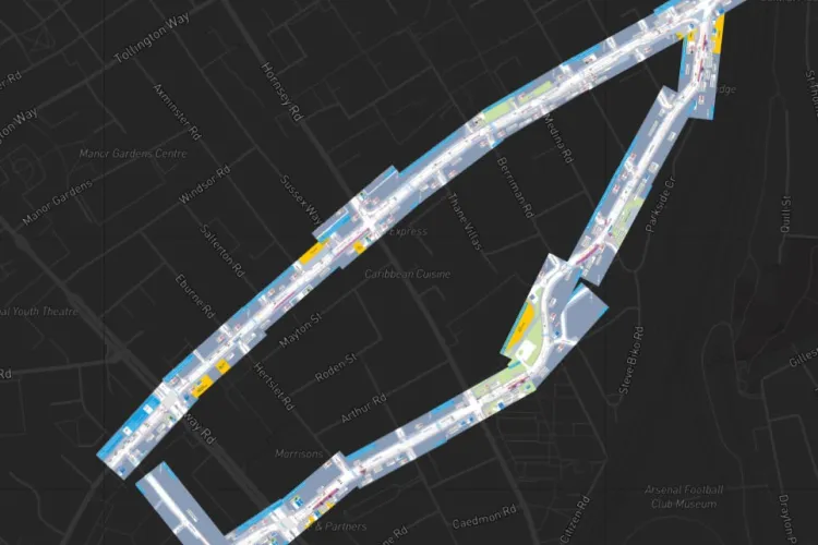
Cycleway 50 Proposal
Looking at official cycling proposals page by page can be challenging. That's why London-based activist Will Petty brought all these TfL PDFs and placed them on the map — now people can understand them in context of the street grid (as well as duplicate and comment).
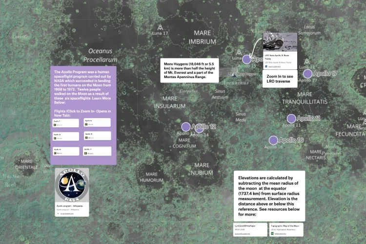
On the Moon!
Using Felt's basemap API feature, Angelica added Planetary Basemap tiles and had some fun taking us on a tour of Apollo moon landings.
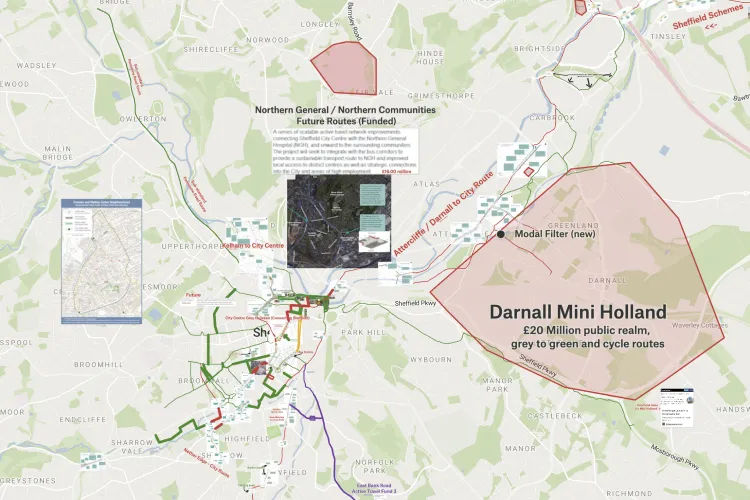
Connecting Sheffield
Duke noticed there is not enough communication around Sheffield's giant Active Travel plans. Felt let him put drawings into context easily and make the bigger picture clear.
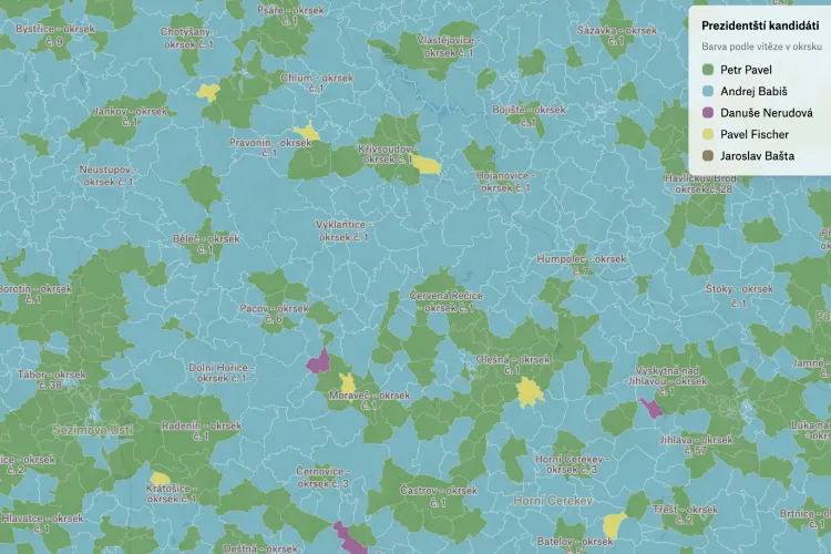
Czech Presidential Election
Data journalist Aleš Ligas mapped Czech Republic presidential race for the local news outlet.
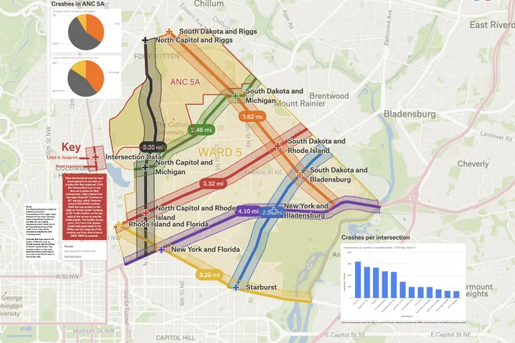
Crashes in DC
Zach put together a map with historic data on crashes within 1,000 feet of major road segments in Ward 5 using Open Data Crashes in DC dataset.
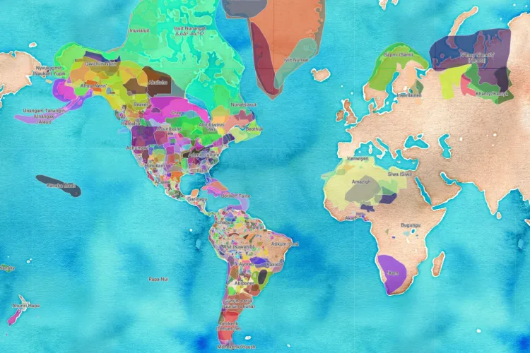
Indigenous territories, treaties, and languages
Quy brought Stamen Design's watercolor basemap and data from Native Land Digital into Felt to explore indigenous territories, language, and treaties around the world.
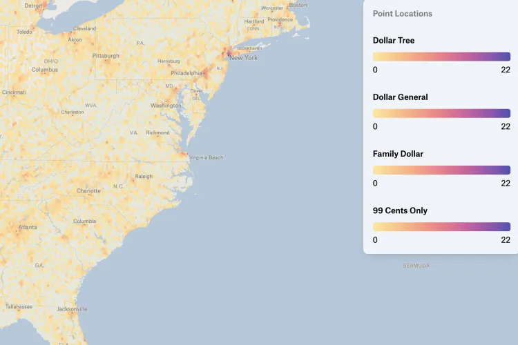
Dollar Stores Distribution
Chris made it easy to tell which brands dominate what geographies in this neat map depicting the distribution of dollar stores around the US.
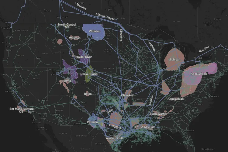
US Energy
Using data from the Energy Information Administration, David built his map to depict the energy infrastructure of the United States.
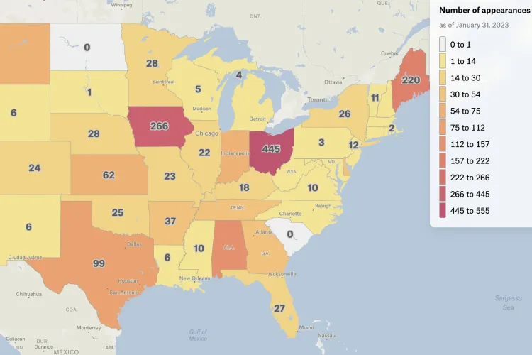
US States in the New York Times Crossword
For all you crossword fanatics out there: if the NYTimes crossword puzzle asks you something about a state, the answer is definitely not North Dakota. Thanks Adam!
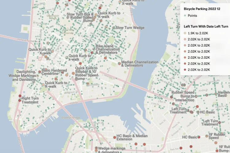
Left Turn Treatments
Data & Research Manager at the NYC Civic Innovation Lab Zhi Keng He put together a map of the city's left turn treatments.
Want to share your map and get featured?
We recently launched our new Slack group where you can connect with other folks using Felt. Post your favorite Felt maps in #showoff-your-map channel and we will feature the best maps at the end of February!
Compare Felt using AI