November spotlight: 10 best Felt Community maps
Celebrating our users and their impressive maps

Felts have been busy putting maps to use – from debunking the myth of the Bermuda Triangle to making safe cycling easier in Oakland, CA.
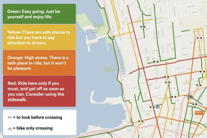
East Bay Bike Routes
Oakland native Rahul collaborated with friends to create a biking map for East Bay and classify routes based on their safety and stress level.
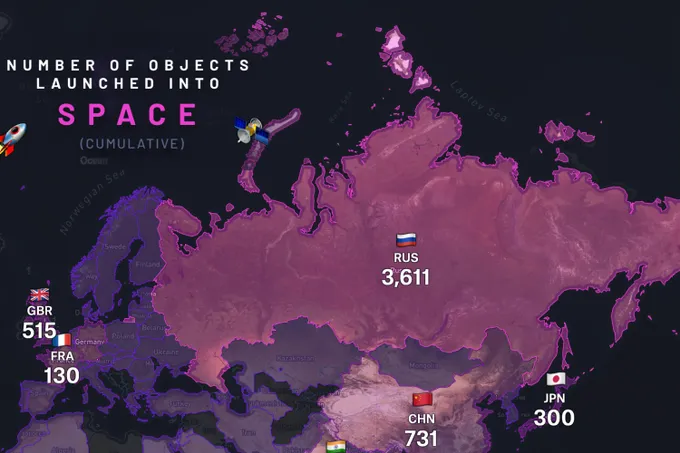
Cumulative Objects Launched into Space
Felt community champion Sam used Felt for the #30DayMapChallenge. In the map below, he took data from the United Nations Office for Outer Space Affairs to illustrate the cumulative number of objects launched into space from each country. Check out more of Sam’s #30DayMapChallenge maps, like coral bleaching severity, world population density, Cairo’s paratransit network, and more.
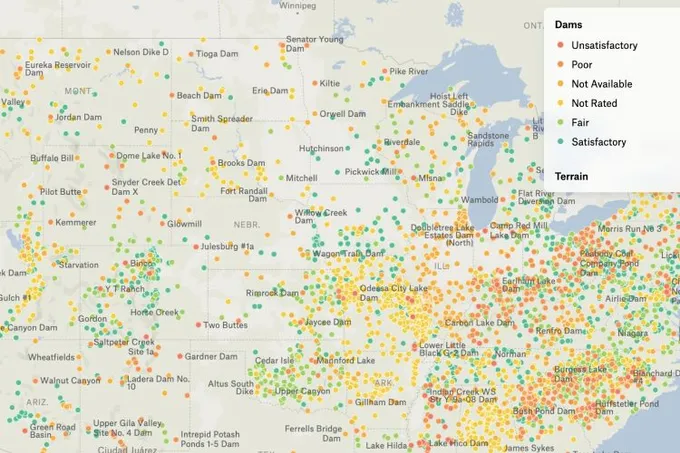
All the Dams, Good and Bad
USA Today developer Chris shared a map showing all the United States based dams and their condition. According to the USA Today investigation, hundreds of dams are at risk due to climate change and rain storms. Click on the map below to check out your local dam conditions.
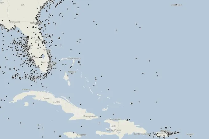
Debunking the Bermuda Triangle with Casualty Data
Map and data animation expert Jack recently mapped all nautical casualties from 1982-2015 according to a US dataset for a video with YouTuber Johnny Harris debunking the Bermuda Triangle myth. Jack added his refined dataset in Felt to demonstrate why the Bermuda triangle isn’t as scary as we thought.
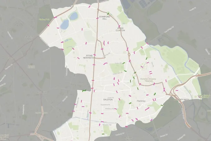
Improving Hackney’s Cycling Gateways
Cycling advocate Will recently led a task force to survey cycling infrastructure conditions across Hackney, London. He managed this data collection project in Felt, collaborating with several other stakeholders, then processed that data into a final map of intersections and gateways that would make for safer cycling. This map will be included in part of the local planning process. To learn more about Will’s process for creating this, check out our Felt Community Meetup recording.
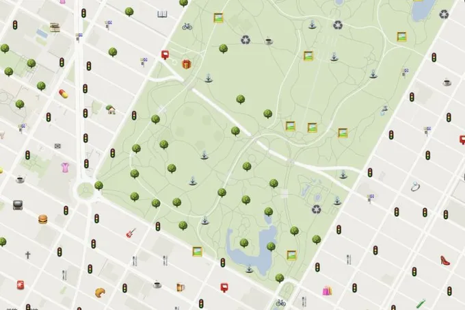
Emoji NYC
Machine learning and geospatial software expert Yoni built OpenStreetMap-derived emoji map of New York City.
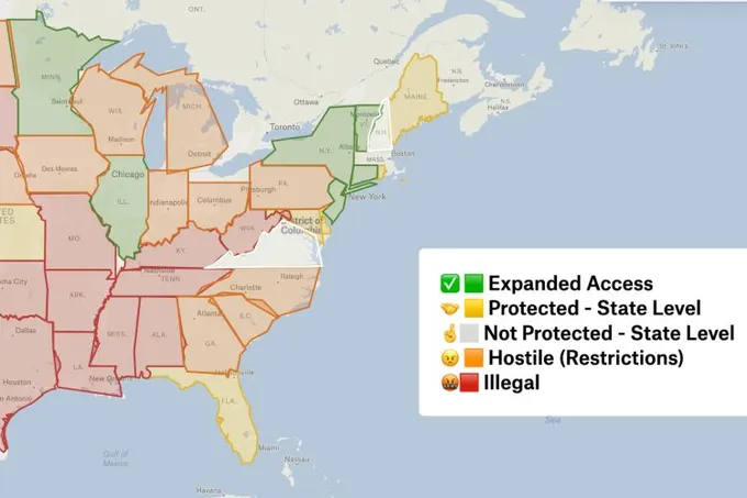
Reproductive Rights in the U.S.
Software engineer Duc-Quy recreated a map built by Center for Reproductive Rights in Felt.
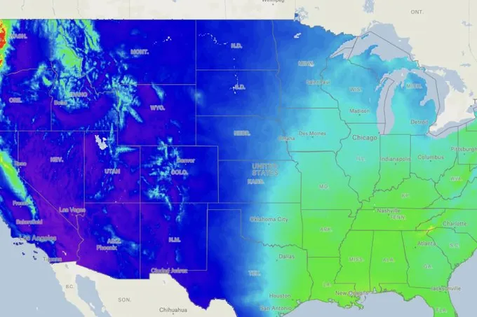
U.S. Annual Precipitation
GIS analyst Chris mapped average yearly rainfall for the U.S. Clicking anywhere will give you the inches of rain. The Pacific Northwest is amazing — look how much rain they get compared to other areas!
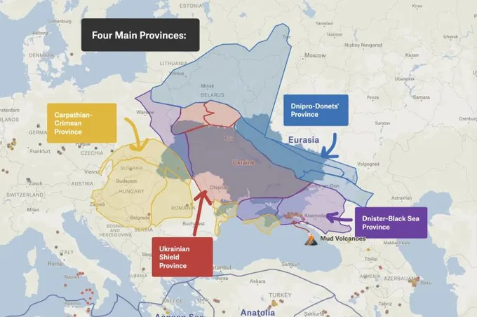
Ukraine’s Geologic Provinces
Another #30DayMapChallenge participant and Felt community champion Angelica mapped Ukraine’s Geologic Provinces and was amazed by the diversity these regions represent.
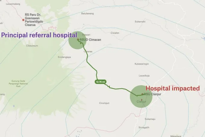
Indonesia Earthquake
Researcher Andrew created a map that shows the Cianjur hospital which was moderately impacted by the recent earthquake in West Java, and proximity to the principal referral hospital where patients are being transferred.
Want to share your map and get featured?
We recently launched our new community where you can connect with other folks using Felt. Post your favorite Felt maps there and we will feature the best maps at the end of December!