37° 48' 15.7068'' N, 122° 16' 15.9996'' W
MODERN MAP MAKING HAS ARRIVED
37° 48' 15.7068'' N, 122° 16' 15.9996'' W
MODERN MAP MAKING HAS ARRIVED
37° 48' 15.7068'' N, 122° 16' 15.9996'' W
MODERN MAP MAKING HAS ARRIVED
37° 48' 15.7068'' N, 122° 16' 15.9996'' W
MODERN MAP MAKING HAS ARRIVED
37° 48' 15.7068'' N, 122° 16' 15.9996'' W
MODERN MAP MAKING HAS ARRIVED
37° 48' 15.7068'' N, 122° 16' 15.9996'' W
MODERN MAP MAKING HAS ARRIVED
37° 48' 15.7068'' N, 122° 16' 15.9996'' W
MODERN MAP MAKING HAS ARRIVED
37° 48' 15.7068'' N, 122° 16' 15.9996'' W
MODERN MAP MAKING HAS ARRIVED
37° 48' 15.7068'' N, 122° 16' 15.9996'' W
MODERN MAP MAKING HAS ARRIVED
37° 48' 15.7068'' N, 122° 16' 15.9996'' W
MODERN MAP MAKING HAS ARRIVED
Maps
Editorial
Behind the lines: exposing partisan gerrymandering with PlanScore
Mike Migurski has been working at the center of spatial problems, open data and politics for a decade. We interviewed him to learn more about his project, PlanScore.

Before we dive into PlanScore, tell us how maps became the focus of your career.

I zeroed in on maps during my 9 years as technical director at Stamen Design. We had primarily been focused on tech and design and the team found that geospatial data, visualization and mapping was our sweet spot. For me, personally, three things became super compelling about maps:

  • Showing spatial problems so people can understand them.
  • A deep appreciation and value of open data being produced.
  • Politics, government, and their relationship to spatial problems.

I followed these interests to all sorts of places working at their nexus, such as Code for America, Remix, and now Meta (formerly Facebook).

PlanScore is a group of legal, political-science and mapping experts working to make redistricting fair and easy to understand via a simple website. Why did you feel the need to start this organization?

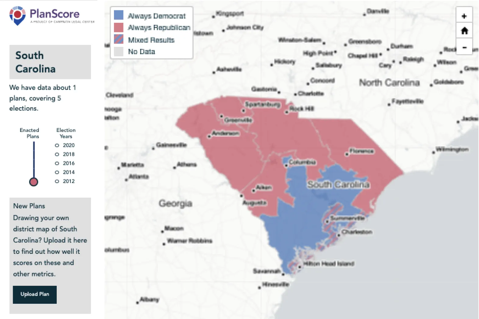
Before I talk about PlanScore, let’s talk about the problem we’re solving: partisan gerrymandering. Every 10 years when the decennial U.S. Census is released, congressional district maps are redrawn by state legislators or redistricting commissions based on new population data. Gerrymandering the tactic of manipulating how these lines are drawn to create an advantage for one party or class.

PlanScore came out of a sense that gerrymandering was upending fundamental components of our democracy. The more I looked into it, the more I understood just what kind of power was in the hands of those drawing these new lines on maps. Districts intend to give everyone fair representation so that voters can influence the work of the legislature. Gerrymandering denies voters that right, impacts what issues are discussed in Congress, and changes what types of laws are enacted.

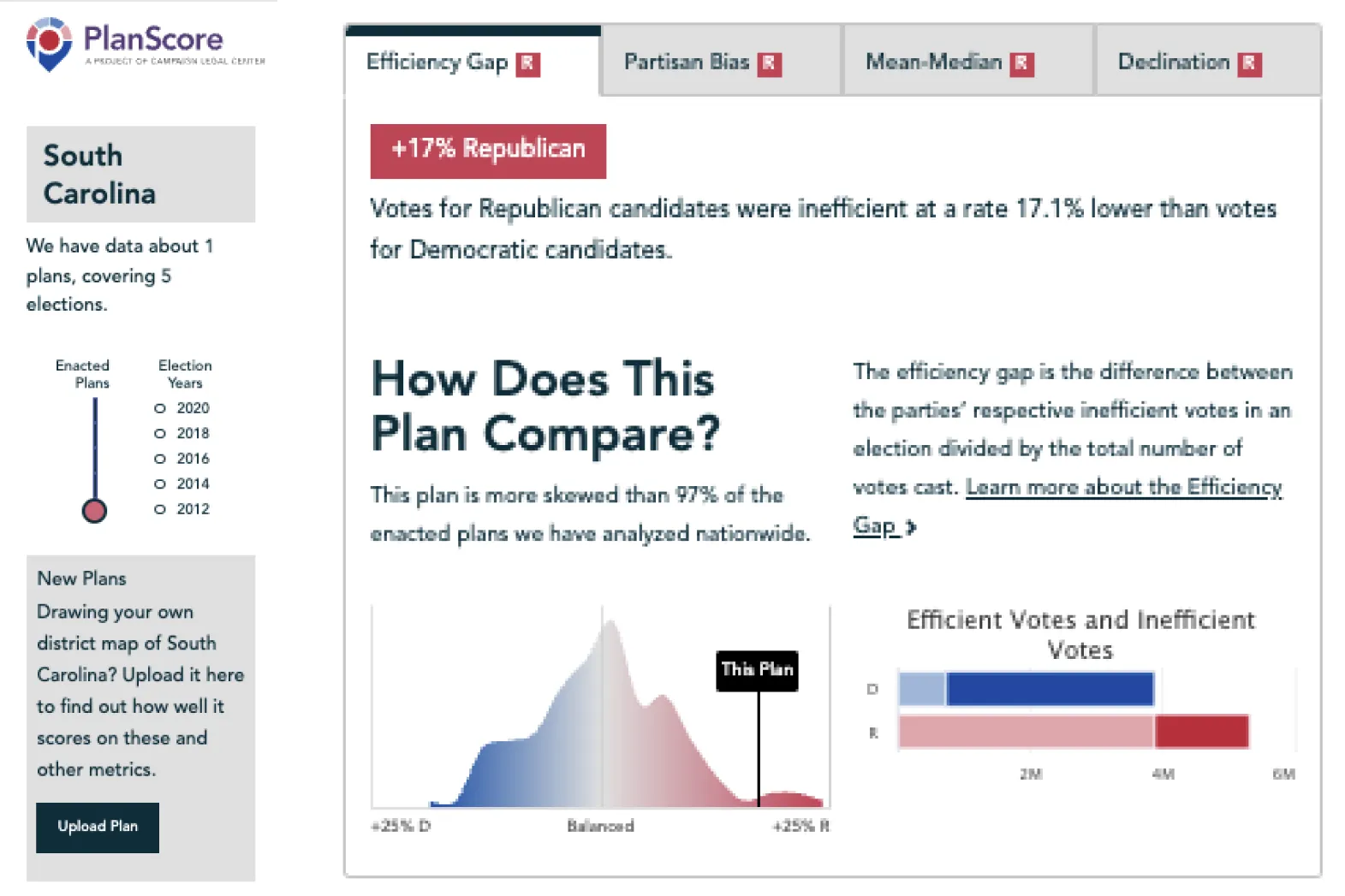
Once I understood the process being used to gerrymander, it felt kind of wild that we didn’t have better tools to expose whether a plan was fair or not, considering these same tools were being used to create the plans themselves. Justice Kagan wrote this in her 2018 Gill v. Whitford dissent:

“Technology makes today’s gerrymandering altogether different from the crude linedrawing of the past. New redistricting software enables pinpoint precision in designing districts. With such tools, mapmakers can capture every last bit of partisan advantage, while still meeting traditional districting requirements (compactness, contiguity, and the like). Gerrymanders have thus become ever more extreme and durable, insulating officeholders against all but the most titanic shifts in the political tides. The 2010 redistricting cycle produced some of the worst partisan gerrymanders on record. The technology will only get better, so the 2020 cycle will only get worse.”

That’s what made us start PlanScore. I had a deep sense that something wasn’t quite right under the hood of our congressional district maps, and that we could contribute to a solution that would yield fairer results. So I connected with public policy researchers, litigators, and academics to create a service that could transparently score district plans and fairness. The 2020 redistricting maps are being drawn and evaluated right now and this time we have the tools in place that are needed to evaluate them.

What was the most surprising thing you learned once you got under ‘the hood’?

You cannot identify gerrymandering simply by looking at lines on map, and if you focus too much on the map, you might miss it entirely. For example, a district with an odd shape might be a majority-majority district, drawn to provide Black voters with access to representation. Or in most new cases, the shape of the district could look consistent with those around it, until you can analyze how the voters projected to vote, and how these voters are packed and/or cracked to create an advantage. The feedback, to reduce the focus on the map, and to instead focus on the voters and the fairness of plan, was consistent across all the experts I spoke with.

PlanScore assesses redistricting maps for fairness as far back as the 70’s. What has changed over the years?

Most significantly, there has been a shift from gerrymandering on a racial basis to a partisan basis. Traditionally watchdog organizations approached gerrymandering cases through a very painstaking process of analyzing maps, in order to determine what their different demographic characteristics are, expose violations in compliance with the Voting Rights Act, and ask for corrections through advocacy or lawsuits. The Voting Rights Act of 1965 was passed in order to deal with racial motivations behind gerrymandering, which went on for many decades particularly in the South. African Americans could vote but could not get representatives to congress because they were gerrymandered out of representation by being “packed” or “cracked” in different voting districts. The Voting Rights Act led to several decades of good outcomes for race-based gerrymandering, but it is currently under attack.


In recent years voters have increasingly tended to have a stable party identity rather than choosing candidates independently per election. Around 2010, the Republican project REDMAP showed that partisan politics and political polarization made it possible to use large data sources, such as US Census information and detailed historical votes, to reliably predict how voters would vote. These two factors—access to large datasets and partisan politics—make it so you can very much decide what your congressional map is going to look like and who your delegation is going to be by creatively drawing lines on maps. As a result, we began to see parties creating visually undetectable advantages for themselves despite voting populations that are often more balanced.

Recent articles claim there is "gerrymandering surge" happening right now. How does PlanScore make it easier to detect whether or not this is true?

Fortunately, there are academic and legal experts developing metrics to expose the fairness of proposed plans (more here). Our board members Nicholas Stephanopoulos and Eric McGhee developed one called the efficiency gap, and worked with Simon Jackman and Chris Warshaw to create historic data and a new predictive model. Anyone in the redistricting process can use PlanScore to test new district plans and predict their partisan outcomes according to several common metrics.

In addition to exposing what proposed plans meant for representation, metrics have to be simple to communicate because lawmakers need to be able to comprehend and implement them. The efficiency gap, for example, is basic arithmetic that tries to count “wasted” votes for each party’s candidates. One of the most important requirements is being able to explain these measures to a judge or a Supreme Court Justice and have them nodding along with you and potentially instituting some kind of remedy.

"...the shape of the district could look consistent with those around it, until you can analyze how the voters projected to vote, and how these voters are packed and/or cracked to create an advantage."

What product challenges did you run into building PlanScore?

We had three big challenges: data availability, credibility, and accessibility.

We built for two audiences, the people who draw the maps—independent commissions, partisan level redistricting bodies—and members of the press. We were able to build credibility with the map drawers by collaborating with data specialists in the community. We worked with GreenInfo Network on design and user research to make sure we're communicating results effectively. Clarity makes it accessible to legal and political experts, adding to our credibility and informing the process. 

In the 2020-2022 redistricting cycle we want to give the press insight into what new maps mean, predict their partisan effects, and provide a way to reference these predictions. We’ve been very successful with this approach. Local newspapers in states where maps are being proposed have reporters saying, “There's a new map from the legislature. It has these characteristics, and the independent website PlanScore says it’s biased towards this party.”

Ok, but how did you get around data availability? That sounds hard.

It’s one of the biggest challenges we faced. Elections in the US aren't really one big system, they are more like 3000-plus separate systems. Effectively, every county runs its own show. In order to do our predictive work, we need complete state records from past elections to make predictions into the future. We need them at quite a high level of granularity. It's easy to get the number of total votes for Trump versus Biden from each county, but if you're drawing district lines on maps you may have to cut counties in half or get into individual city neighborhoods. So it becomes important to have precision data at the level of individual voting precincts.

We tackled this issue by identifying the other people in the ecosystem working on data and collaborating with them to combine everyone’s strengths. Our strengths are all about the predictive model and the scoring pages. Meanwhile, folks like Michael McDonald, Brian Amos, and Steve Gerontakis from Voting and Election Science Team (VEST) are focused entirely on data availability. They're on the phone, talking with county election officials, digging through open data sites, issuing FOIA requests, and turning election results into extremely detailed nationwide maps of voting activity in every state for recent elections. VEST doesn’t have 100% coverage yet, but when they cover a state we're able to score it immediately. This is the same process that political strategists use.

As you mentioned, the 2020 redistricting process is underway right now. What can the curious citizen do to understand what proposed plans mean for their representation?

We have a new feature that we released just about a month ago to cover this! Before a map has been legally enacted, you'll typically see many proposals for draft maps. For example, you might have a state’s Democratic house caucus propose their map versus the Republican house caucus proposing an alternative. The PlanScore Library, curated by our partners at Campaign Legal Center, shows these proposals as they emerge and scores their partisan effects. In many cases plans haven't actually been enacted yet and there's an opportunity to provide feedback to the redistricting commission or state legislature. After plans are enacted they are much harder to influence and require legal challenge.

The second thing they can do to make more fundamental change, is to advocate for an independent redistricting commission. Traditionally, state legislatures have been responsible for redistricting for state legislative and congressional districts, but these have shown to be, on the whole, more partisan in their results than their non-partisan or bi-partisan independent commission counterparts.

Time seems very much of the essence. 

Yes, it's very much like Friday news dumps with new plans. If an organization wants to put together a really unscrupulous or deliberately unfair map and they feel like they need to hide that, one easy way to do it is to drop it right before a deadline. They can rely on the fact that it takes people forever to score these things. We want PlanScore to make it a two minute process. What if you could just take that file, upload it to a website and then immediately get back something that tells you, you know, how it performs on different metrics, what the expected outcomes are going to be, and how that compares to historically enacted plans, which is basically what we've done.

Any unexpected outcomes over your term at PlanScore?

Yes! After successfully executing on our plan to serve the two audiences above, we continue to find opportunities to make an impact. For example, our board member Ruth Greenwood is a litigator who works on this issue. Her evaluation of a map before PlanScore often took an entire weekend. She could set aside a full Saturday to figure out how to represent a map quantitatively, and then use that to write a report and a recommendation. Then she has to turn that into an exhibit for a legal brief. Ruth guided the design of PlanScore to deliver the information needed for a brief alongside the plan’s score. We’ve already seen the Campaign Legal Center using this in a filing against Colorado on behalf of the League of United Latin American Citizens (LULAC).

These two factors—access to large datasets and partisan politics—make it so you can very much decide what your congressional map is going to look like and who your delegation is going to be by creatively drawing lines on maps.
Bio
Michal Migurski is an Oakland-based expert in technology & open source GIS, and the Executive Director of PlanScore. He is a former CTO of Code for America, has worked at Stamen, Mapzen, Remix, and is currently Engineering Manager of Spatial Computing at Meta.
LinkedIn
More articles

Cartography Tips for Designing Web Maps

Search, filter, select — data discovery done right

Getting the most out of Felt’s new Workspaces

Teaching Spatial Analysis with Felt

Powerful new admin tools and a streamlined billing experience

Three key UI upgrades in Felt 2.0