Dynamic styling, hillshades, & raster algebra – Felt’s new raster rendering engine
Felt is on a mission to make mapping effortless for everyone — from pros to the people who work alongside them.
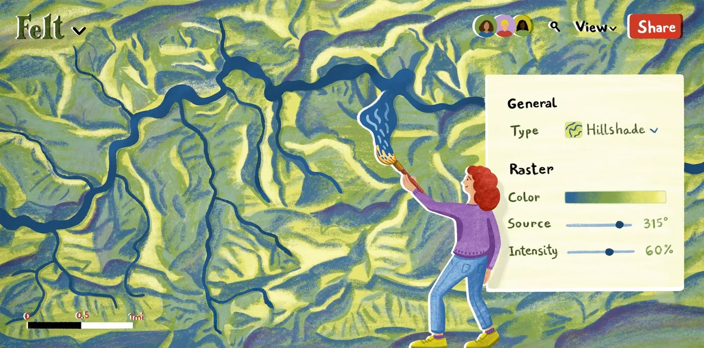
Felt is on a mission to make mapping effortless for everyone — from pros to the people who work alongside them.
Felt is on a mission to make mapping effortless for everyone — from pros to the people who work alongside them. We’ve built a simple yet powerful way for users to create beautiful visualizations with ease. Now we bring that same ease to visualizing all your remote sensing data and unlocking our platform for analyzing raster files side by side any other format.
Today we are launching a full set of features to seamlessly visualize, highlight, and perform advanced analysis on your raster data, all in one place on the web. While you could always bring your GeoTIFF files into Felt, now you can:
- Visualize topography, elevation, land cover, climate and weather data — by applying custom colors to continuous and categorical raster data
- Analyze your raster data, calculating NDVI, NDMI, or NDWI
- Generate hillshades from high-resolution terrain data
- Share you data alongside other formats — from vector to DEMs to sensor data — with a single link
With this launch, Felt is the one place on the internet both GIS professionals and those new to maps can bring all their data formats onto to the map, analyze it, and share.
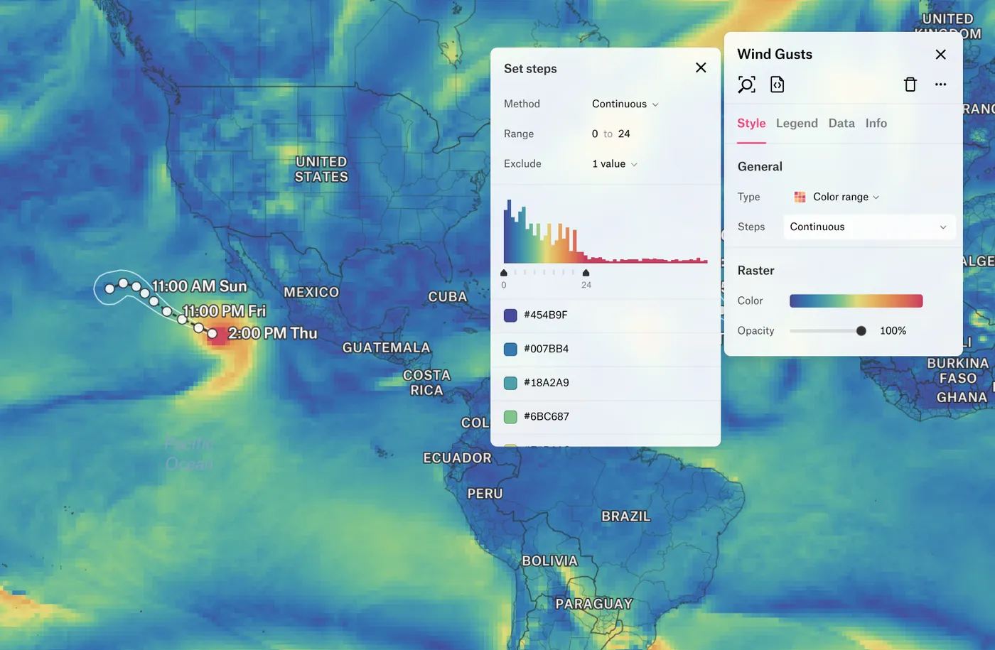
Dynamic styling, right in your browser
The process of displaying non-image rasters requires the application of a color ramp to the data values or mapping pixel values to color gradients. The process can be time-consuming — it may involve pre-processing or loading up special software — and the end result is a static file that’s difficult to share.
Felt’s new raster styling capability allows you to reveal the rich texture of spatial patterns in your data much more quickly, and customizing colors is easy. Rather than spend your time processing data you simply:
- Drag the data into Felt
- Style the data in Felt
That’s it!
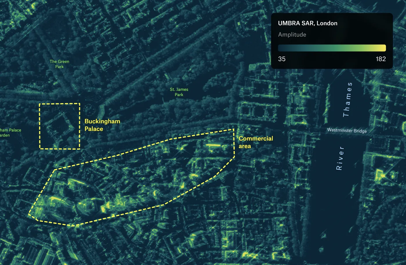
When styling, it’s easy to make a data visualization you love. Customize the color range and color palette with intuitive sliders until the results best represent the data. Users can even customize colors based on the range and distribution of the data values.
Create stunning hillshades in seconds
A common type of non-visual raster data is elevation data. These datasets, commonly known as Digital Elevation Models (DEMs), are useful for providing context for many applications, from mapping landslide scars with LiDAR-derived data, to floodplain mapping, to visualization of high-resolution collects from drones over construction projects.
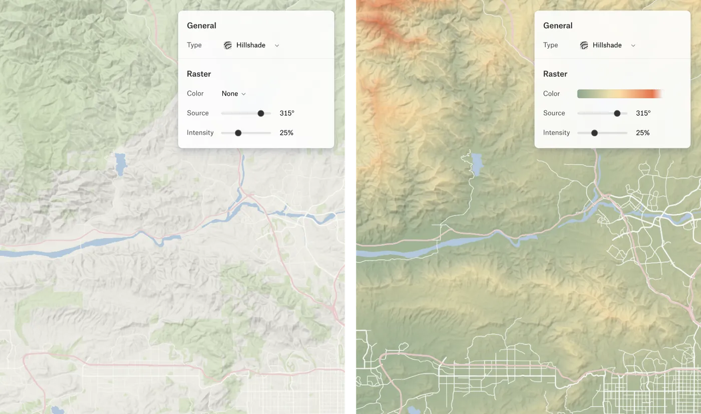
Our raster capabilities include dynamic hillshading, which allows users to display the rich texture of DEMs in their Felt maps. Not only that, Felt makes it easy to add color, or a hypsometric tint, to bring your hillshade to life. When combined with a colorized visualization, terrain — or bathymetry — patterns are revealed in rich detail.
Powerful calculations, like NDVI, and more
Raster algebra describes mathematical operations on raster pixels. By applying these operations on your data, you can create new, derived datasets within Felt. To start, we’ve enabled 3 dynamic raster calculations:
- Normalized Difference Vegetation Index (NDVI), used to display the health of vegetation from Near-Infrared (NIR) and Red spectral bands.
- Normalized Difference Water Index (NDWI), useful for highlighting areas of surface water (e.g. flooding), derived from the Green and NIR spectral bands.
- Normalized Difference Moisture Index (NDMI), which measures the moisture content of vegetation using Shortwave Infrared (SWIR) and NIR bands.
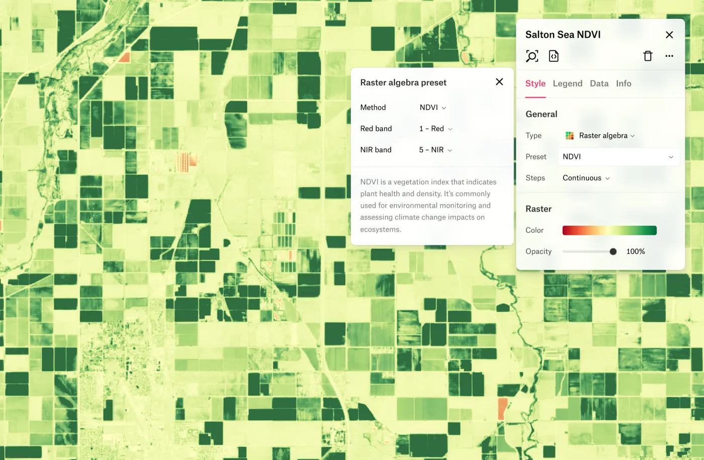
This is only the beginning. We will continue to add powerful raster algebra methods to the platform.
Striking categorical visualizations
Some raster data, like data from National Landcover Database (NLDC), CropScape, or deep learning models for land cover classification, represent classes of data, where numeric pixel values correspond to nominal landcover classes. These kind of data are commonly used in applications like agricultural mapping, where pixel values correspond to types of crops.

Now you can bring your categorical rasters into Felt. In Felt, you have control over the color and transparency of every unique class, resulting in striking yet informative cartographic visualizations.
The best way to work with maps, simply
This launch makes all the best parts of Felt available for anyone struggling to analyze, share and communicate easily with raster files. Many other parts of Felt’s existing platform will accelerate your data workflows, including:
- Precomputed classifications and stats: As your data loads through our pipeline, Felt precomputes your classifications and statistics, leaving only symbology for tweaking.
- Share with just a link and get instant feedback: Felt is accessible to use for everyone — clients can jump in, make edits directly, or leave a comment, giving you time back to focus on what matters.
- The ability to combine multiple formats to tell the whole story: add hurricane track vectors on wind speeds, or any other combination – you can ‘Upload Anything’ to Felt (or even paste a link to a file right into Felt, and watch it load through the pipeline before displaying on the map!).
Whether you’re selling imagery to clients around the world or analyzing climate data for stakeholders at risk of a natural disaster, Felt will make every aspect of working with your data effortless.