How to Design a Beautiful Map
At Felt we’re building a tool that empowers anyone to make a great map. As with any creative tool, applying a few key techniques to the design of your map can take it from a rough draft to a beautiful, professional design. We spend a lot of time thinking about how to make maps look great in Felt. Here is the guidance we've developed.
As the design and cartography leads for Felt, we think a lot about how to improve Felt user experience, with the goal of helping you make maps that are both useful and beautiful! By following the guidance below, your maps will look better in no time.
Choose a compelling story, and stick to it
First up, the contents of your map are the most make-or-break part of the craft. Who is your audience? What do they need to know? And how will they use it? Put yourself in the shoes of the viewer as much as possible throughout the process.

A great story doesn’t wander too much, or digress to other topics, or include too much extra information. Choose a topic, list out the most important things to convey that support the core story, and add those. Avoid cluttering the map with too much stuff.
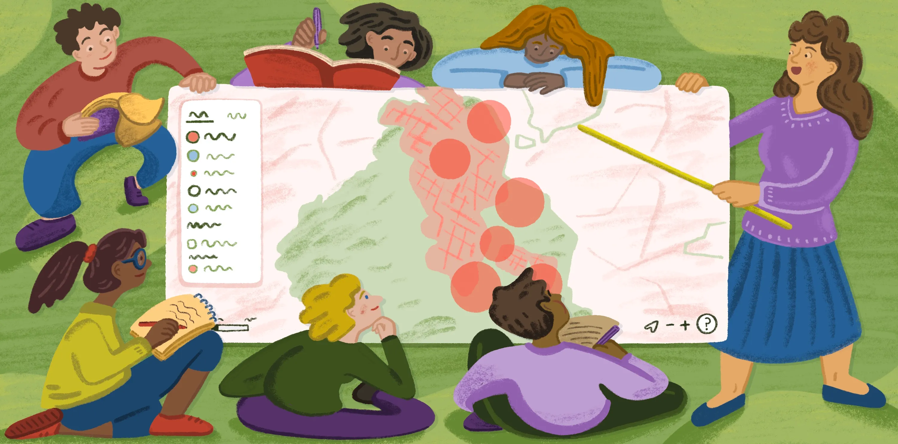
Create visual hierarchy
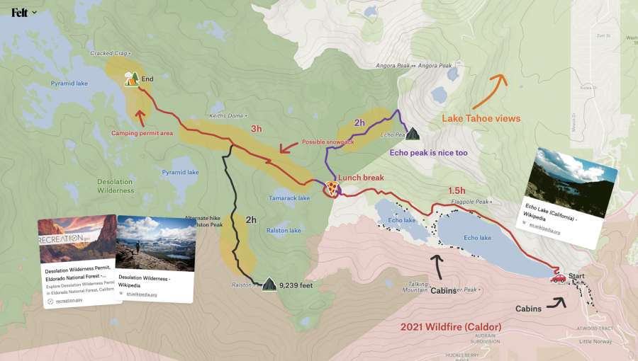
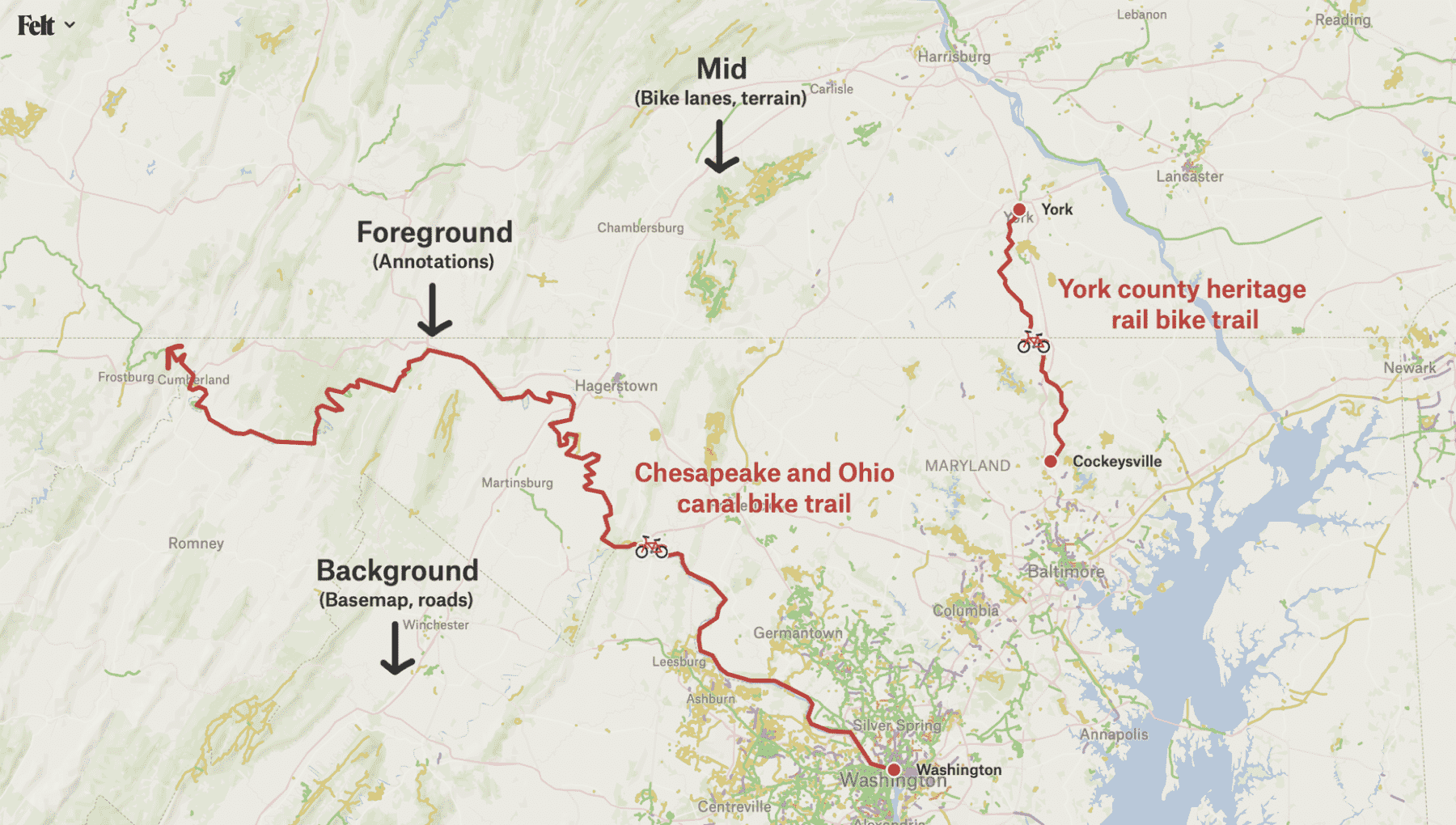
The concept of visual hierarchy is used everywhere in design, and that’s especially true in mapping. Information can be broken down into fore, mid, and background. The most important elements should stand out in the foreground, catching and drawing your eye before anything else in the map. Elements in the background should be subtle, providing useful context without drawing too much attention. Use size, color, and contrast with your drawings and annotations to indicate what information is most important.
Combine layers with the basemap for context or appearance
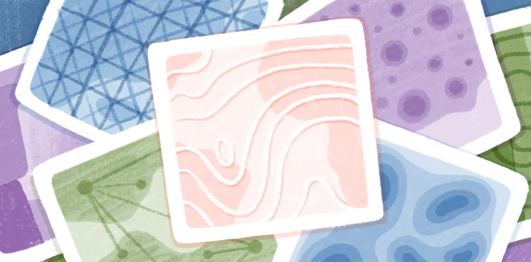
From a design perspective, Felt’s basemap sits softly in the background, the data layers lie on top of that, and our drawing and annotation tools stand out prominently in the foreground. This visual layering of information available in Felt opens up the possibilities of what your background map canvas can transform into.
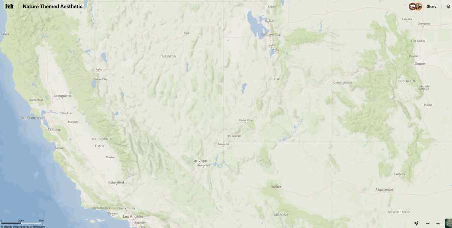
Felt comes bundled with dozens of curated data layers. Some of these layers are useful for certain use cases, but many are useful for a broad range of maps because they enhance the basemap. For example, using layer combinations like Terrain, Intact Forest Landscapes, and Ocean bathymetry can instantly change the look and feel of the background basemap to highlight more of Earth’s natural features.
Layers with lower contrast colors like Airports and Ferries and Terminals sit further back with the basemap and can be used to provide additional context to your map:

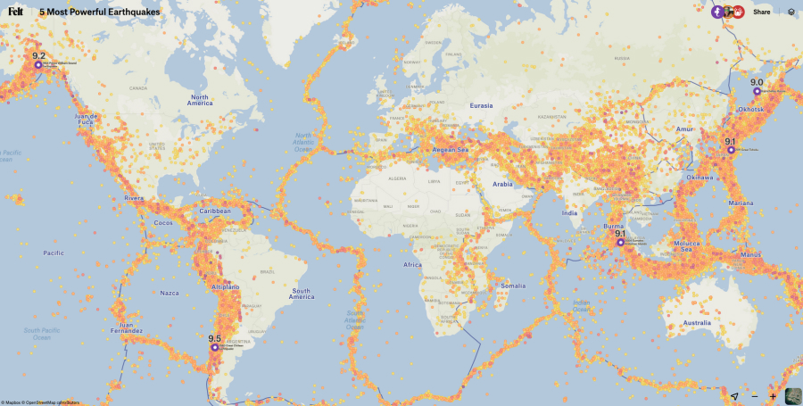
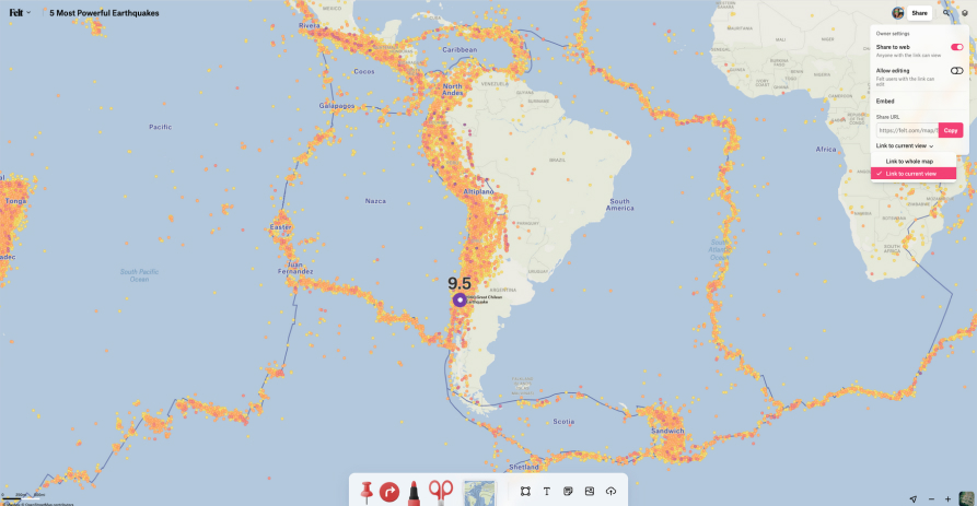
Layers with higher contrast colors like Earthquakes and Tectonic Plates stand out more against the basemap. Even with a higher contrast combination, drawings and annotations remain in the foreground:
Browse around Felt’s layer library to find ones that can help bring more geographic context or aesthetic qualities to your map!
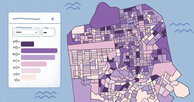
Limit your colors, create a harmonious theme
Felt offers the full rainbow of colors, but generally using too many of them at once will lead to a cluttered feeling map, like a box of crayons emptied onto your desk.
Consider the basemap behind your image, which uses earth tones like subtle greens and blues and any layers that you have added. Evaluating these two pieces together will help establish a color palette even before you start drawing.
If you can limit your map to just a handful of colors, with each color having a clear meaning or purpose, it will look more thoughtful and intentional in the end. You can also use black, white, and even brown as “neutral” colors when adding more content to the map without increasing the color count.
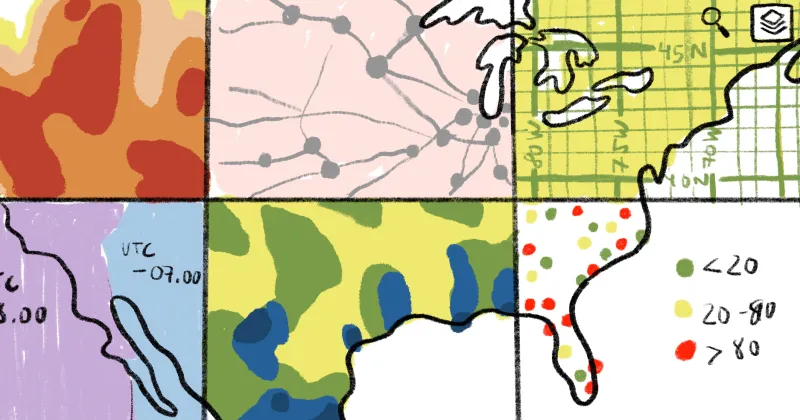
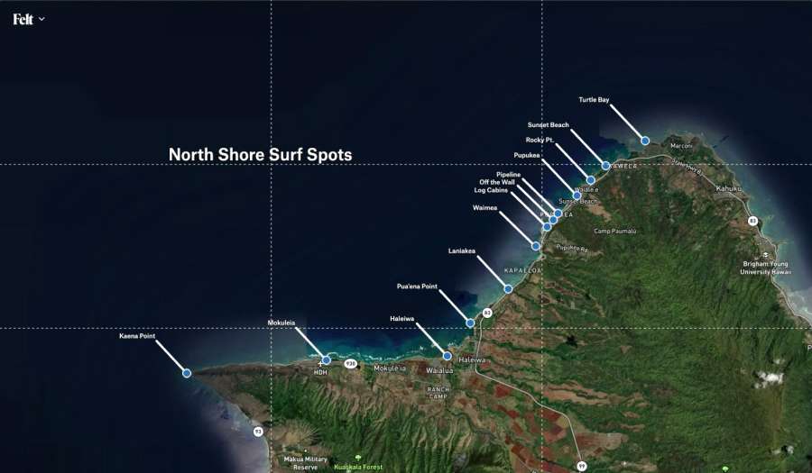
Use symbols that are easily understood
Using symbols that are well known and easily understood is an effective technique to promote overall map legibility. If you can use a symbol to provide additional context to your map that doesn’t require a label to be interpreted, this leaves more visual room in the foreground for labels and text that are important for your map’s story and purpose.

Follow the rules of thirds and balance
If you’ve ever studied photography, you’ve come across the rule of thirds: generally speaking it’s pleasing to the eye to have the main subject of an image land along the thirds lines. Maps are no exception to the rule!
Balance is also key - if a bunch of content sits on the left half of the map, and a single point sits way out to the right, it may wind up feeling unbalanced to the left side. Of course, you don’t want to make up information or locations that aren’t relevant to your map, but if you have notes and annotations on top, you can move them around to help create a more balanced layout.
Tips for sharing your map
Taking a screenshot?
When you screenshot a map for sharing, hide the UI components by pressing ⌘ . on mac, or Ctrl . on PC. As described above, use a photographer’s eye to think about the rules of thirds and balance and consider whether there are any ways to make it stronger.
Sharing your map as a link?
Before sharing your map link, establish the area and extent that you want other’s to view your map when they open it. You can use the + / - controls in the bottom right of the interface to zoom in and out and hold the map with the mouse to pan North, South, East or West. You can then fine-tune the map view by zooming in and out more incrementally with your mouse’s scroll wheel.
Once you have your desired extent, you can select the option in the Share menu “Link to Current View” to generate a shareable link that opens to that view!
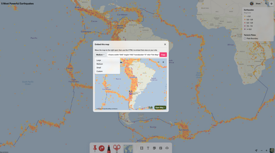
Embedding your map?
Just as important to finding the right extent and balance of information for your map’s screenshot or shareable link, the same applies to an embedded map. The size of your embed will be dependent on your publishing medium so be sure to test using one of our preset sizes or a custom one.
And finally, our most important tip
Given that Felt offers a new and unique way to create, collaborate, and share maps on the web, have fun and get creative with the Felt-map making process!
Compare Felt using AI