37° 48' 15.7068'' N, 122° 16' 15.9996'' W
MODERN MAP MAKING HAS ARRIVED
37° 48' 15.7068'' N, 122° 16' 15.9996'' W
MODERN MAP MAKING HAS ARRIVED
37° 48' 15.7068'' N, 122° 16' 15.9996'' W
MODERN MAP MAKING HAS ARRIVED
37° 48' 15.7068'' N, 122° 16' 15.9996'' W
MODERN MAP MAKING HAS ARRIVED
37° 48' 15.7068'' N, 122° 16' 15.9996'' W
MODERN MAP MAKING HAS ARRIVED
37° 48' 15.7068'' N, 122° 16' 15.9996'' W
MODERN MAP MAKING HAS ARRIVED
37° 48' 15.7068'' N, 122° 16' 15.9996'' W
MODERN MAP MAKING HAS ARRIVED
37° 48' 15.7068'' N, 122° 16' 15.9996'' W
MODERN MAP MAKING HAS ARRIVED
37° 48' 15.7068'' N, 122° 16' 15.9996'' W
MODERN MAP MAKING HAS ARRIVED
37° 48' 15.7068'' N, 122° 16' 15.9996'' W
MODERN MAP MAKING HAS ARRIVED
Maps
Editorial
How Nonprofits are collaborating on Felt to get out the vote
Nonprofit visual communications expert Evan O’Neil shares how he is using Felt for civic engagement & and advocacy to build a more equitable Houston this election.

How did you first get into cartography and visual communications for nonprofits? 

I started off doing design work for bands, mostly posters for shows and album covers. Then I slowly got into activism, and I have been working with nonprofits and advocacy organizations for over 10 years now. I started off on the branding side, but then I slowly moved towards mapping and data visualization because I think it gives us an opportunity to better understand the social and political reality of today. 

A lot of your projects are dedicated to Houston. Which one you’re most proud of?

I collaborate with One Breath Partnership, and I helped produce a four-part investigation called The Houston Arrow — if you look at almost any map with the city’s social data, you can see a group of neighborhoods shaped as an arrow that is more rich and well-developed than other parts of the city, with significant racial inequities. We explored how history, segregation, and history of Houston affected what we see today. 

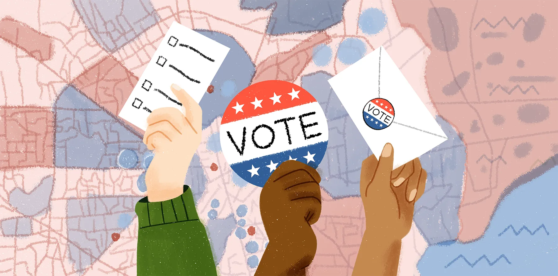
How did you use Felt to coordinate multi-organizational canvassing effort to register voters for the midterms?

I work with an organization called Houston in Action. This nonprofit brings together dozens of partner organizations that work all across the city and aim to remove barriers to civic engagement and empower communities to make change. When it comes to elections, we work together to make sure everyone has information about upcoming elections, including voter registration deadlines.

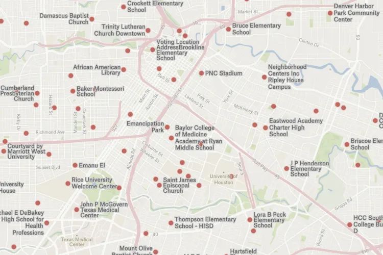
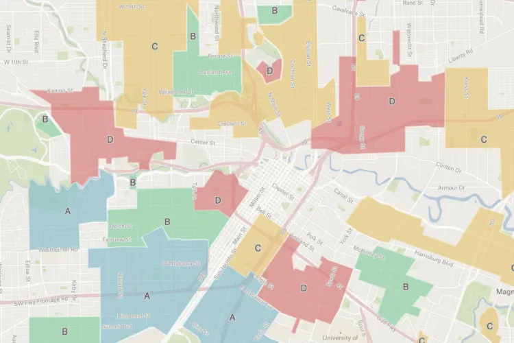
Houston is a very big city, and it’s hard to coordinate activities so everybody would know where everyone else is working. To coordinate our voter registration canvassing campaigns in the past, we would take a screenshot of a map of Houston and then have people on Google Jamboard draw on top of the screenshot. This process was really chaotic because this work is hyper local–you want to see the regional level but also street by street–and I was looking for better tools.

This year we used Felt, and it was a great fit. We broke the map into neighborhoods, like North Houston, East Side, Southwest, etc. To prepare, I uploaded a map of Houston voting precincts as a data layer. Over Zoom, representatives from each organization used the highlighter tool to mark up their plans. We weren’t limiting organizations to voting precincts–they could color in the general area that they were in and then add the tag for their organization. Sometimes people didn't know that other organizations were in their area too–the map helped them form valuable new relationships and adapt their plans to avoid overlap.

I was pleasantly surprised by how intuitive Felt is for first-time map makers. A lot of people in these organizations haven't used many mapping tools beforel, but everybody picked it up almost immediately.  In the end, there were almost 40 contributors.

From this work, we were able to put together their door-to-door canvassing plan that efficiently used our resources. Unlike a Jamboard, we were able to export data from Felt and data teams were able to organize their volunteers to know exactly where they were going.

Harris County 2022 Election Voting Map used to document polling locations which organization will use to coordinate on day-of election plans.

How are nonprofit organizations using maps to make sure the midterm election process is equitable?

With Houston in Action project, we analyzed where the early voting and the election day locations were to make sure that they were equally distributed through the city, and no one was being left out of the process. The map helps us identify and add the priority zip codes to make sure that Houston citizens all have adequate polling location access.

Now that the voting registration deadline has passed, the organizations I'm working with are focused on making an election day plan. We need to decide who's going to be where so we can maximize our impact by coordinating and on collateral handout or schedules and/or food. From what we've experienced so far, collaborating together on a Felt map is the fastest and smoothest way to identify areas where we can combine efforts, as well as any gaps–like polling locations that aren't being covered by any organization within the network.

Redlining in Houston

What value does mapping bring to non-profit organizations?

Nowadays, we often forget the value of a place. Many people are very comfortable living online and not paying attention to their physical surroundings. I think tools that allow people to collaborate and organize to improve their neighborhood or their city are really important. That’s what motivates me to work on various projects dedicated to Houston politics and history. 

Collaborative mapping tools like Felt help me gather community-sourced histories or collaborate on a project that brings a local community together. 

We work a lot with Home Owners' Loan Corporation (HOLC) redlining maps, and when you look at an old map of Houston, the arrow shape is already there. The world that we live in now is shaped by decisions in the past. Learning about history and how different decisions were made in the past can really tell a lot about our current world. These redlining maps were made in the 1920s and 1930s, but they define the world we live in today.

Share your story

If you enjoyed learning about Evan's approach to mapping and want to share your own creations, join our new Slack group where you can connect with other folks using Felt, join community events, and win some fun swag! Post your favorite Felt maps in #showoff-your-map channel and we will feature the best maps at the end of November! If you haven't tried using Felt yet, you can sign up for free and give it a try! Then share your incredible new map with the world.

I was pleasantly surprised by how intuitive Felt is for first-time map makers. A lot of people in these organizations haven't used many mapping tools before but everybody picked it up almost immediately.
Bio
Evan O'Neil has been integrating public interest and social responsibility into his visual communication work for over 10 years. He collaborates with community advocacy organizations and brings the principle that “good communication is good listening” to his work. Evan is interested in visual communication projects that tell community stories and advocate for positive change through mapping, data visualization, concise visual strategy, and a collaborative process of clear communication. He is a Project M alumnus, was named a League of Women Voters Rising Star, and creates music under the band name El Modena.
LinkedIn
More articles

Cartography Tips for Designing Web Maps

Search, filter, select — data discovery done right

Getting the most out of Felt’s new Workspaces

Teaching Spatial Analysis with Felt

Powerful new admin tools and a streamlined billing experience

Three key UI upgrades in Felt 2.0