Multiplayer prototyping: if your tools aren't fun, you're not doing it right
Julius Tarng
,
Creative Technologist
•
Wednesday, August 25, 2021
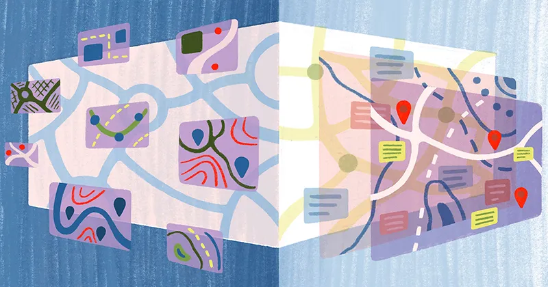
For the past few months, I've been prototyping different web drawing tools for Felt—a collaborative mapping app which aims to get everyone to think in maps.
For the past few months, I've been prototyping different web drawing tools for Felt—a collaborative mapping app which aims to get everyone to think in maps.
As a contractor, I prioritize opportunities where I get to learn and play with new technology. Felt's proposal to help them build never-before-seen web drawing tools put them at the top of my project list immediately. It was a great opportunity to combine some of my prior experience building spatial software while learning about mapping and Geographic Information System technology!
Fun = Speed
I believe the best way to design something is to prototype it. I often prototype many ideas as quickly as I can, as to assess many different options before making a decision. Fun tools help me move quickly, since the more fun I have, the more ideas I want to try out. It doesn't matter if the tools are esoteric or niche. For example, Origami Studio (whose noodles cause many to balk) is one of my go-tos when designing products. Even though the learning curve was extremely high and debugging can be a brain-melter, slapping down patches feels viscerally fun! It reminds me of playing the Incredible Machine when I was younger. It doesn’t matter if the contraption was contrived if you put the ball in the box — often, that was the best part. I look for libraries that evoke a similar feeling when programming. It should let me create new pieces easily, and mix them around to create new combinations.
Want to know more about Felt?
Learn all you need to know watching this 2 minute video or book a demo with our team.
For most digital products, prototyping in a care-free way can yield great results. However, for collaborative, multiplayer, spatial products, the performance of the prototype is key — you need to deliver a smooth experience, even if you’re just playing with a new idea. Otherwise, you’ll end up getting a lot of unhelpful feedback from users who were distracted by a janky tool. React is my go-to for prototyping these types of products, and there are a few tools and patterns I've discovered that I keep coming back to because they deliver on iteration fun (read: speed) and performance.
Data Graphs with Jotai
React makes it very easy to create a deterministic tree of components, and it's tempting to simply waterfall your props down. However, with a large set of elements, each of which can be changed every frame by multiple collaborators, it can be very hairy to access the specific part of the dataset that you need performantly.
Jotai addresses this pain point directly and helps us structure our data in a way that can minimize rerenders and prop waterfalling. It adds a lot of functionality on top of useContext that feels fun to use (and if you've used node-based flow tools like Origami, it'll feel familiar). The basic building blocks are atoms, which are bits of reactive state. Atoms can depend on one other, and you can imperatively interact with atoms, too.
Here’s a simple example of a data graph made in Jotai, where we have a big array of layers, a selected layer ID, and we want to derive a 3rd atom that has the latest layer data of the selected layer based on the selected ID.
Origami users will note that this can be represented in a graph:
The atom setup may look a little contrived, but these building blocks are now super easy to use in the component code!
We can push the usage of atoms as deep in the React tree as we want to, without having a messy props waterfall (and as we use strict Typescript, it saves my fingers from adding prop types, too!) that can be cumbersome to update as the prototype evolves. Jotai helps us reduce the pain of moving things around.
You can also imperatively interact with atoms through writable atoms, which allow you to compose side-effects easily, and can be used across the application!
Jotai has become one of my favorite tools to use, and hopefully it’s piqued your interest.
Managing a complex interface with Uncontrolled Compound Components
We have experimented with 8 drawing tools so far using these techniques and we will continue to add more. Each tool has slightly different behavior while sharing similar functionalities. I'm still trying to figure out the best patterns to manage them. One I learned about and implemented recently was based on Jenna Smith's Uncontrolled Compound Components blog post.
The general idea is to prioritize co-locating your code, so all your TextLayer code is in the same file or package, instead of scattered in switch statements across all the surfaces it could be used (Inspector, Canvas). The pattern uses React portals so you can teleport code from, say, <TextLayer> into <Inspector>. This enables you to stay in TextLayer to modify it, or easily delete the whole tool (we've deleted several dud tools already).
To build on the previous example of showing a selected layer’s information in an inspector, we could use this pattern to reduce the atoms needed.
It’s a fun, flexible pattern and I keep discovering new ways to structure my components to make it easier to move quickly while prototyping.
Reducing un-fun parts of frontend with Radix, Stitches
Two of the other tools I’ve really depended on while prototyping Felt are Radix and Stitches, both created by the same team, which Jenna Smith is a member of!
Accessibility is super important, and most digital products today comprise the same 10-20 components: dropdowns, tooltips, dialogs… Yet many of these aren’t available in standard HTML elements. For example, you can use a <p-inline><select><p-inline> to create a dropdown, but selectors have different accessibility requirements from dropdowns. Radix provides unstyled components that give you accessibility out of the box: keyboard shortcuts, focus management, etc. They even have a Context Menu component, which I can’t wait to play with when we add in right-click functionality on Felt.
I love writing CSS, but vanilla CSS doesn’t match up too well with the component-based workflow of React apps. Fighting with specificity when implementing variants is not fun. In addition to a robust design token API, Stitches provides a way to easily create variants that work perfectly with the props API of React components. You can even create variants of variants!
My Philosophy: If you’re not learning and having fun, what’s the point?
Last year, I was still working as a Product Designer — I started noticing my interest in projects waning. After much discussion with others, it turns out that I was just not learning, and thus not having any fun. I had always been very involved in the technical aspects of the products I designed, and often coded for fun. It seemed like a good time to experiment with engineering as my primary role. In the past 10 months, I’ve worked with more than 6 clients as a prototyper/frontend specialist, and as a result been able to be exposed to the tools above, and many more I’ll share another day.
Learning is a core component of my motivation, and lately, I’ve been trying to learn as much as I can about spatial accessibility. As real-time/collaborative become more common, libraries like RoomService, Replicache, and Liveblocks have been created.Spatial experiences are going through a similar renaissance, too, albeit with fewer tools. In many digital applications, it's possible to create a robust experience for folks using assistive technology — for example, you can use most social media with a screen reader, and keyboard navigation is straightforward in a 1-dimensional feed. However, how do you express 2-dimensional visual diagrams and relationships in a semantic way? In recent years, more and more video games have started taking accessibility more seriously as well, with difficulty settings, display adjustments, and cool features that are fun for everyone, like slowing down or becoming invincible. If you know of any research or tooling out there (fun or otherwise), please reach out.
I often prototype many ideas as quickly as I can, as to assess many different options before making a decision.
Bio
Julius runs an independent practice that specializes in prototyping novel multiplayer and spatial experiences. He’s based in Dallas, TX and spends most of his time watching anime, kpop survival shows, and playing games. Previously, he led design at Webflow and created the design tools team at Facebook.


.webp)