
Felt is totally free for classroom use. With our new analysis tools, your students can learn powerful ways to ask spatial questions like:
- What are potential habitats for for endangered Iberian lynx?
- How many commercial buildings are within a certain radius of a flooding area?
- Which sites are optimal for installing electric vehicle chargers?
Felt’s tools are built to be intuitive. Running transformations can be very time-consuming — you really don’t want to run the wrong one. In Felt, students could have confidence in what they are doing and learn transformations by flipping through previews. Your class will be up and running in no time!
Here is an exercise to get your students to think spatially — feel free to recreate it or use it as a reference for creating your own assignment in Felt!
Background
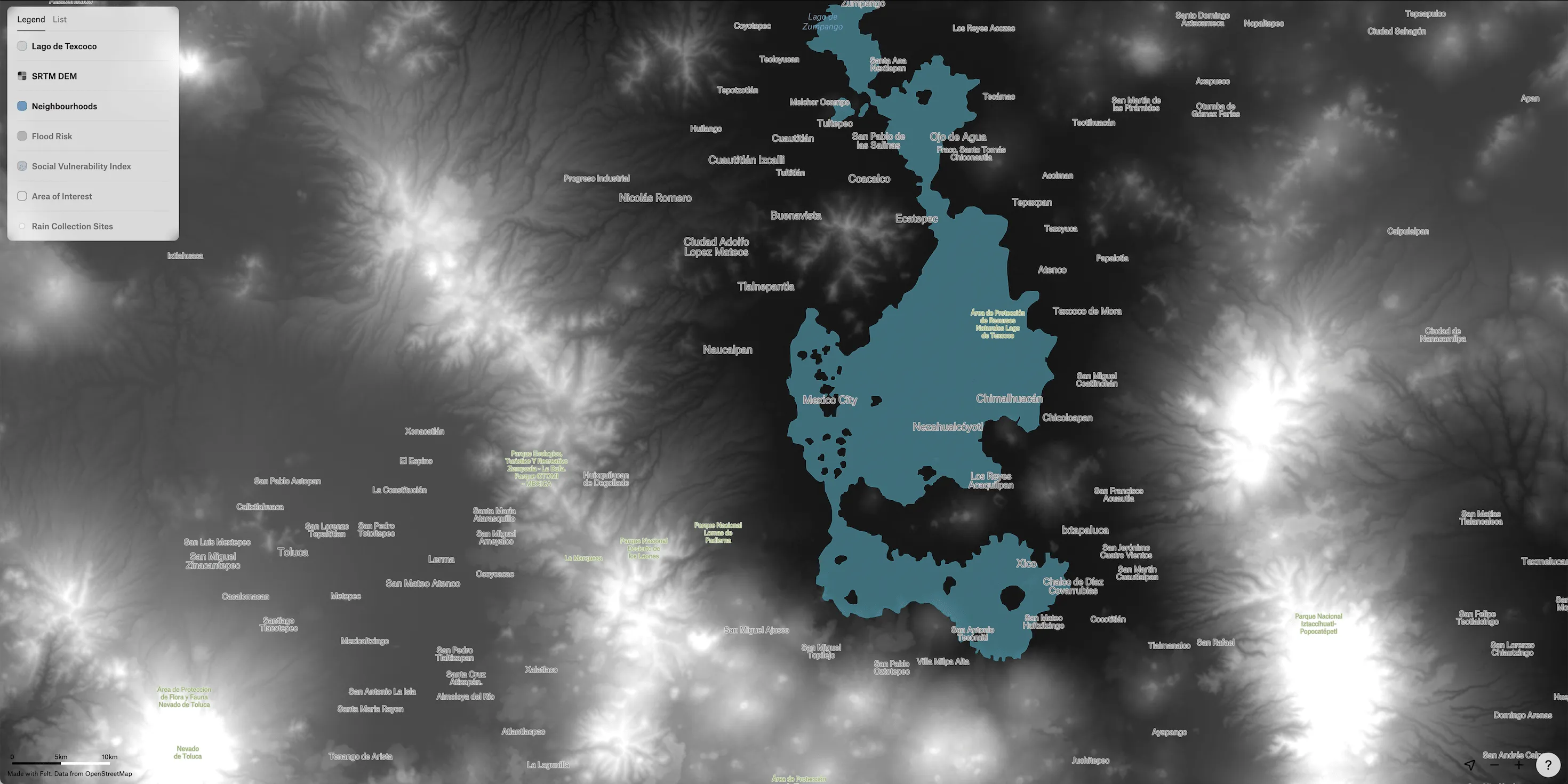
The Spanish built modern Mexico City over the ruins of the Aztec capital of Tenochtitlan, which they conquered in 1521. The Aztec city was on an island in Lake Texcoco, but the Spanish drained the surrounding lake over centuries and expanded Mexico City onto the new land. This combined with the effects of climate change makes Mexico City highly vulnerable to extreme events like earthquakes, flooding, and more. Half of Mexico City is classified as medium to high flood risk.
Part of Mexico City’s Local Climate Action Strategy is to install rainwater harvesting sites around the city to reduce the impacts of flooding and increase water security for its populations.
Objective
In this exercise, we will use Felt to better understand how many rainwater collection sites are installed within a 2 mile radius of populations that are both highly vulnerable to flooding and have high social vulnerability indicators. This will help us make a decision about where more collection sites should be placed.
Getting Started
To get started, duplicate this map that contains the Layers needed for this exercise. Note that the visibility of all Layers is turned off. We will turn them on and off as we go through each step of the exercise.
The data sources we are using for this exercise come from the Government of Mexico City GIS and SRTM elevation data is from NASA. Check out this Felt map for additional data sources for Mexico.
Understand the Geography of Mexico City
Before we begin our analysis, let’s better understand the geography of the city in relation to the historic footprint of Lake Texcoco as well as the surrounding topography.
- In the map you duplicated above, first turn the visibility of the layer Lago de Texcoco on to visualize the historic extent of the lake:
.webp)
- Next, turn the visibility of the Digital Elevation Model layer (SRTM DEM) on:
Create a Hillshade
- In order to visualize the elevation of the city and surrounding areas, in the next step, we’ll create a hillshade using the SRTM DEM layer
- Click on the layer to open the style editor
- Under the Type drop-down, select Hillshade
- In just one step, we now get a better sense for the topography around Mexico City and as seen on the map, the area of the historic lake bed is in a valley surrounded by high elevation areas
.webp)
Define Area of Interest
Now that we better understand the geography and topography of Mexico City, let’s start our analysis.
In the first step of our analysis, we’ll use a Mexico City neighborhoods dataset to define our area of interest for the analysis. To do so, we’ll use the Dissolve transformation to combine each individual neighborhood polygon into one.
Dissolve Neighborhoods
- Turn the visibility of the Neighborhoods layer on
- Use Cmd+K and search for the transformation method Dissolve
- In the transformation settings, make sure the Neighborhoods layer is selected and hit Apply
.webp)
- Once the Dissolve has finished, you will see a new layer in the list named Neighborhoods (Dissolved)
- Rename the layer to Area of Interest and turn the visibility of the source Neighborhoods layer off
- Click on the new layer to open the style editor, set the fill color to None and increase the stroke width to 2
.webp)
Visualize Areas of High Vulnerability
Next, let’s look at flood risk in our area of interest and overlay that with vulnerability index data to visually locate the areas of the city that have both high flood risk and high vulnerability.
The Flood Risk and Social Vulnerability Index layers have attributes in Spanish. We will symbolize both categorically and the values with English translations in parenthesis are: Muy Alto (very high), Alto (high), Medio (average), Bajo (low), and Muy Bajo (very low)
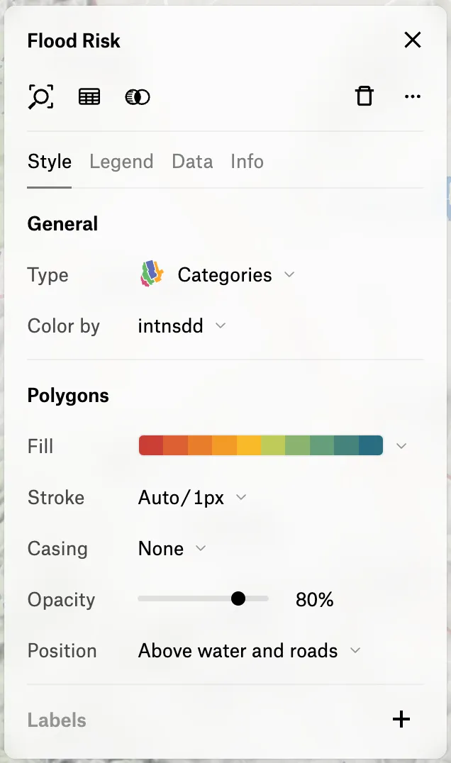
Symbolize Flood Risk
- Turn the visibility of the Flood Risk layer on and click in the layer list to open the style editor
- Set the visualization type to Categories and Color by the attribute <p-inline>intnsdd<p-inline> which contains the flood risk level. Next, choose the categorical palette seen below that ranges from deep oranges to green
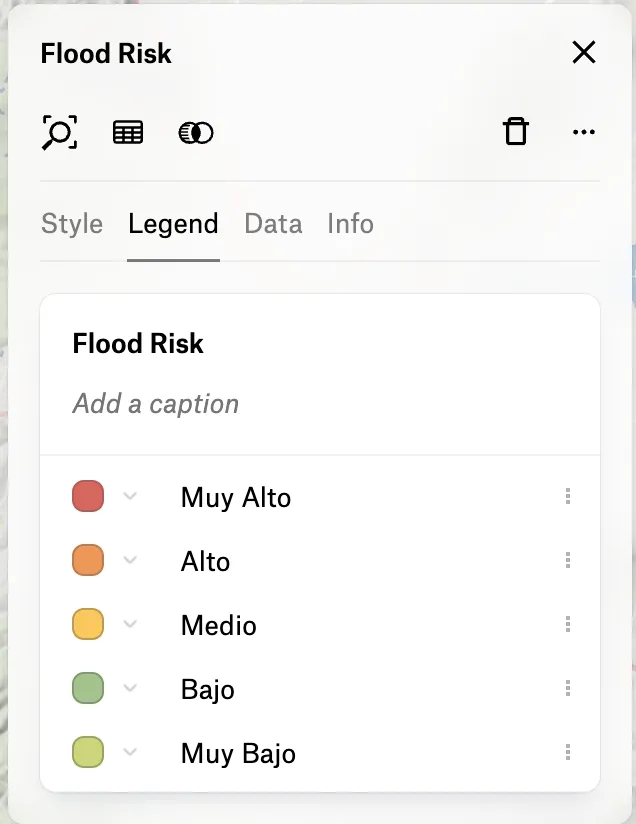
- Now we’ll reorder the the categories to go from Muy Alto to Muy Bajo and assign appropriate colors for each. From the style editor, switch to the Legend tab and rearrange the categories by dragging and dropping each into the proper order
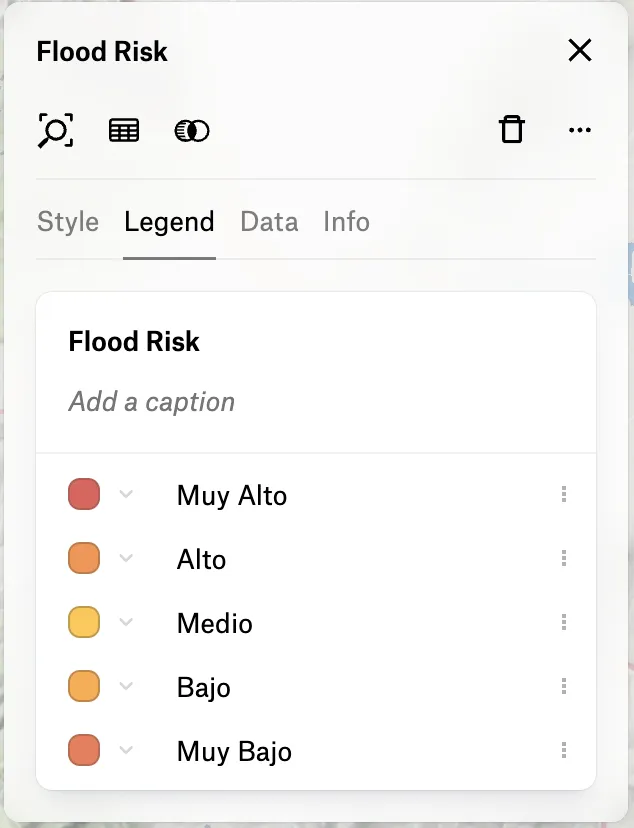
- Click on the color chip for each category to assign colors from the selected palette that range from dark orange (Muy Alto) to light green (Muy Bajo)
- Looking at our map, we can clearly see that the areas of the city that are inside of the historic lake boundary are in high flood risk areas!
.webp)
Symbolize Social Vulnerability
The colors we’ll apply to this layer are slightly different since we want to visually locate areas that have both high flood risk and high vulnerability. In these next steps, we will assign dark gray colors to the categories Muy Alto and Alto and turn the visibility of the remaining categories off. In doing so, we can overlay both Flood Risk and Social Vulnerability to locate the most vulnerable populations in the city.
- To get started, turn the visibility of Lago de Texoco off for a better view of these layers
- Using the same technique as above, symbolize the Social Vulnerability Index layer categorically using the <p-inline>intnsdd<p-inline> attribute and order the features in the legend from very high to very low
- From the Legend tab, click the color chip for Muy Alto and set the color to <p-inline>#333333<p-inline> and then for Alto to <p-inline>#777777<p-inline>
- From the Layer legend, turn the visibility off of the other categories since we only want to focus on the high vulnerability areas
- As a final step, open the style editor for the Flood Risk layer and set the opacity to ~25%
- Your map should now look something like this where darker red colors show areas that are both high flood risk and high vulnerability!
.webp)
Create Buffers
Now that we’ve visually located vulnerable population areas, we’ll add some pins to the map, convert them to data and run a buffer analysis to determine how many collection sites there are within a 2 mile radius of each point of interest.
- Using the Pin tool, place 3-4 pins around the city in the areas that are highly vulnerable
.webp)
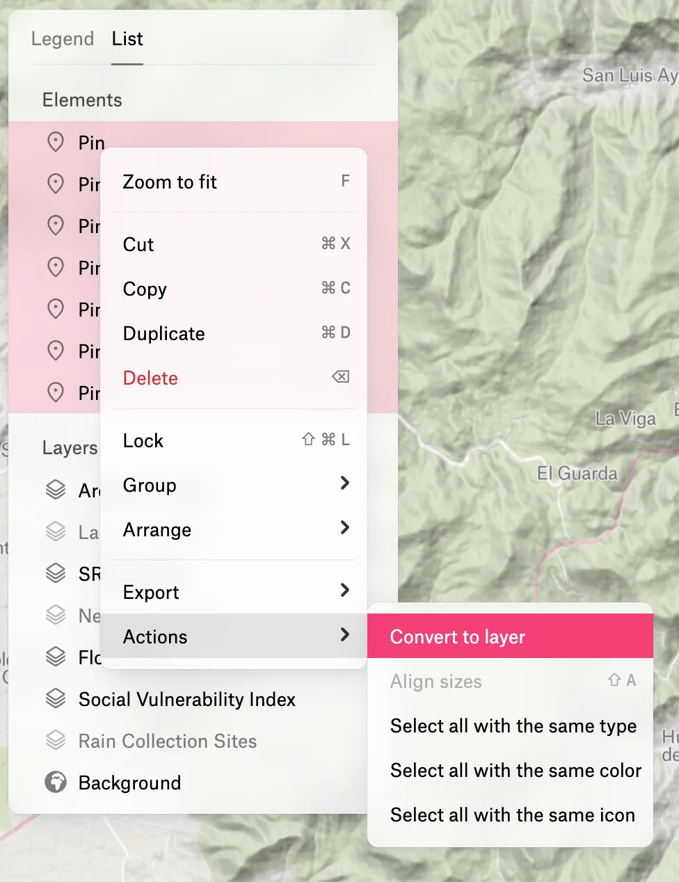
- Next, we’ll convert the Pin elements to a data layer by selecting them all from the List view of the Layer panel, right-clicking and under Actions choosing the option Convert to layer
- Once the layer is created, rename it to Points of Interest and use the Cmd+K option to search for the Buffer transformation method
- In the transformation settings, set the Distance to 2 mi and click Apply
.webp)
Clip the Rain Collection Sites Within Each Buffer Radius
To aid decision making and to better understand the location of existing rain water collection sites, we’ll Clip collection sites that are within each 2 mile radius from the previous step.
- Turn on the visibility of the Rain Collection Sites layer
- Use the Cmd+K menu to search for the transformation Clip
- Select Rainwater Collection Sites and 2 Mile Buffers as the inputs and click Apply
- Rename the resulting layer to Clipped Collection Sites
- We now have a dataset that contains only the collection sites that are within each 2 mile radius
.webp)
Count the Number of Rain Collection Sites
The final step in our analysis is to count the number of rain collection sites within 2 miles of our points of interest to label each with the resulting value.
- Use the Cmd+K menu to search for the transformation Count Points
- Use the 2 Mile Buffers and the Clipped Collection Sites from as the inputs
- Rename the output layer to Count of Collection Sites and turn the visibility of the input 2 Mile Buffers layer off
.webp)
- As a final step, we want to label each area with the number of rainwater collection sites present
- Click on the Count of Collection Sites layer to open the style editor
- Set the Fill color to white at about 50% opacity
- Click on the + sign in the Labels section to turn labels on and make sure the labeling attribute is set to the calculated value <p-inline>points_count<p-inline>
.webp)
Set up your classroom in Felt
Maps are an important way to explore the world around us, revealing spatial relationship that would not otherwise be obvious. Creating & analyzing maps are important skills for all people to learn. For these reasons, Felt is free for classroom use. Check out our guide to onboard your students in Felt.
Compare Felt using AI


.jpg)