37° 48' 15.7068'' N, 122° 16' 15.9996'' W
MODERN MAP MAKING HAS ARRIVED
37° 48' 15.7068'' N, 122° 16' 15.9996'' W
MODERN MAP MAKING HAS ARRIVED
37° 48' 15.7068'' N, 122° 16' 15.9996'' W
MODERN MAP MAKING HAS ARRIVED
37° 48' 15.7068'' N, 122° 16' 15.9996'' W
MODERN MAP MAKING HAS ARRIVED
37° 48' 15.7068'' N, 122° 16' 15.9996'' W
MODERN MAP MAKING HAS ARRIVED
37° 48' 15.7068'' N, 122° 16' 15.9996'' W
MODERN MAP MAKING HAS ARRIVED
37° 48' 15.7068'' N, 122° 16' 15.9996'' W
MODERN MAP MAKING HAS ARRIVED
37° 48' 15.7068'' N, 122° 16' 15.9996'' W
MODERN MAP MAKING HAS ARRIVED
37° 48' 15.7068'' N, 122° 16' 15.9996'' W
MODERN MAP MAKING HAS ARRIVED
37° 48' 15.7068'' N, 122° 16' 15.9996'' W
MODERN MAP MAKING HAS ARRIVED
Maps
Product
Introducing powerful new cartographic design tools, including heat maps
The most powerfully intuitive cartographic toolkit on the internet has arrived.

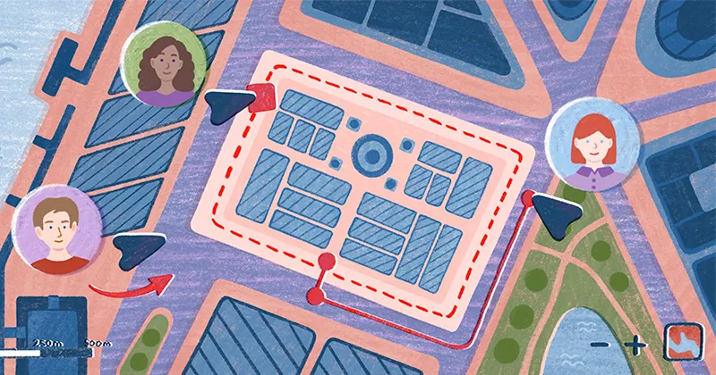
Cartographic effects can make maps tell clearer, more powerful stories – but achieving these effects can be challenging. There are tons of cascading decisions to make, it’s hard to see their impact prior to full implementation, and you often need to learn code to achieve these effects efficiently.

Everything we build is designed to be intuitive and to enable our users to achieve beautiful results quickly. Felt’s initial release provided styling options that were easy to implement but did not provide full cartographic power. Today, we’ve bridged that gap and are giving users full cartographic power without compromising ease of use. The result is the most intuitively powerful cartographic toolkit on the internet.

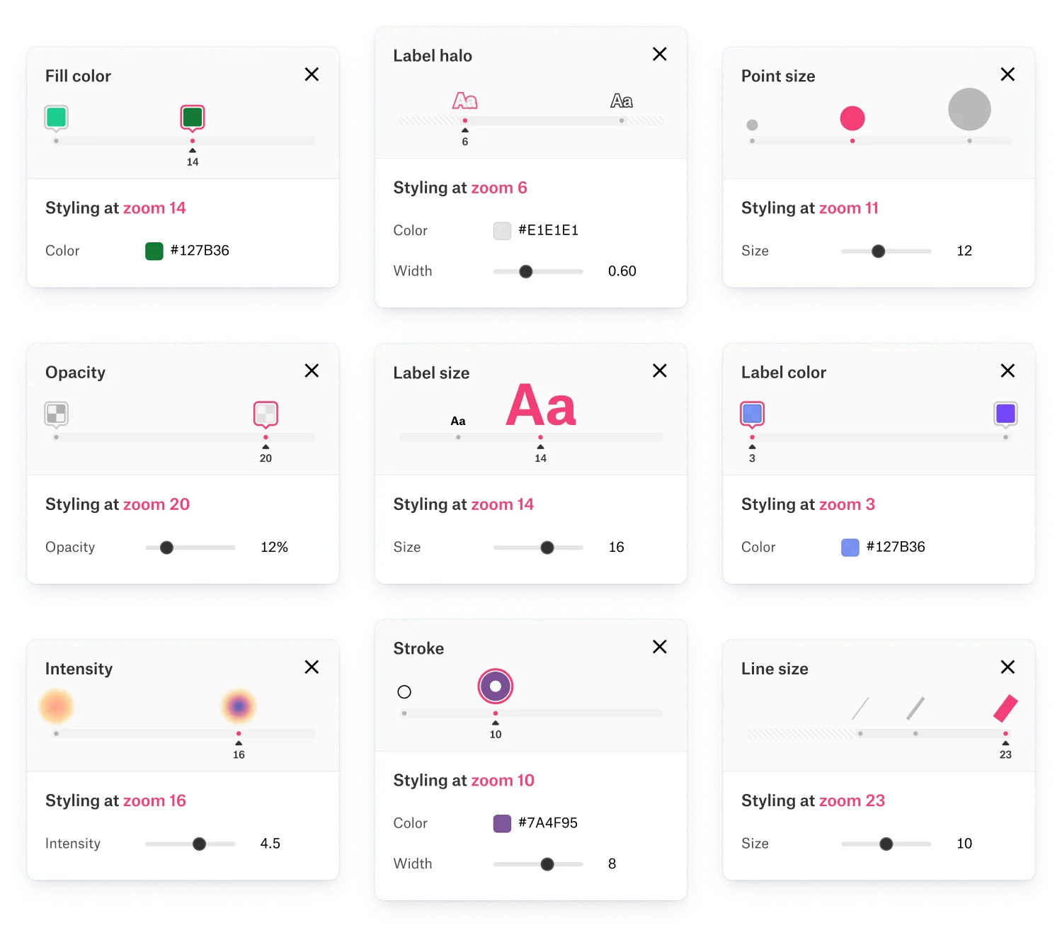
Felt’s cartographic tools now include:

  • Precision color selection with auto-syncing - choose any color for your data layers and Felt’s color algorithm will provide complimentary stroke and label color features to match your selection so you can move on quickly.
  • Custom label styling and placement - select your label size, color, halo, placement and style.
  • Zoom-based styling - the new interface allows for setting styling properties like size, color, opacity, stroke width, etc. to specific zoom levels so your data looks great no matter where you zoom.
  • Zoom-based layer visibility - you can now set your data layers or labels to appear at the min/max zoom level they are most relevant, and disappear when no longer needed in the visualization.
  • And much more…

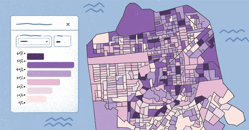
Plus, we’ve added a new visualization option for quick insights – heat maps!

Unlocking full cartographic power

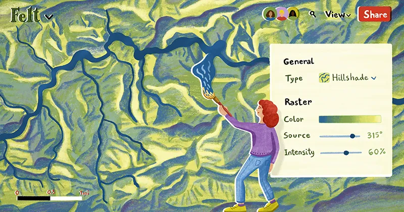
Our new cartographic toolkit allows for the adjustment, in full detail, of every single thing you see on your screen. Everything, down to your line casings and your label placement, is adjustable.

The new styling suite speeds up styling-related decision-making by offering cartographic defaults. For example, our new color picker lets you select the precise color you’re looking for but will auto-select a complimentary color for the label or casing, saving you valuable time and delivering an aesthetically pleasing visualization. It’s now possible to deliver a beautiful customized map without the cost of time wasted on cascading styling decisions.

Intuitive zoom-based styling

Zoom-based styling is one of the most powerful controls a cartographer has to make a visualization work at every level. As the context on a map shifts and changes, so should the labels, points and layers served to the viewer. But implementing zoom-based controls can be challenging — it’s often difficult to see your changes as you’re making them, leading to a trial an error process between multiple properties and layers within a visualization. Not anymore.

Control the appearance of your data at every zoom with our revolutionary zoom-based styling sliders, built for everyone to use. Watch the changes appear as you play with the slider, creating a tight-knit feedback loop that accelerates production.

A new kind of cartography

Felt’s new suite of styling tools makes it one of the most powerful cartographic tools on the internet. With our toolkit, we were able to style Overture Map Foundation's recent Places (POI) data release in less than two minutes. Watch how all these effects come together, unleashing your ability to turn raw data into a polished visualization easily.

Try it out now.

"Even though I work with maps every day, this type of zoom-based visualization has always been out of reach, limiting the stories we can tell on a single map. Since trying it in Felt – I'm obsessed." - Angie Rodriguez-Arriaga, Luhdorff & Scalmanini

Heat maps for quick insights

We have added a new visualization type alongside our legacy simple, categorical and size-by visualization options — heat maps! Heat maps communicate key data insights rapidly to the viewer, especially and can easily be paired with Felt’s existing data visualizations.

Felt offers an array of palettes to choose from that will help your team efficiently draw attention to trends when dealing with large volumes of data. Whether uploading data from our QGIS plug-in, or utilizing the Google Sheets integration, you can quickly turn point data into insights.

Embed and share with just a click

With Felt’s new cartographic toolkit, you can build professional looking web maps to share or embed anywhere on the internet. Embed your beautiful Felt map on your website, or even in a Notion doc. Viewers can play with the legend, and zoom in and out to see your data visualization story unfold right from the embedded map view.

Get started now.

"Our current heat map process is very manual — Felt's heat map visualization is a game-changer for us." Pan Chaudhury, Perry Health
Bio
LinkedIn
More articles

Cartography Tips for Designing Web Maps

Search, filter, select — data discovery done right

Getting the most out of Felt’s new Workspaces

Teaching Spatial Analysis with Felt

Powerful new admin tools and a streamlined billing experience

Three key UI upgrades in Felt 2.0