Assemble
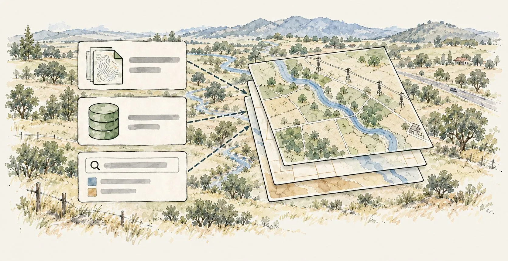
Every layer on one map. Files, live databases, Esri Feature Services. Ask the Data Finder for what’s missing: "transmission lines in Bexar County" arrives styled and sourced in seconds.
Screen candidates and score the shortlist, then put the live map in front of the people making the call. They open a link, not a PDF.
Who has the latest flood layer?
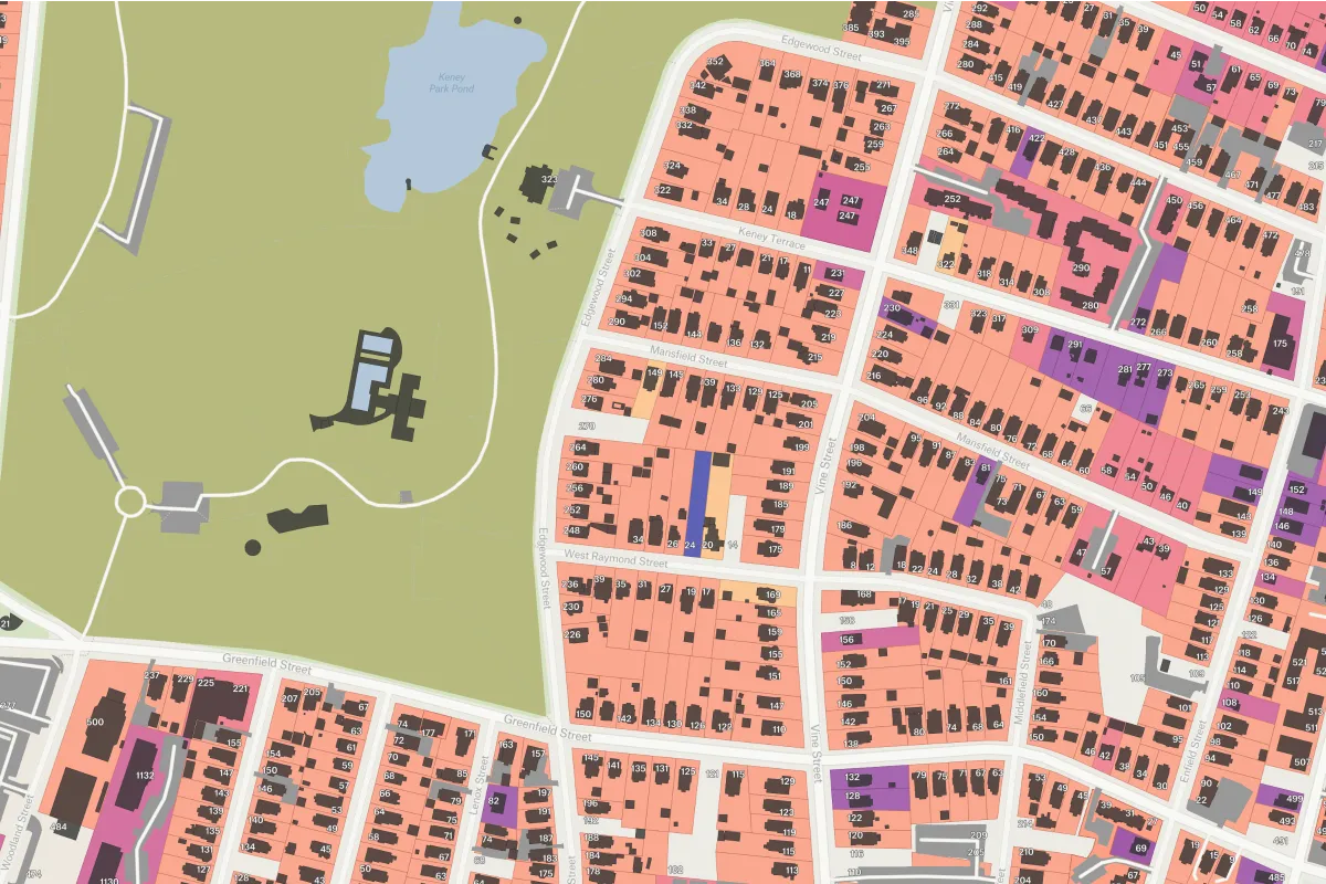
Every layer lives somewhere different: parcels with a vendor, demographics with the Census, flood zones with FEMA. Someone spends weeks collecting them before a single site gets screened.
Site analystIs this the current version?
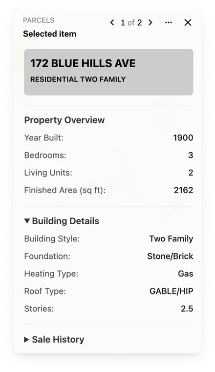
The people making the call don’t open GIS. They see the analysis as PDFs and slides, so every question means another export, and the map on screen is already out of date.
Committee chairThat’s not how we scored it.
Real estate scores on demographics, engineering on constraints, finance on cost, each in its own spreadsheet. The same site comes back with three different answers.
Engineering leadEvery layer on one map. Files, live databases, Esri Feature Services. Ask the Data Finder for what’s missing: "transmission lines in Bexar County" arrives styled and sourced in seconds.
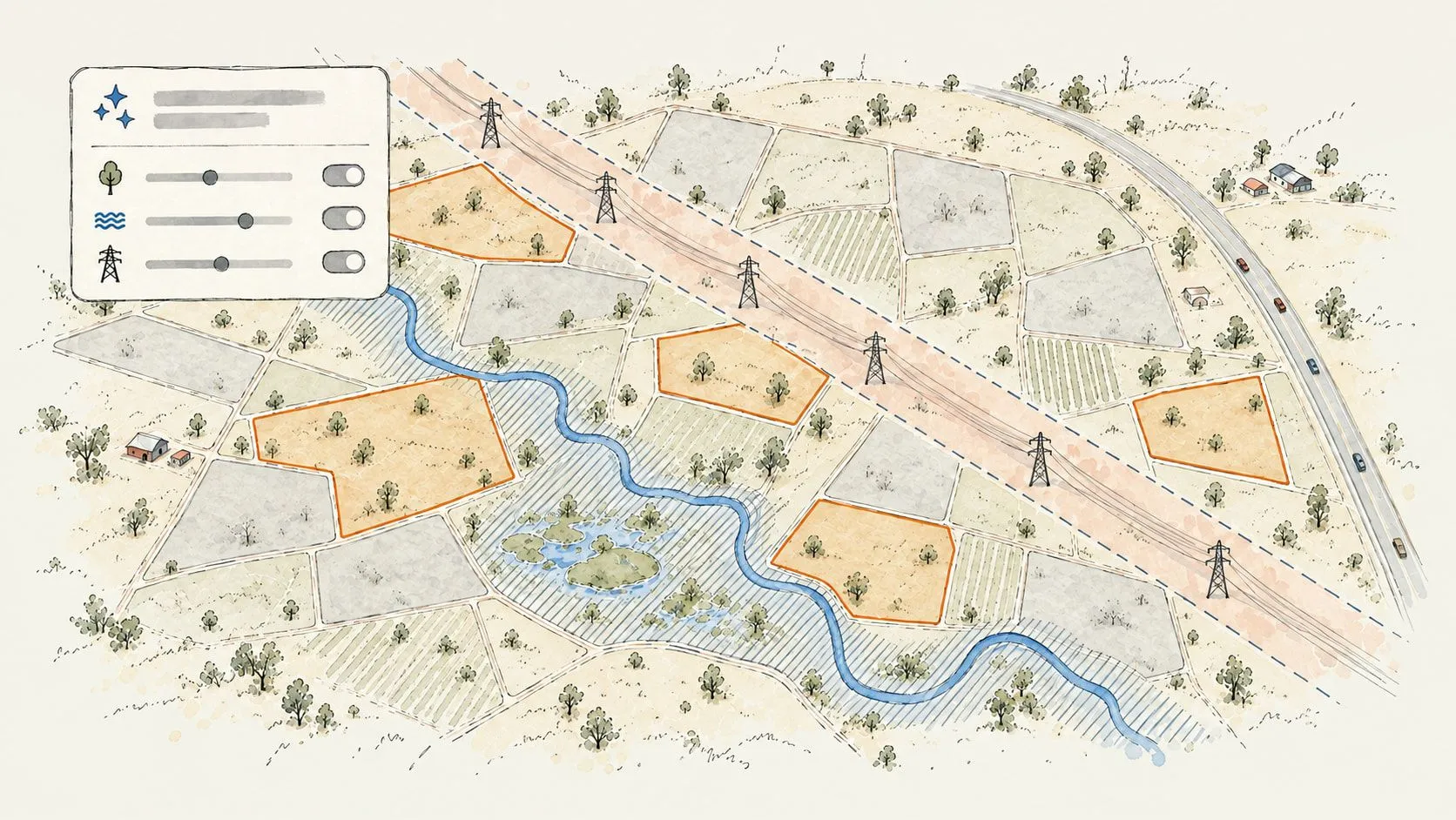
Fatal flaws first. Buffer transmission corridors, exclude wetlands and floodplains, filter by acreage and ownership. Felt AI runs it from plain English, so screening doesn’t wait on GIS bandwidth.
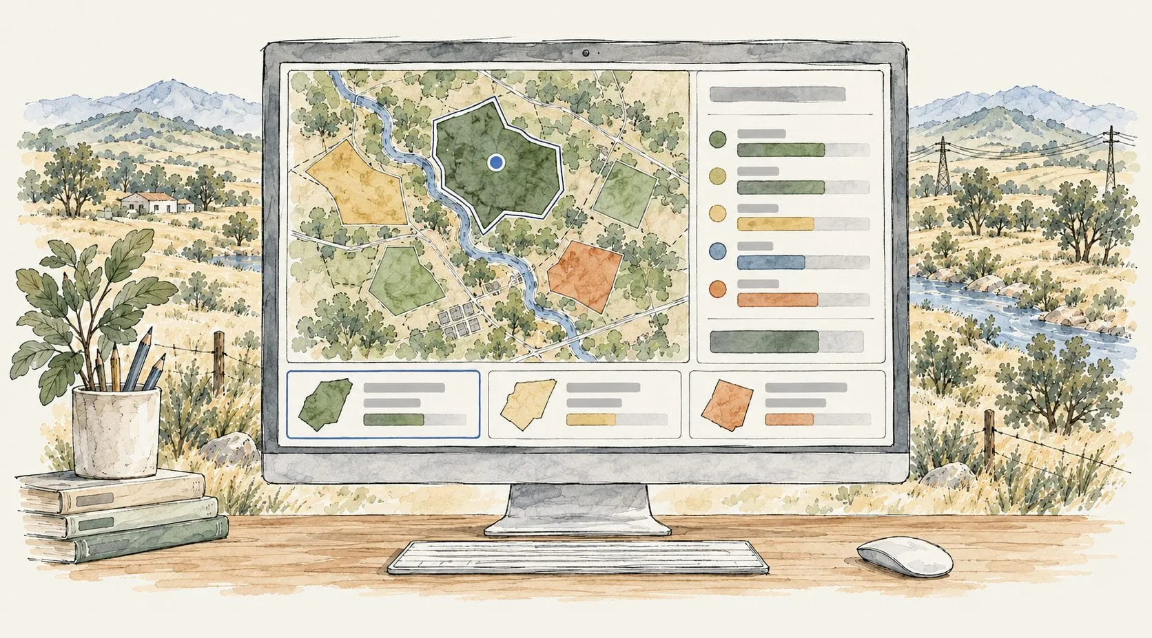
Join your internal data to the survivors and rank them on weighted criteria. Style the scores so the shortlist reads at a glance. Compare finalists side by side.
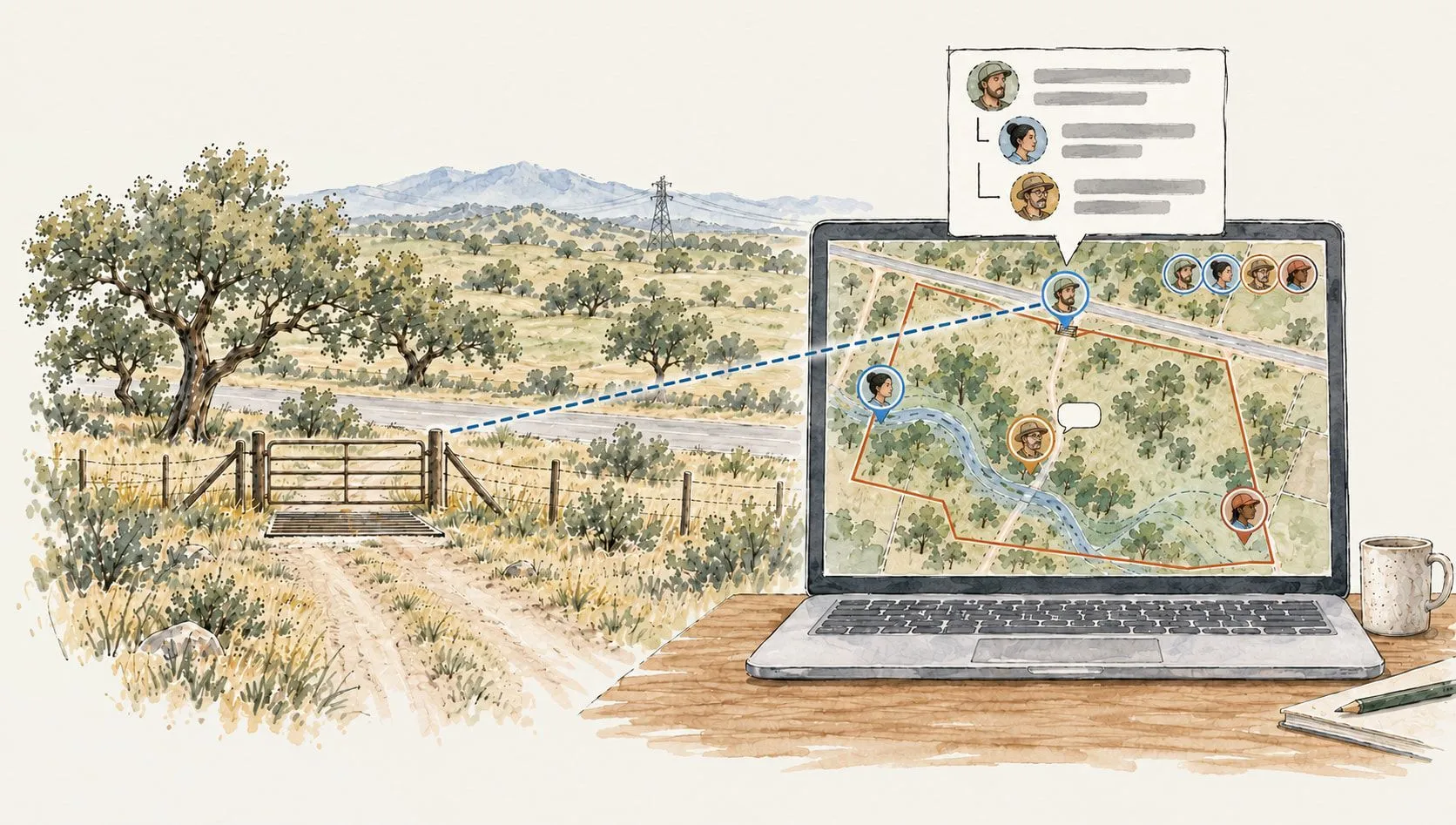
Share the map with a link. No license, no install, no training. "What about access from the north?" gets asked as a comment pinned to the parcel. The committee meets inside the map.
Felt brings demographics, foot traffic, competitors and your own store performance onto one map, so you can draw drive-time trade areas around every candidate and compare the finalists side by side.
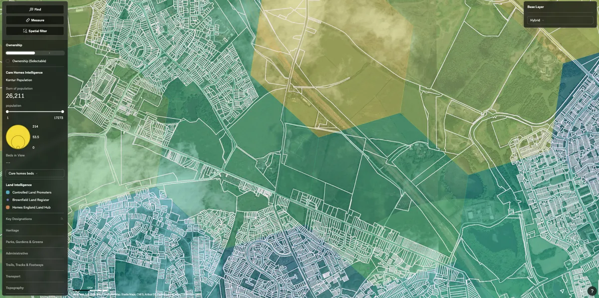

Felt AI made it easy to build the custom features that accelerate my site selection workflows.
 Demographics and income
 Foot traffic and mobility
 Drive-time trade areas
 Competitors and co-tenants
 Existing store performance
 Available properties
Felt puts parcels, transmission, terrain and environmental constraints on one map, and Felt AI screens them in plain English: buffer the lines, rule out wetlands and floodplains, and work out the buildable acres on each parcel. Land agents run that themselves instead of waiting on the GIS team.
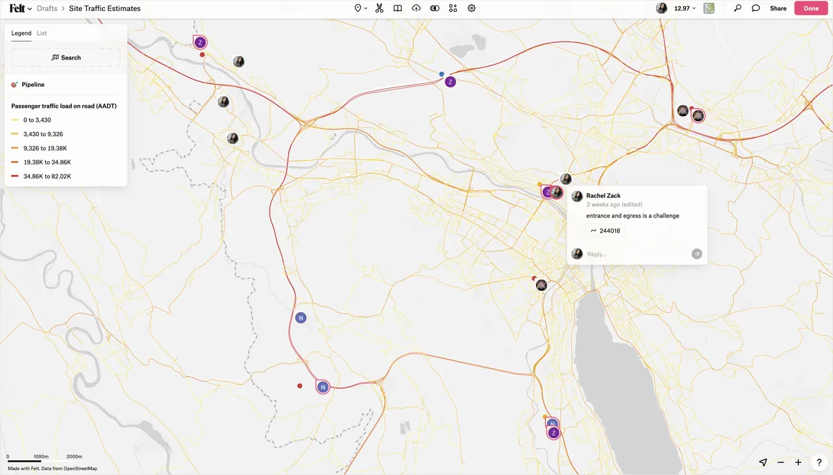

With Felt and Databricks, our site acquisition team was able to self-serve insights for the first time.
 Parcels and ownership
 Transmission and substations
 Slope and aspect
 Wetlands, flood zones and protected lands
 Interconnection queues
 Land contacts and outreach status
Data center sites start with power. Felt layers substation capacity and interconnection queues with fiber, water, zoning and environmental risk, so you screen on power first and weigh the rest on the same map.

The up front investment to build a custom solution that met our performance standards would have been massive.
 Substations and transmission capacityInterconnection queue positions
 Fiber routes and carrier hotels
 Parcels and zoning
 Water availability and rightsFlood, seismic, environmental constraints
 Competing announced projects
Every siting team asks the same question next: how does our data get in?
Upload Anything. Shapefiles, GeoJSON, KML, geodatabases, GeoTIFF, DWG/DXF, spreadsheets, and most anything else GDAL reads.
Add by URL. Paste a link to a Google Sheet, an Airtable view, a hosted file, or an ArcGIS service, and turn on Live to keep it refreshing.
Global Library. Census demographics, boundaries, flood and drought risk, roads, and power plants: curated public data, sourced and dated, on every plan.
Internet Data Finder. Locates public datasets by plain-English request and adds them styled and sourced.
Live connections. Postgres, Snowflake, BigQuery, Databricks, SQL Server, and Esri Feature Services keep internal data current on the map.
Felt AI. Runs spatial analysis conversationally: buffers, filters, joins, summaries.
API + Felt MCP server. For teams wiring siting into automated or agent-driven workflows.
Free to start. Your committee never needs a license.