Exploring 10 different types of maps and how to use them effectively
Maps do more than show cities or the shape of the land. Every type of world map tells a different story. They can illustrate voting in a particular region, how weather moves, or where resources are located. Choosing the right map projection helps reduce distortion and match your message to the data.
Read on to learn about 10 different types of maps, what each one highlights, and how Felt makes creating and sharing easier.
What are the main types of maps?
Maps organize and represent spatial information in different ways. A single location can look completely different depending on the type used. Imagine a coastal city like San Francisco. A topographic map might show coastlines and mountain ranges, while a political map might highlight voting districts and housing trends. Each changes how Earth’s surface is displayed and has its own particular style, helping viewers understand where things are and how they change or relate to one another.
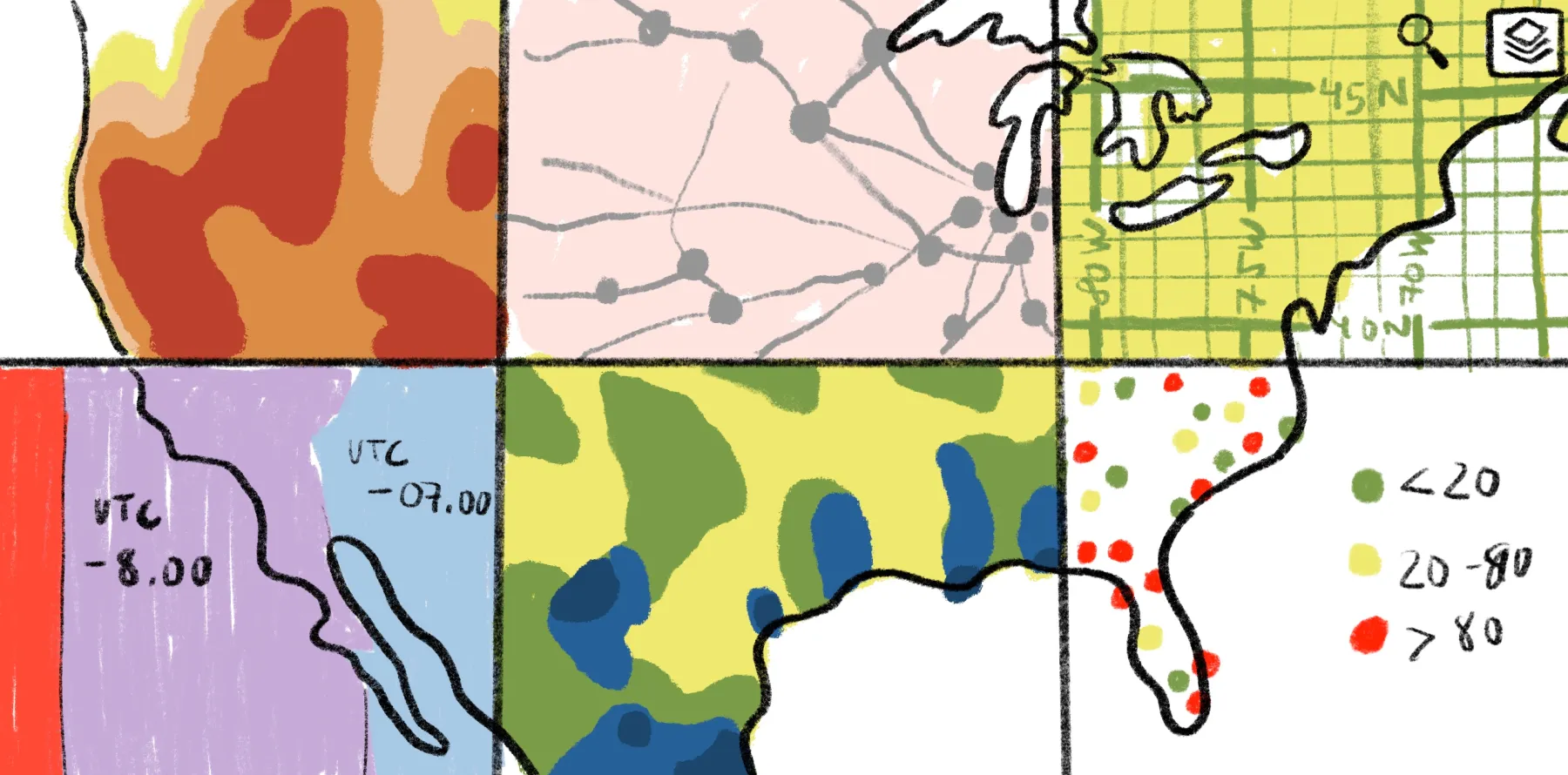
Below, we’ll take a closer look at the following 10 different types of maps:
- Political maps: Show how governance and political identity connect to place.
- Physical maps: Highlight landforms like mountain ranges, rivers, and coastlines, helping us understand the natural shape of the world.
- Topographic maps: Illustrate Earth's geographic features with contour lines and shades that represent varying elevations.
- Thematic maps: Visualize a specific dataset, including median income, crop types, and real estate development, to reveal patterns across space.
- Climate maps: Demonstrate long-term weather and environmental patterns.
- Economic or resource maps: Detail where goods and services are produced, like timber, oil fields, and manufacturing hubs.
- Population maps: Chart how people disperse across space, supporting demographic analysis, urban planning, and public services development.
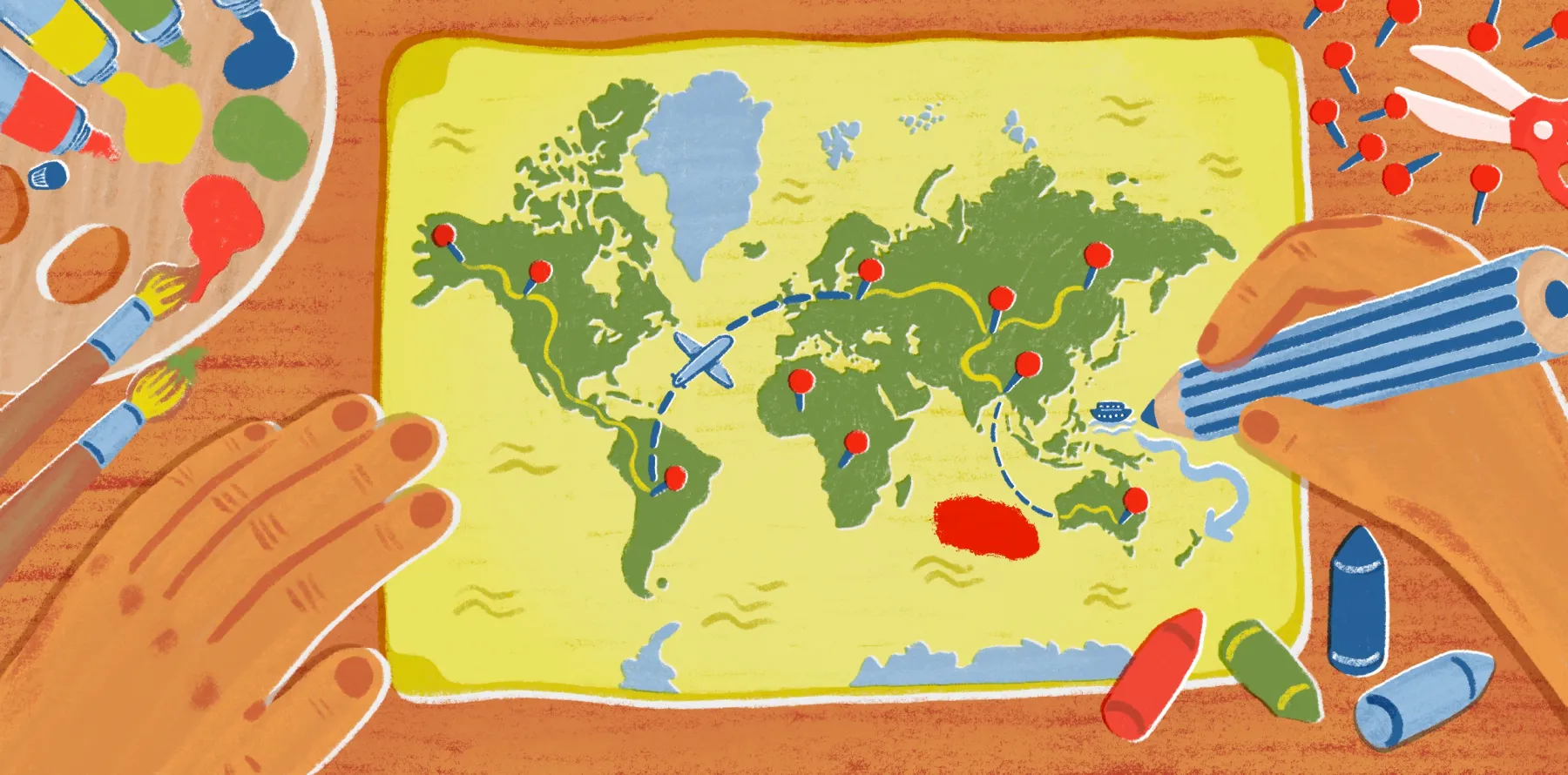
- Road or navigation maps: Show roads, transit routes, and distances to help with travel logistics, whether navigating a city or coordinating fleet operations.
- Weather maps: Visualize real-time and forecasted weather conditions for quick interpretations of temperature, rainfall, and wind patterns.
- Historical maps: Reveal how space changes over time, like shifting borders, land usage, and deforestation.
The 10 map types and when to use each
The following types of maps help determine what your viewers notice first — whether you want to clarify geographic borders, surface elevation changes, or how trends shift across space. Understanding what each represents helps you choose the right format for your message.
1. Political maps
People use boundaries to mark territory, organize governments, and decide who makes decisions where. A political map identifies areas like countries, states, and cities. It helps explain jurisdiction and governance.
Take a detailed visual of a county’s school district. A planning committee uses this type of political map to understand what neighborhoods fall under specific school districts. This is helpful for enrollment projections or proposing new zone policies.
2. Physical maps
Before you can build boundaries or policies, you have to understand the land. Physical maps — or reference maps — focus on natural landforms like mountains, valleys, and coastlines. You use these when you want to understand the shape and texture of the Earth’s surface. For example, state planners might use a reference map to highlight national parks.
3. Topographic maps
Topographic maps display land shape, elevation, and terrain across a specific latitude and longitude. Cartographers use contour lines and gradient shading to represent features like ridges and valleys.
For example, geologists use topographic maps to conduct field investigations. They help identify ridgelines and drainage basins for surveys in a landslide area. Slopes can help them predict where terrain might shift during heavy rainfall.
4. Thematic maps
Cartographers use thematic maps to visualize a single dataset across space. These show patterns like income, crop types, and health issues, revealing trends and relationships that aren’t obvious from raw numbers alone.
For example, a public health team might track cases of heat stroke across the city. When layered with green spaces and tree coverage, the map reveals a pattern where fewer trees have high instances of heat stroke.
5. Climate maps
Climate maps help visualize how weather behaves across geographic regions over extended periods. They show patterns that influence how people farm, build, and conserve land. They’re especially useful when comparing conditions between locations or planning for seasonal changes. For example, a farming community might review a climate map to understand how rainfall varies across nearby fields. This helps determine which areas are better suited for planting and when to expect dry spells or heavy moisture.
6. Economic or resource maps
Resource maps show where goods and services originate. They highlight industries like fisheries along a coastline, mining in the mountains, and business hubs in a city center. Resource maps help countries and municipalities understand why certain regions develop and how geography shapes local and national economies.
When used strategically, planners can visualize production across certain areas. For example, a development committee might review a resource map of agricultural zones to plan better transportation routes that support the local economy.
7. Population maps
Population maps show how people live across a region. They highlight areas with accelerating growth or limited access to essential services. Planners rely on these to make decisions about infrastructure and community support. For example, a city planning team will turn to a population map to decide where new transportation routes will have the highest impact for commuters.
8. Road or navigation maps
Navigation maps show how people move, identifying highways, streets, and transit routes. They help you understand how to get from point A to point B, making them ideal for logistics and travel planning. Imagine a delivery business that uses navigation maps for multi-stop route planning to avoid traffic and save fuel.
9. Weather maps
We’ve all seen a weather map on the morning news. These show current and forecasted conditions, including temperature, storm systems, and precipitation. They’re great for quick analysis to prepare for changing weather. A city might use them to monitor an impending storm and issue alerts to protect drivers and residents.
10. Historical maps
Historical maps reveal how a place changes over time — such as shifting country borders, redirected rivers, and trade routes that grow and disappear. They provide a broad view of a landscape and why it looks the way it does today. A researcher might study historical maps of a coastal district. Comparing them with modern maps reveals how port development reshaped the shoreline.
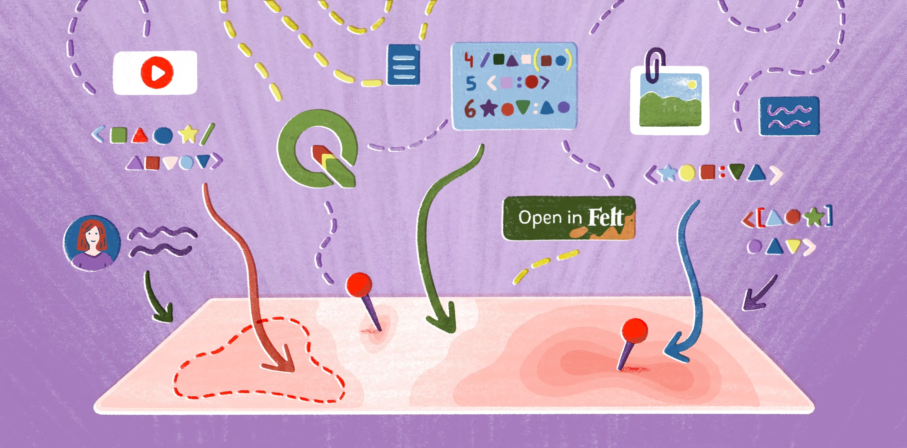
Building and sharing maps collaboratively
Modern mapping software like Felt turns static visuals into interactive workspaces. Here are a few ways they can support better mapping and teamwork:
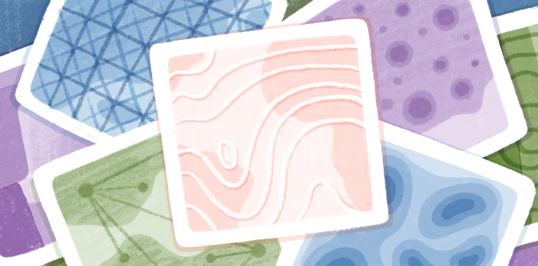
- Layer different maps into a single workspace to compare patterns and context.
- Change map names, build new ones, and share them all instantly via links and embeds without experience in geographic information systems.
- Use AI-native features to spot trends quickly and support better decision-making.
Collaboration enables teams of educators, investigators, and city planners to learn faster and make decisions with everyone on the same map. To see how shared maps support better outcomes, check out these examples from the Felt community.
Create and share powerful maps with Felt
Maps provide us with a deeper understanding of places, the relationships between those places, and the decisions we make for them. When teams can explore together, the conversation is quick and clear.
With Felt, you can build interactive maps, combine multiple data layers, and collaborate with your team in real time all in one place. Start your next project with Felt and see how shared, interactive maps change the way you work.
Compare Felt using AI


.jpg)