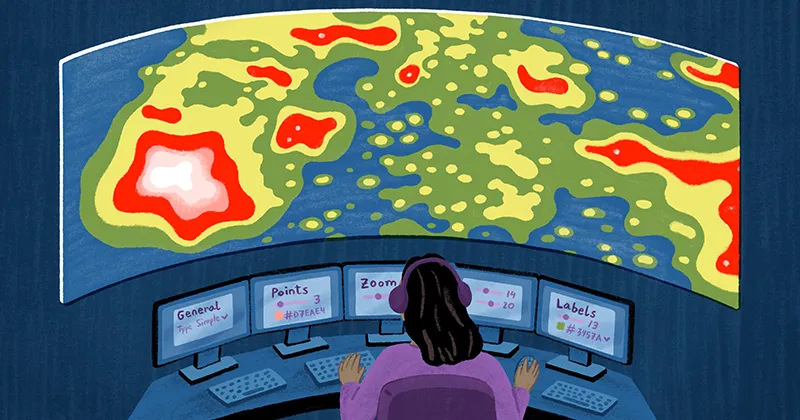
At Felt, we're on a mission to create a better way to work with maps. By integrating established cartographic best practices as default settings, we're further simplifying the map-making process so you and your team can focus on telling compelling stories and delivering meaningful insights more quickly and efficiently.
Keep reading to learn more about how we are simplifying the cartographic process with our default style settings!
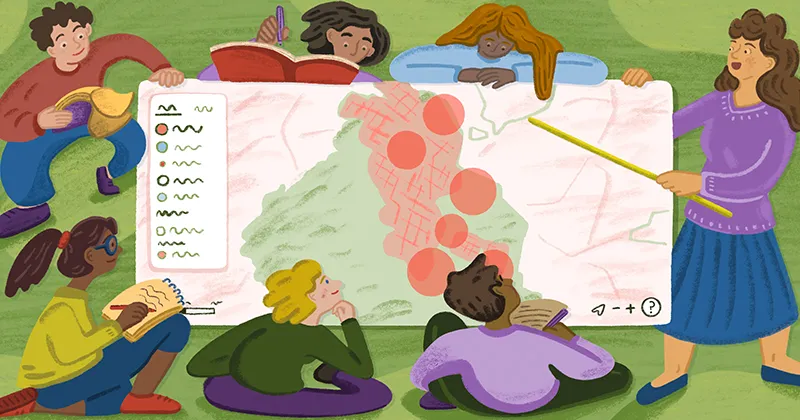
Cartography is more than representing geographic features on a map; it's about crafting visually engaging and informative experiences that are easy to understand by map readers to help them quickly identify spatial patterns and relationships. To achieve this goal, cartographers use a variety of design techniques to enhance map readability and aesthetic appeal.
Some of these techniques include:
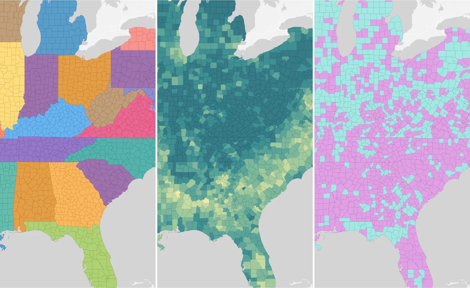
- the careful selection of stroke colors to match fill colors, to create maps that maintain visual continuity and provide clear boundaries between different regions or geographic features
- ensuring map labels are legible, associated with their corresponding features and have proper placement which are essential for conveying geographic information clearly
Making maps that are visually appealing and informative shouldn't require specialized cartographic expertise or a deep understanding of design principles. With Felt, you can be confident that your maps are optimized for aesthetics and legibility by default.
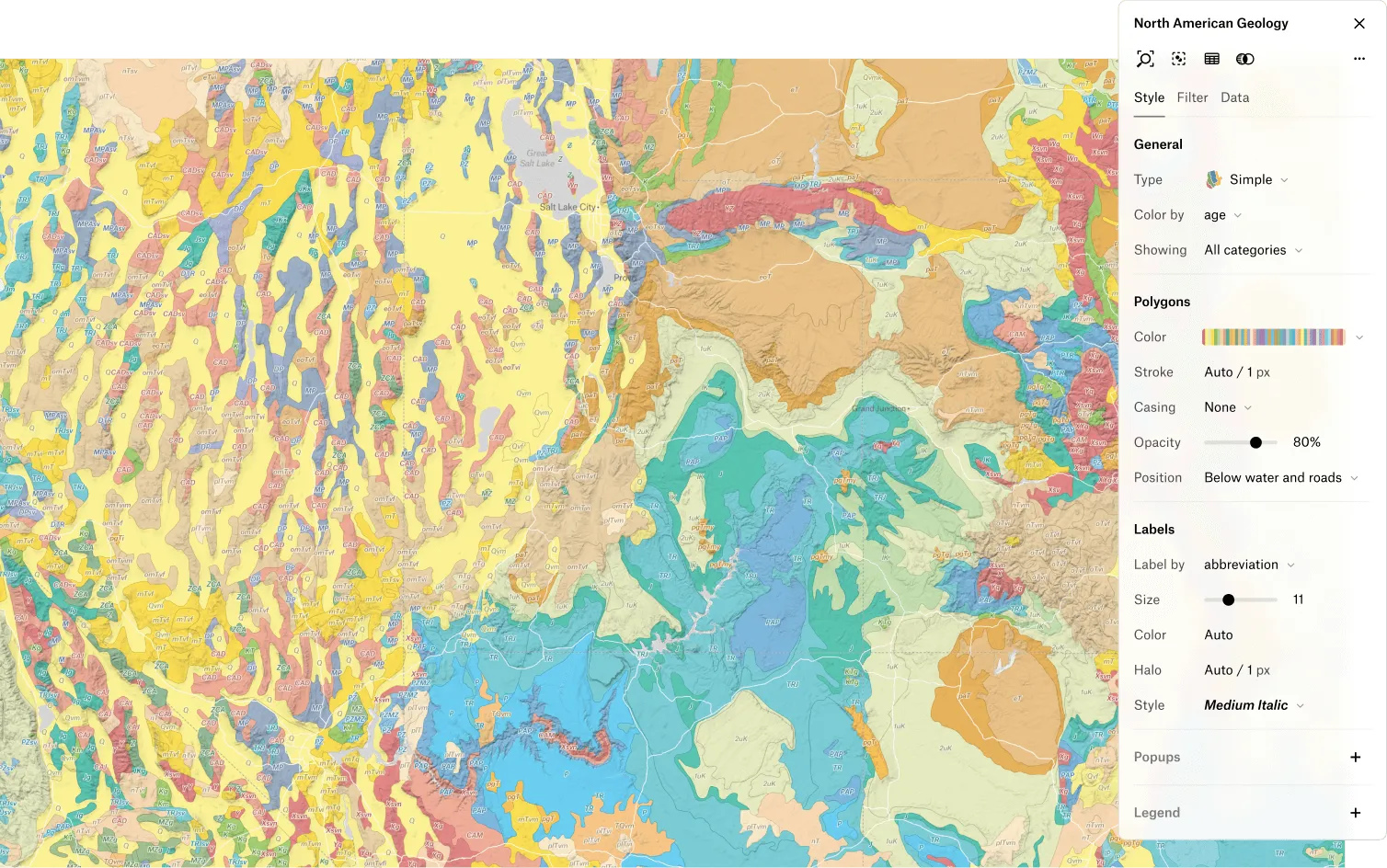
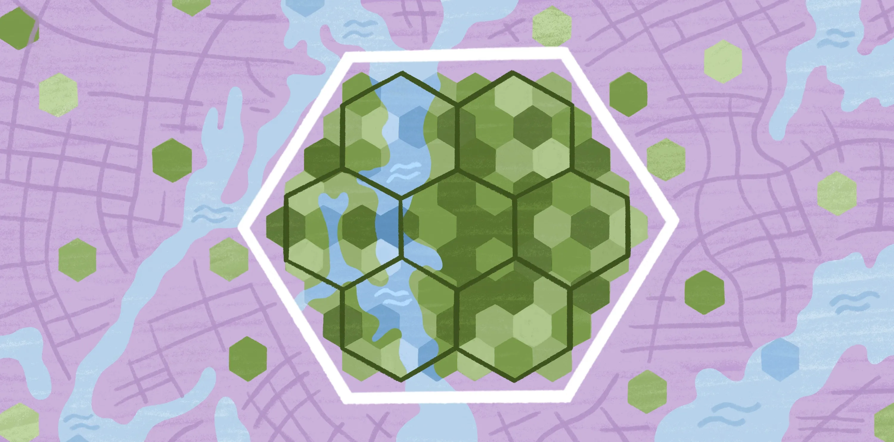
Set stroke colors to complement fill colors for visual balance
In Felt, stroke colors are automatically selected for map features based on a given fill color. To achieve this, we look at two aspects of the original color: its vibrancy (how intense the color is) and its brightness (how light or dark it is). By comparing these to predefined thresholds, we then determine how much to adjust them, ensuring that the new color remains distinct from the original. With this logic, even if a map has a combination of light and dark fill colors, the outlines are always visually balanced between them.
Using similar colors for outlines and fills helps maintain visual continuity within a map making the it appear more organized and aesthetically pleasing to the viewer. This technique also helps distinguish between adjacent areas, making it easier for map readers to interpret the information presented.
Set label and halo colors for legibility across backgrounds
In Felt, by default, we provide legible labels across different backgrounds that are associated with the geographic feature they represent. This streamlines the map-making process by eliminating the need for users to manually adjust label and halo colors while moving across different backgrounds and styles.
If on a light background (like our default or light basemap)
- Label color is generated using the same stroke method described above
- Halo color is light to promote legibility against the background
If on a dark background (like our satellite or dark basemap)
- Label color is light to promote legibility against the background
- Halo color is generated using the same stroke method described above
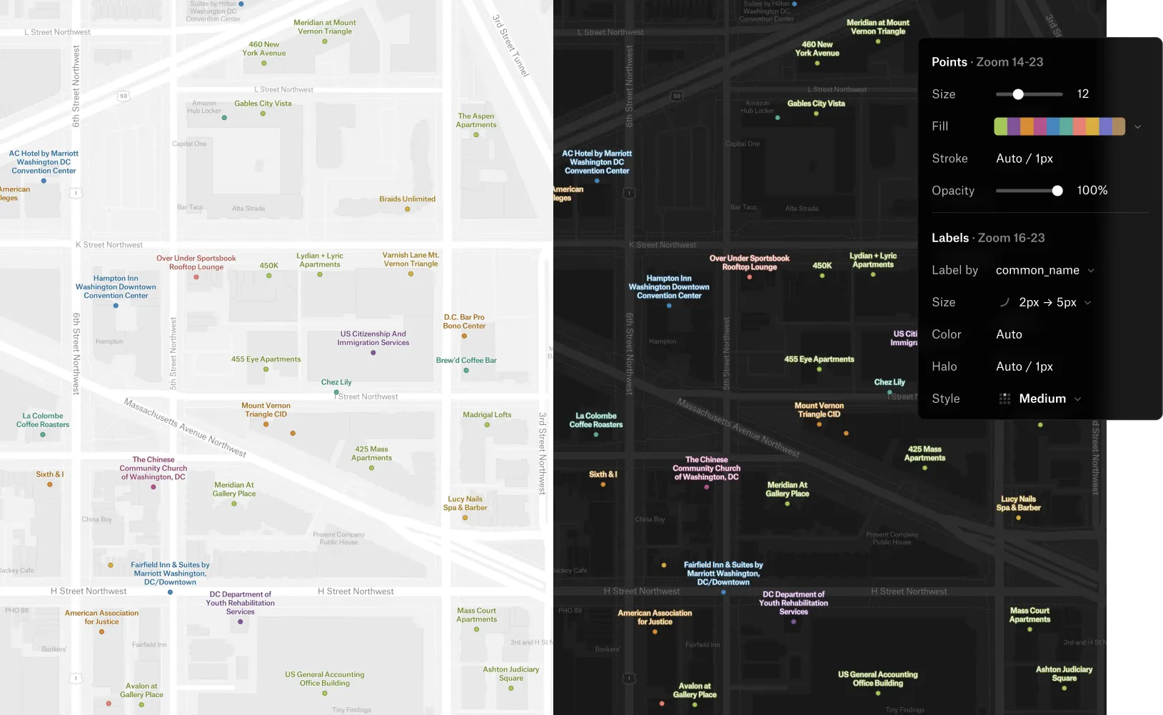
In the case where there is a custom label color chosen, a new halo color is automatically generated from the input color providing a complementary halo color that ensures readability regardless of the lightness or darkness of the background.
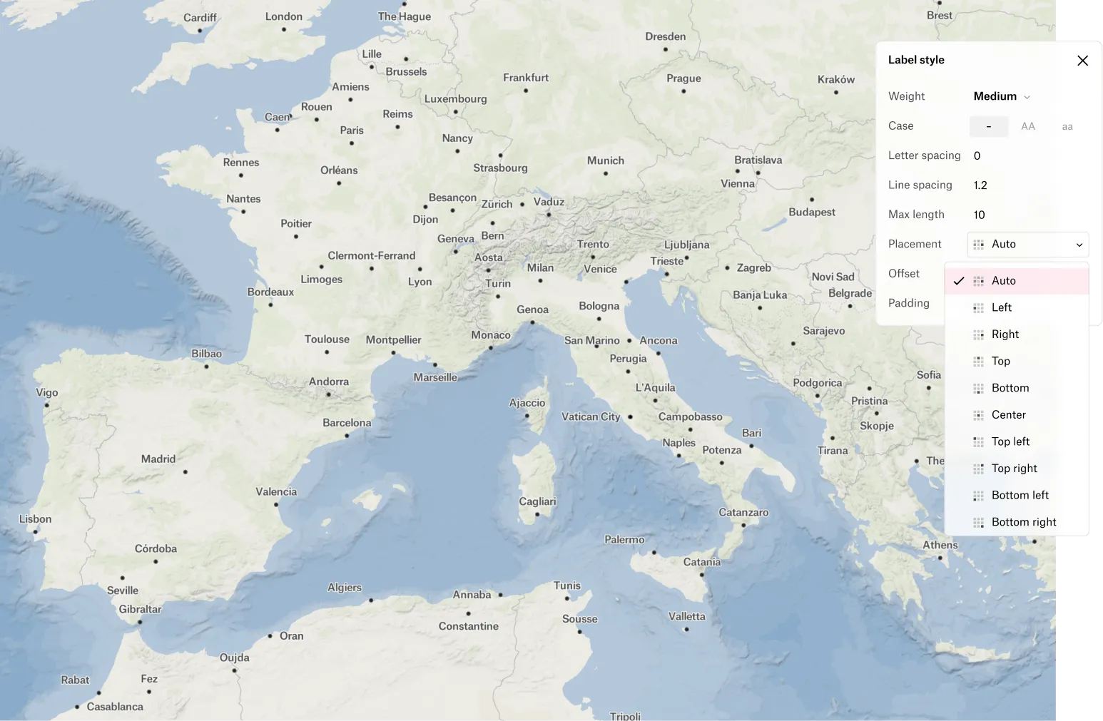
Set multiple positions for better label placement
To ensure effective label placement, Felt provides well thought out default placement options for lines and polygons and for points, we default to an option that finds the best position.
For point labels specifically, a common cartographic method is to try multiple label positions around a point until the label finds a position that fits in relation to the other labels around it. This helps place more labels while reducing clutter which in turn, makes for a more aesthetically pleasing map.
Ready to dive in?
These are just a few examples of how Felt is committed to simplifying the complexities of cartography, allowing you to focus on what matters most: telling compelling stories and delivering meaningful insights through your maps. Join us in revolutionizing the map-making process for everyone. Set up your subscription today.
Compare Felt using AI