Look at these 5 geo-mapping tools to visualize your geographic data
Customer addresses, delivery routes, field observations — they all exist somewhere in the real world. Geo-mapping organizes spatial data on a map to capture this geographic context. It reveals patterns that empower deeper understanding and better decision-making. Rather than scanning spreadsheets for clues, teams visualize data to see how relationships unfold across neighborhoods, regions, and networks.
In this guide, we’ll break down the geo-mapping definition and how it transforms data into interactive maps. We’ll look at how geo-mapping software aids teams across industries and how Felt makes it easier to build maps that reveal powerful spatial insights.
What is geo-mapping?
Geo-mapping, sometimes called geospatial mapping, turns location-based data into maps. It visualizes geographic information so teams can analyze patterns in a spatial context rather than scanning rows of numbers in a spreadsheet. Geographic information system (GIS) software organizes this information into spatial layers and helps users understand how locations relate to one another.
The process starts when users collect location data linked to an address or coordinates. Modern GIS software like Felt geocodes the data, converting addresses into geographic coordinates. From there, teams organize the information into layers, adjust how it appears on the map, and analyze the results.
For instance, a city planning team might track addresses of traffic accidents. The GIS software plots street addresses or intersections on a geospatial map. Heat maps, pin maps, or cluster maps can reveal patterns, such as intersections with unusually high accident rates. Adding extra layers to the base map, like the time an accident occurs, can help planners understand when accidents happen, allowing them to adjust traffic signals or even redesign road layouts.
How do you create a geo-map? Top 5 geo-mapping software to try
Whether mapping fleet systems or tracking your customers’ demographic data, teams rely on GIS software to turn location data into interactive maps. These 5 mapping software tools turn your location-based data into layered visualizations, support geospatial analysis, and generate shareable insights.
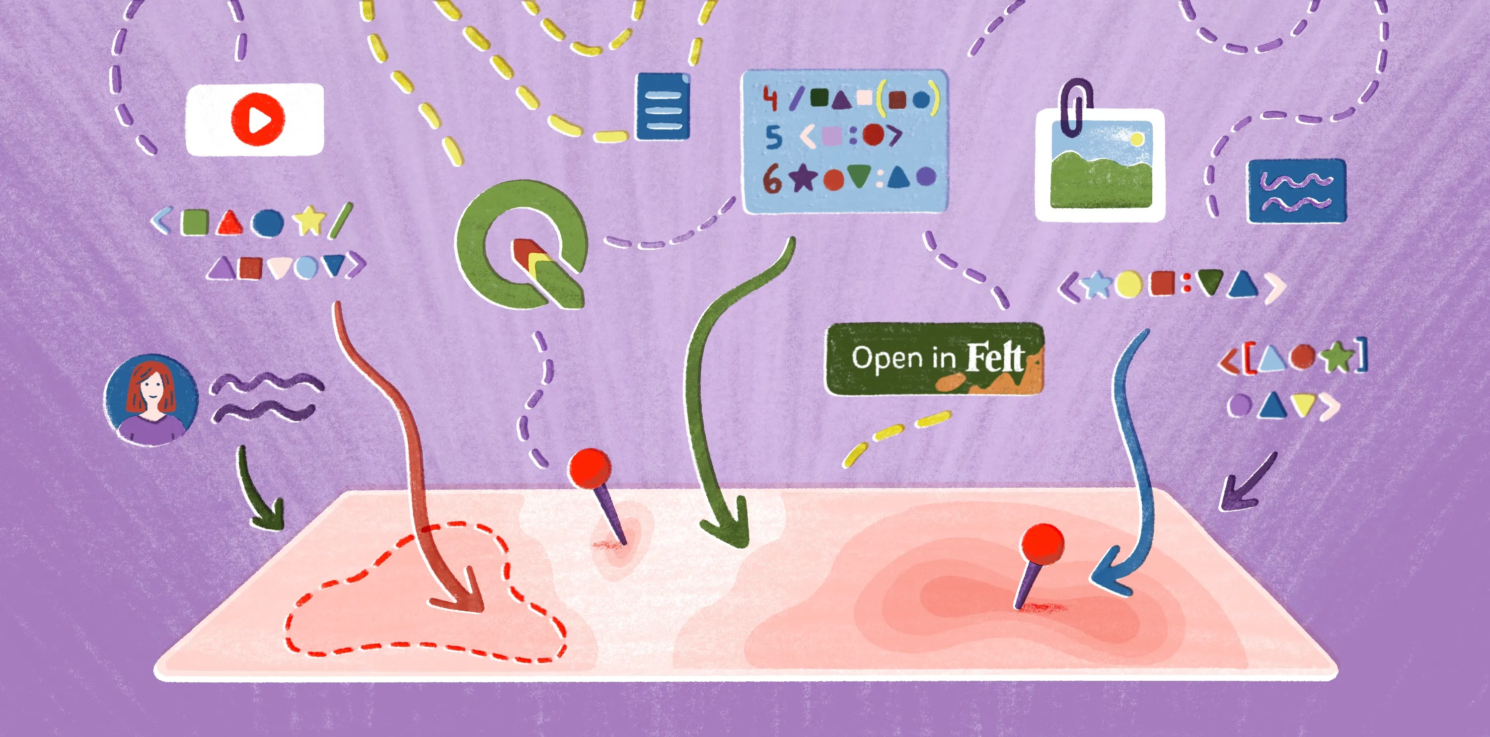
1. Felt
Felt is the first comprehensive cloud-native GIS platform for interactive maps, data, and boundary analysis. Felt makes it easy for experts and novices to explore spatial information and share results without complex setups. Some standout features include:
- Browser-based mapping and analysis, designed for real-time collaboration
- Automatic geocoding and styling, with functionality across a wide set of data formats
- Easy-to-use dashboards and tools to create time sliders, charts, and other interactive visualizations
- Advanced data visualization formats, including heat maps and pin maps, with filters to provide extra context
- Built-in formulas to calculate areas, measure distances, and create buffering points for accurate map projections
Felt has several subscription options, including two pricing plans:
Professional
- 7-day free trial
- Designed for individuals and teams building and sharing cloud-native GIS workflows
- Includes interactive maps, collaboration, AI-powered features, and browser-based GIS workflows
Enterprise
- Custom pricing
- Built for organizations that require enterprise security, governance, live cloud data connections, developer tooling, and dedicated support
Contact the Felt sales team for “Enterprise” pricing.
2. Google My Maps
Google My Maps is a free, web-based tool that allows users to build custom maps using Google’s base maps and simple layer tools. It lets users perform simple tasks like pinning locations and styling layers. It works well for:
- Mapping event locations for a community calendar
- Mapping travel itineraries or trip stops
- Showing store locations on a basic map
- Visualizing survey responses tied to specific addresses
For a basic visual reference, Google My Maps can do the job. But once analysis gets more complex, teams usually move to platforms like Felt to automate heavy datasets, customize visualizations, and empower better collaboration.
3. ArcGIS Pro and Online
Developed by ESRI, ArcGIS is a geospatial platform with a desktop application (ArcGIS Pro) and cloud-based platform (ArcGIS Online). ArcGIS offers ready-to-use maps with the Living Atlas of the World, which includes a wide range of imagery and base map options. However, ArcGIS Pro requires extensive knowledge and training to navigate. GIS teams turn to the software for:
- Extensive data import and integration options
- Spatial analysis tools, dashboards, and reporting features to build and analyze 2D and 3D map visualizations
- Large ecosystem of tools across web and desktop applications
Pricing information isn’t readily available. You must consult a sales associate in your region to inquire about subscription pricing for the Online and Pro versions.
4. QGIS
QGIS is a free, open-source GIS application used to design detailed maps. It offers strong customization through plugins and supports many data formats. However, it has a steep learning curve and lacks formal support. QGIS offers experienced GIS professionals the following:
- Powerful customization features to help personalize dashboards with custom legends and tables
- Strong user community that provides documentation and actively participates in forums
5. Mapbox APIs
This developer-focused, web-based GIS platform is known for its high-performance mapping capabilities. Mapbox’s library of developer APIs lets teams build customized maps for web and mobile applications. Some of its key features include:
- Robust styling options, including customizing colors, layers, and fonts to reflect your brand
- Plenty of tools to scale across web and mobile platforms
Mapbox is a pay-as-you-go service with a free tier for initial usage. It can become costly if your usage increases sharply compared to Mapbox alternatives with fixed prices.
Geo maps: 5 Examples across industries
Where something happens often matters as much as what happens. Teams use geo-mapping when decisions hinge on territory, coverage, or proximity.
Here are five ways strong map visualizations help teams spot patterns and act on them. We’ll illustrate different use cases with maps built on Felt.
Agriculture
On a farm, conditions rarely stay consistent from field to field or harvest to harvest. Geo-mapping highlights relevant geographic data like soil health and crop conditions over time. Maps help agricultural teams adjust irrigation schedules and equipment use.
This map measures agricultural soil suitability across California. Using a simple color visualization, it clearly illustrates the water-holding capacity of soil across the state, helping farmers understand drought resilience and irrigation needs.
Cities and government
Cities contain overlapping systems that vary from neighborhood to neighborhood. Even small geographic differences can have a big impact on access to services. Geomaps help agencies see how zoning and infrastructure align with population patterns, making it easier to prioritize improvements and respond to community needs.
This cluster map charts public schools and student-age populations across Denver. Users can click on a neighborhood and see how many schools it contains alongside demographic data. Education boards and city officials can use these patterns to anticipate where enrollment pressure may rise and direct resources or facility upgrades where they’re needed most.
Climate and natural resources
Geological formations, microclimates, and human activity don’t align in simple ways. Maps help teams understand how natural systems intersect with development on the ground.
This map looks at proposed carbon capture storage sites in relation to existing transportation, CO2 pipelines, and major emission sources. Seeing those elements together helps planners understand how captured carbon moves through existing pipelines.
Urban development
Urban development often follows transit routes. New housing and commercial development tend to cluster in areas with good transportation access. Geomaps help planners and developers understand where growth concentrates and how neighborhoods change over time.
This map tracks residential and commercial building permits issued within walking distance of light rail stations in the Denver metropolitan area. By visualizing where development clusters around transit, it gives planners a clearer view of how the city evolves.
Transportation
Travel patterns shift by neighborhood, time, and availability, which makes spatial data useful for understanding changing demand. Geomaps help agencies and mobility providers see how networks are utilized and where infrastructure lacks.
This map shows New York City’s Citi Bike e-bike density over a one-week period alongside station locations and bike lanes. It helps planners understand usage patterns and identify high-demand corridors to improve existing infrastructure.
Build interactive maps with Felt
Organizations working with location-based data need a way to move from raw information to dynamic maps without slowing momentum. As modern mapping tools become more accessible, more teams perform spatial analysis without relying on specialists. They work directly with geodata and use it to guide everyday decisions.
Felt is a collaborative web GIS platform that builds interactive maps, runs spatial analysis, and shares insights in real time. Its intuitive design makes common geoprocessing and analysis workflows simple and straightforward, so teams can quickly move from data to visualization. Book a demo with Felt to see how interactive mapping fits into your workflow.
Compare Felt using AI