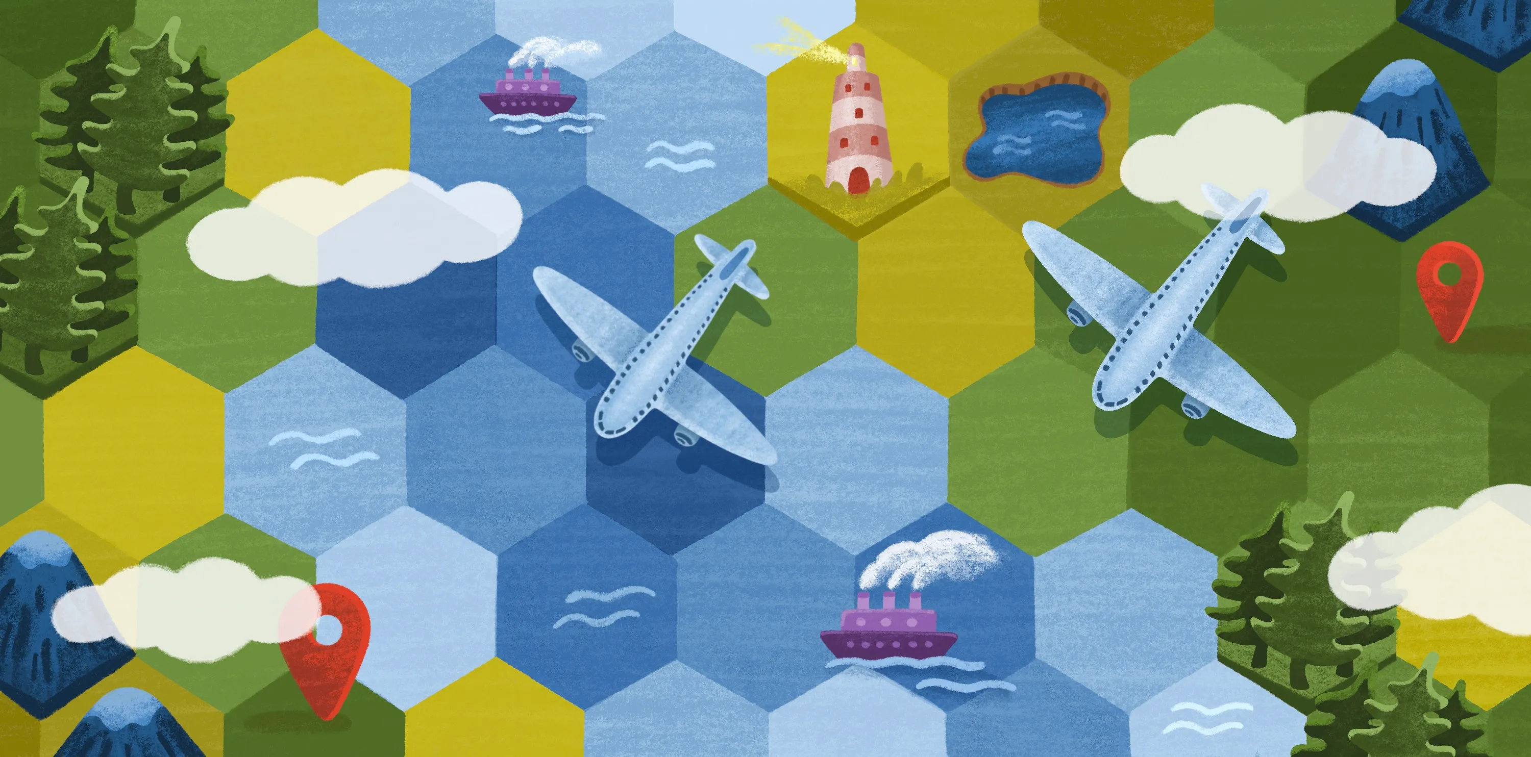
10 Map Data Visualization Examples and Practical Use Cases
Imagine trying to understand a company’s supply chain, a city’s traffic patterns, or a nation’s disease outbreak using spreadsheets alone. It’s a difficult task. Fortunately, map data visualization makes complex information easier to interpret. A well-designed, interactive map helps decision-makers see relationships and trends that might otherwise remain hidden.
Today, organizations rely on spatial analysis and data mapping for everything from logistics to environmental research. Tools like Tableau helped popularize data visualization maps. Now, modern geographic information system (GIS) software like Felt offers more collaborative ways to create dashboards and share maps across teams.
Read on to see geospatial visualization examples and ways spatial data leads to smarter decisions. Whether you’re new to mapping or building advanced dashboards, these cases show how spatial tools uncover insights and drive action.
What Is Map Data Visualization?
Map data visualization arranges raw data on a geographic map to show where events happen and how they relate. Instead of scanning endless rows in a spreadsheet, you see patterns and relationships in a way that feels intuitive.
From basic data mapping to advanced spatial analysis, geovisualization shares stories, insights, and connections that traditional charts often miss.
Map data visualization spans industries and sectors. Examples include:
- Business analysis and logistics
- Urban planning and traffic flow
- Public safety and emergency response
- Environmental monitoring and research
In every scenario, map-based data visualization is a powerful tool for making complex information more digestible so teams can act with confidence.
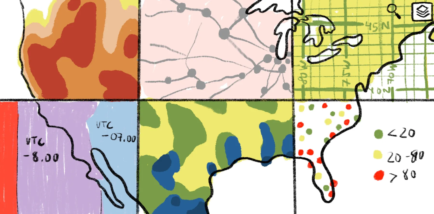
10 Examples of Map Data Visualization
Geospatial visualization examples come in many forms. Each map type offers a unique way to explore data points and geographic relationships. Below are 10 examples with real-world use cases from Felt’s gallery.
1. Point maps
Point maps display individual locations as dots. They’re ideal for visualizing distribution and density — like store branches, public facilities, or incident reports.
Felt’s point map shows the sales performance by different product categories across the U.S. With Felt, teams can filter data points by region, order volume, or revenue to guide targeted growth strategies and market expansion.
2. Heat maps
Heat maps use color gradients to show data density or intensity. They help teams identify hotspots quickly. These maps have a wide range of use cases, including tracking traffic accidents, player movements, and temperature variations.
The Felt gallery heat map documents building damage that responders detected after an urban fire. The map helps assess incident severity and prioritize response efforts.
With Felt’s interactive heat maps, teams can zoom in, adjust intensity thresholds, and visualize spatial trends.
3. Choropleth maps
Choropleth maps color geographic regions based on data values. They’re ideal for comparing statistics across larger areas, including counties, states, and countries.
Felt’s example choropleth map shows the percentage of occupied housing units in the U.S. Government agencies and private organizations might use this information to understand the economic, social, and cultural factors influencing housing trends.
Felt’s interactive features for data visualization let teams hover for exact metrics and share insights without building multi-sheet dashboards in Tableau.
4. Proportional symbol maps
These maps use symbols of varying sizes to show data magnitude at specific locations. They’re great for analyzing population, revenue, and resource distribution.
This visualization from Felt highlights natural hazard exposure and estimated annual losses at a county level in Texas and Louisiana. It helps insurers and planners assess vulnerabilities. These include underwriting, structural, and agricultural risks to help allocate resources.
Teams using Felt can explore datasets simultaneously and collaborate in real time as they look for geographic trends.
5. Flow maps
Flow maps show movement between locations, illustrating the direction and volume of people, goods, and resources. They’re popular for visualizing migration patterns and tracking the spread of global diseases.
This flow map from Felt reveals commuting patterns in different parts of the U.S. City planners can use it to make informed decisions about transportation and infrastructure to reduce bottlenecks. Color-coded flow lines and dynamic panel controls make spatial relationships easy to explore.
6. Cluster maps
Cluster maps group nearby data points to reduce clutter and reveal patterns in dense datasets. It’s common to use cluster maps when examining population density, retail locations, and disaster events.
The cluster map from Felt’s gallery shows rain collection sites outside Mexico City. Planners might use this data to identify expansion areas or funding needs. Felt’s zoom features make it easy to assess individual data points and spot patterns in the surrounding area.
7. Hexbin maps
Hexbin maps divide geographic areas into hexagonal cells or “bins.” They aggregate overlapping data points, making dense datasets — such as customer locations or traffic accidents — easier to read.
Felt’s example map visualizes nearly 500,000 e-bike trips across New York City. This data is useful for understanding demand hotspots and evaluating bike lane coverage.
Felt users can adjust bin sizes, filter by category, and explore spatial analysis.
8. Topographic maps
Topographic maps display elevation and terrain features. They help analyze land use, geographic constraints, and environmental factors like watersheds and natural hazards.
Felt’s topographic map showcases campsites and elevation changes along the Appalachian Trail. Hikers can use it to plan routes, gauge difficulty, and choose the best spots to rest. Felt’s interactive layers let users toggle terrain features and overlay routes, providing an accurate picture of what the landscape is really like.
9. Time-series maps
Time-series maps reveal how data changes over time, revealing growth patterns. Typical use cases include environmental monitoring (like habitat loss) and performance tracking (like shifts in revenue).
The example from Felt offers an in-depth look at energy sites, from wind turbines to power plants. This data helps researchers and policymakers recognize energy production trends and plan for future needs.
Felt’s interactivity lets users play through time periods, compare trends, and visualize data in motion — something conventional maps can’t do.
10. Cartogram maps
Cartogram maps resize geographic areas based on data variables. They’re often used to visualize market share or population studies, where raw geography doesn’t tell the whole story.
With the help of interactive tools, you can adjust variables and compare datasets. This makes complex data more engaging and easier to share across teams.
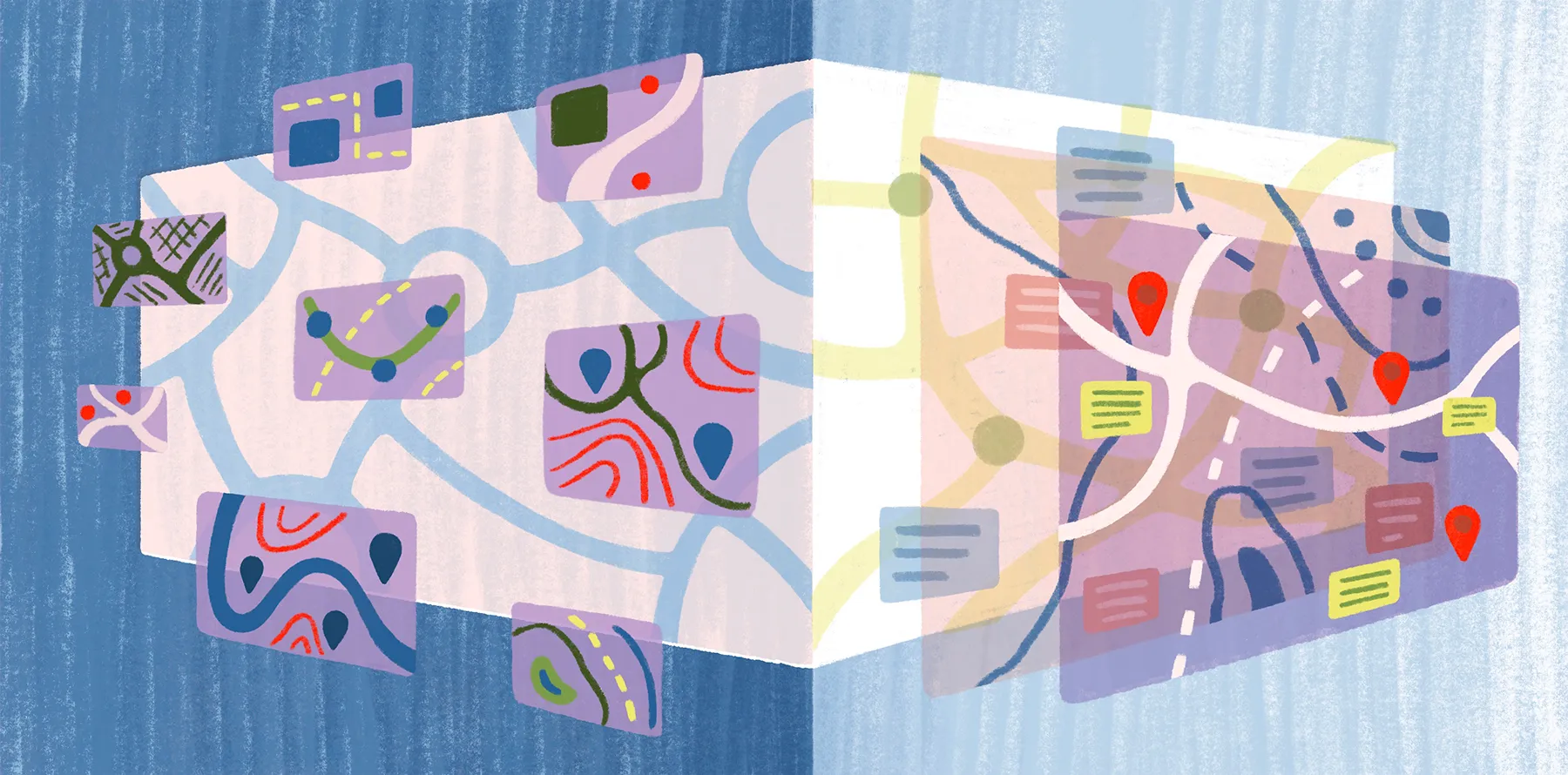
What Tools Can You Use for Map Data Visualization?
The right tool helps turn raw data into actionable insights. From open-source platforms to collaborative dashboards, here are five leading tools for map data visualization:
- Felt: This modern, browser-based mapping tool is built for collaboration. It lets teams layer datasets, develop interactive maps, and create dashboard-style views without complicated coding. Because it’s designed for easy sharing, Felt makes data mapping seamless across industries.
- QGIS: This is a free and open-source example of desktop-based GIS software. It’s favored by companies that need advanced spatial analysis. QGIS supports a range of map uses, from environmental monitoring to urban planning, and integrates well with external data sources.
- Google Earth: This user-friendly tool makes viewing spatial data simple. It’s a solid choice for viewing spatial data files like KML/KMZ files, satellite imagery or CSV/GeoJSON with associated location data.
- CARTO: This is a cloud-based platform for business mapping. CARTO helps data analysts build interactive maps to analyze supply chains and market insights.
- Tableau: Known for powerful data visualization capabilities, Tableau lets users overlay geographic data on interactive maps. It supports custom geocoding and dynamic filtering, helping businesses that want to uncover location-based trends.
Experience Map Data Visualization With Felt
Map data visualization is no longer a luxury. It’s an essential tool for making smarter, data-driven decisions. Whether you’re designing a city’s infrastructure or monitoring environmental changes, the right map shows patterns you can act on.
Felt is an AI-native, cloud-based Web GIS that empowers teams in any industry to build and deploy modern spatial tools. With collaborative dashboards, real-time editing, and effortless sharing across audiences, Felt transforms complex datasets into clear, interactive maps.
If you’re ready to unlock intuitive geospatial visualizations, try Felt today and see your data come to life.
FAQ
What are the benefits of map data visualization?
Map data visualization turns raw spatial data into clear, actionable insights. It helps users spot patterns and relationships that are difficult to see in spreadsheets alone. Interactive maps also improve collaboration by allowing teams to explore, filter, and share data in real time.
What are the five types of data visualization?
The five main types of data visualization are: charts and graphs, maps, tables, dashboards, and infographics. Each type serves a different purpose. For example, bar and line graphs track trends, pie charts show proportions, and maps visualize spatial patterns. Each type upgrades raw data into well-defined insights teams can build upon.
Compare Felt using AI


.jpg)