Mapping projections: 3 types and how to choose the right one
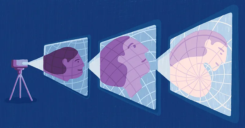
When you look at a world map, you’re seeing a flat interpretation of a spherical planet. This is the result of various types of map projections — methods used to convert Earth’s curved surface into a two-dimensional format. Projection allows cartographers to display continents, oceans, and geographic features on a flat map.
However, no projection is perfect. Each type involves trade-offs between shape, area, and distance. Some are designed for navigational use, while others aim to represent landmasses accurately. Even specialized formats like the polar projection have their niche, offering a precise view of the Arctic and Antarctic regions.
Read on to learn more about mapping projections, their key properties, and how to select the right projection for specific tasks.
What are map projections, and why do they exist?
A map projection is a method of showing the curved planet on a flat surface. While a globe shows the truest representation of Earth, it’s not always practical for navigation, data visualization, and printing. Map projections let cartographers transform the Earth’s surface into flat, usable formats that display everything from continents to flight paths.
The challenge is that flattening a sphere creates distortion. Every projection changes something, like shape or area, which means no version qualifies as the most accurate map projection.
For example, the Mercator map preserves direction but stretches land near the poles. The Gall-Peters projection emphasizes equal-area representation but distorts shapes near the equator.
Each global map projection is a compromise. Picking the right one comes down to whether you’re looking for accuracy, appearance, or ease of use.
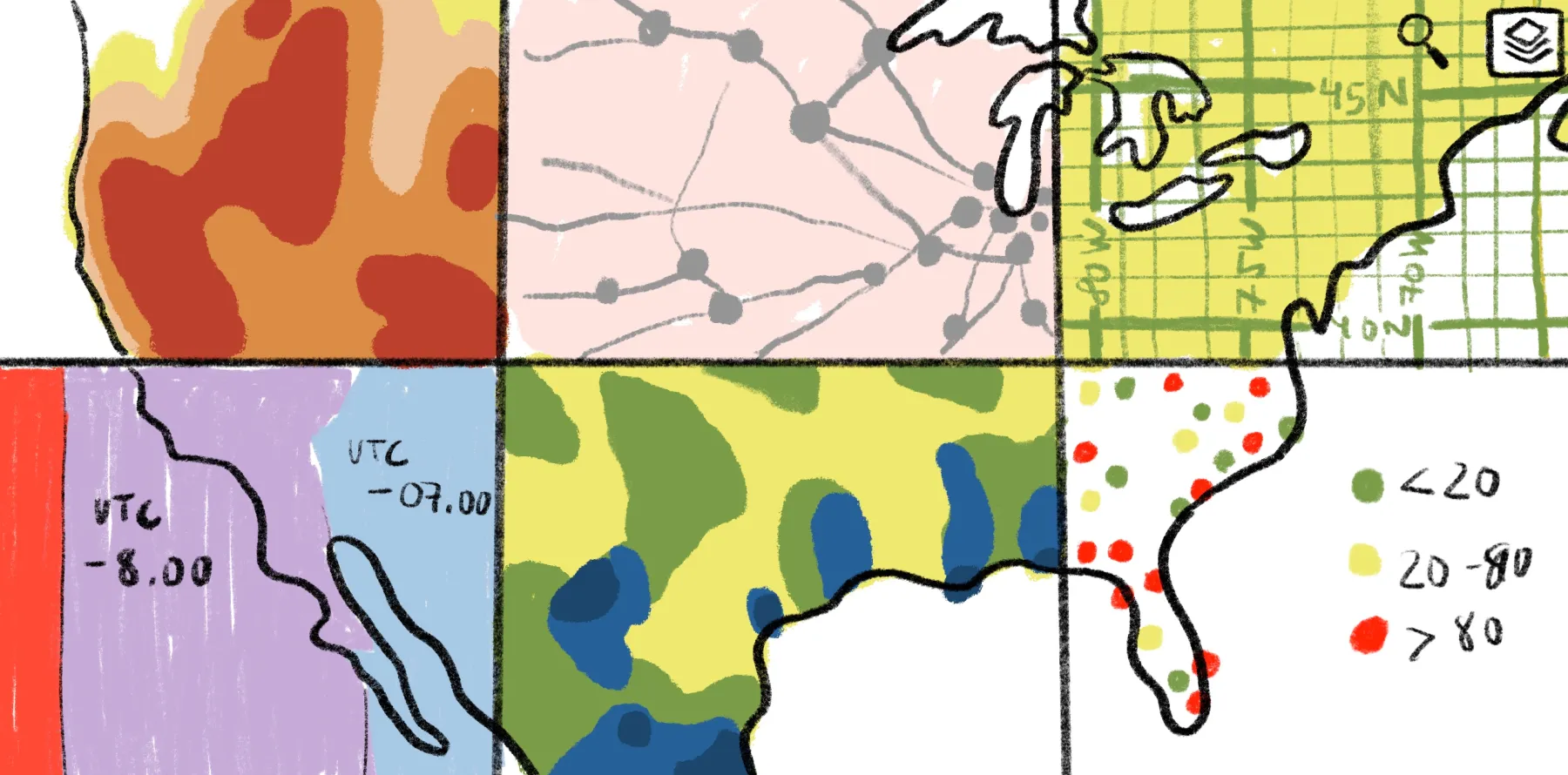
3 main categories of map projections
Cartographic projections are commonly grouped into the following three categories. Each one offers different advantages depending on the geographic task.
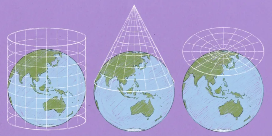
1. Cylindrical projections
These project Earth’s surface onto a cylinder. When unrolled into a flat rectangle, meridians become evenly spaced vertical lines and parallels become horizontal. This grid makes it easy to plot longitude and latitude.
Cylindrical projections are widely used for online mapping and navigation. But they stretch land near the poles, causing noticeable distortion in shape and size.
Cylindrical examples: Mercator map, Miller projection, Gall-Peters projection
2. Conic projections
Cartographers create a conic projection by conceptually placing a cone over part of the globe. Similar to cylindrical projections, they project Earth’s surface onto the cone and then flatten it. This produces curved parallels and straight meridians, making it especially useful for mapping mid-latitude regions.
Conic projections strike a balance between shape and area, so they’re frequently used for country or regional maps. Still, scale and distance become distorted farther from the lines of contact, so these projections aren’t ideal for global representations.
Conic examples: Albers Equal Area, Lambert Conformal Conic, Equidistant Conic
3. Azimuthal (planar) projections
An azimuthal projection maps the Earth onto a flat plane from a specific point, typically the poles. It maintains accurate direction and consistent distance from the central point, making it useful for measuring precise radii.
Azimuthal projections are excellent for showing high-latitude regions or for specialized applications like radio mapping. But areas farther from the center appear stretched or distorted. For this reason, they’re best suited for mapping specific regions rather than the entire globe.
Azimuthal examples: Azimuthal Equidistant projection, Polar projection, Stereographic projection
Key properties of map projections
Different map projections offer distinct ways to represent Earth’s curved surface on a flat map. Understanding the following properties can help you choose the right type of map for your needs.
Conformal projections
Conformal projections preserve local shapes and angles, making small regions appear as they do on a globe. This accuracy makes them ideal for navigation and meteorological maps, where precise angles guide direction and movement.
The drawback is that landmasses appear smaller or larger than they actually are. Therefore, this approach isn’t recommended for comparing geographic scale or land area.
Equal-area projections
These show countries and continents in their true relative size, providing a fair sense of scale across the globe. While the shapes of landmasses may stretch or compress, these maps excel for statistical analysis, population studies, and land area comparisons.
The Gall-Peters projection is a well-known example of this technique, balancing size accuracy with visual familiarity.
Equidistant projections
Equidistant maps display distances accurately from one or more reference points. They’re practical for aviation, radio mapping, and route planning. But accuracy diminishes outside these reference lines. As a result, scale and shape may vary across the map.
True-direction (azimuthal) projections
These maintain correct bearings from a central point and keep angles for navigation and communication precise. They’re useful for polar maps and regional communication. Farther from the center, shapes and areas may stretch or distort.
Choosing the right map projection for your needs
No map projection is perfect as each distorts some aspect of Earth’s geography. The key is to choose the projection that best supports your goals and fits your message.
Navigation often relies on conformal projections like the Mercator map. It preserves accurate angles, so sailors and pilots can plot straight-line routes. For data visualization and thematic maps like those showing population density or land use, an equal-area projection is the better choice. The Gall-Peters projection is helpful if you want to show proportional landmasses, even if their shapes appear stretched.
When studying the poles, azimuthal projections — including the polar projection — offer a realistic sense of distance and direction from a central point. And if you’re designing a general reference or educational map, compromise projections like the Winkel Tripel and Robinson projection work best. They balance distortions of shape and area to create a more natural, visually appealing view of the world.
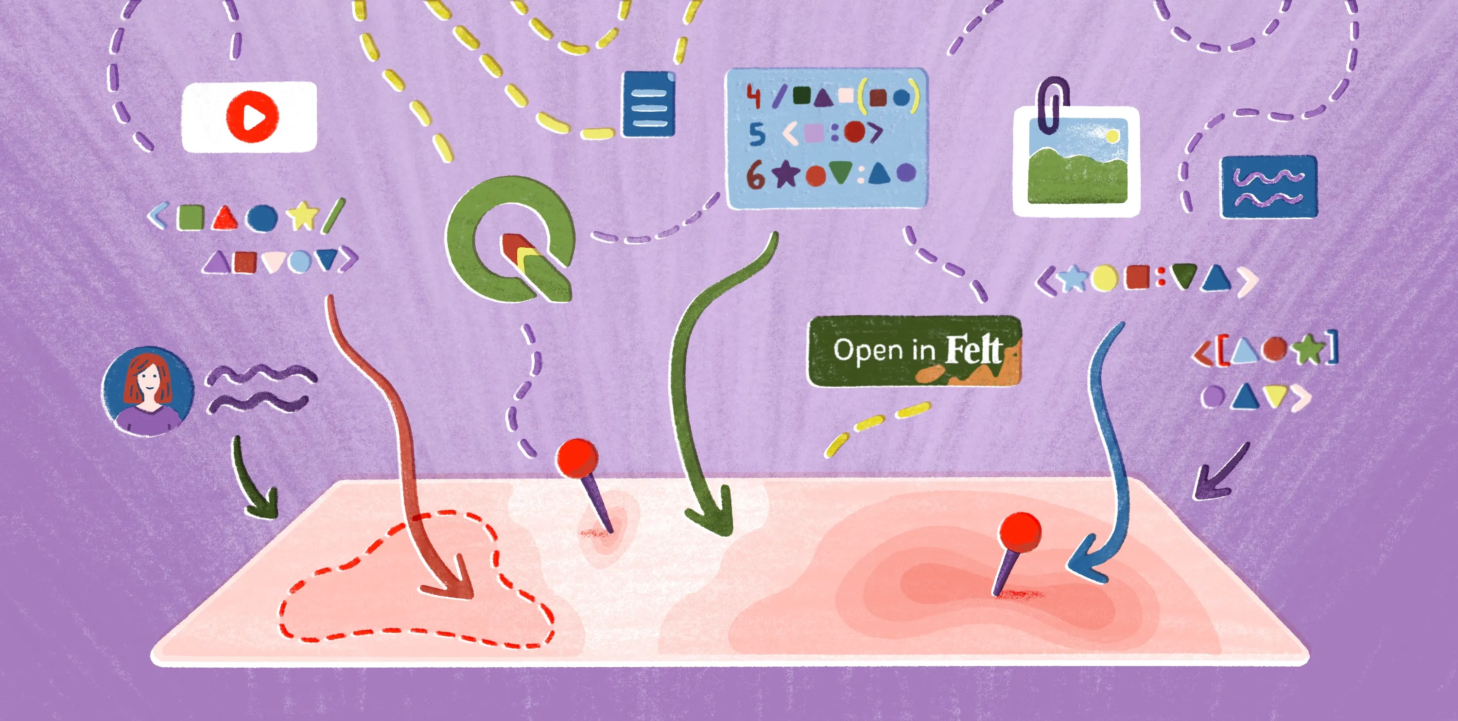
How Felt makes map projections easy
Map projections shape how we see the world and understand the data within it. The science behind map projections can get tricky, but tools like Felt make working with spatial data refreshingly simple. You can explore, edit, and share maps right in your browser without needing to master the finer points of cartography.
While Felt displays your data in Web Mercator projection (the standard for web maps), we ensure all measurements are geodetically accurate by using the right mathematical approach under the hood.
For each operation—whether buffering points, measuring distances, or calculating areas—we automatically apply purpose-built projections or geodesic formulas optimized for that specific calculation. For example, point buffers use a custom projection centered on the point itself (like placing a flat surface directly on the Earth at that location), while distance and area calculations use geodesic math that accounts for the Earth's curvature directly.
This means you get the intuitive, familiar Web Mercator view for visualization while your analysis operates with the precision of purpose-built geodesy. The best of both worlds. Whether you’re working on a classroom project, analyzing field data, or visualizing global trends, Felt makes it easy to create and interpret maps — no technical expertise required.
Try Felt for yourself and see how our platform turns complex geography into clear insights.
FAQ
What is the most common type of map projection?
The Mercator projection is the most commonly used, especially in online mapping and navigation. It uses a consistent grid and preserves direction. But it exaggerates the size of regions near the poles.
Which map projection is best for world maps?
There’s no single best map projection. For general world maps, the Winkel Tripel and Robinson projections are popular because they balance shape, size, and distance. This creates a more natural and visually appealing projection.
What map projection does Google Maps use?
Google Maps uses a modified Mercator projection, as this keeps angles and shapes consistent for navigation. With this projection, streets and landmarks look accurate at local scales, although areas near the poles look larger than they really are.
Why can’t any projection be perfectly accurate?
Flattening a spherical surface causes distortion. For that reason, each map projection must choose what to prioritize — such as shape, size, or direction.
Why can measurement projection differ from your web map projection?
Web maps often use coordinate systems or projections optimized for display, not for precise measurements. As a result, distances may vary slightly from those calculated using specialized measurement projections in GIS software.
Compare Felt using AI