How to map demographic data and turn stats into stories
Mapping demographic data shows you important geographic and socioeconomic relationships across the U.S. A map visualizes how population density, income levels, and education vary across urban areas and rural regions. Whether you’re launching a business or planning development, demographic mapping helps you uncover gaps and opportunities in the market and make decisions that target the right audience.
Let’s explore how to find reliable demographic data, prepare it for analysis, and interpret key statistics.
What is demographic data, and why map it?
Demographic data is the information that describes the characteristics of a population. Typically, this includes factors like:
- Age
- Income
- Education
- Race and ethnicity
- Household size
This reveals the “who” behind the numbers, giving context to help you spot trends and understand community needs and market potential.
Mapping this information takes it a step further by turning statistics into visual insights, showing you where racial groups live, how income levels shift, and which areas lack services. Instead of digging through spreadsheets, you can quickly see the differences in demographics. This helps planners and businesses pinpoint growing demand and underserved populations — like those needing more childcare centers or senior housing.
Demographic data usually comes from census reports, government surveys, and open datasets. The U.S. Census Bureau has detailed information down to individual neighborhoods, while local governments have additional information on income and education.
Step-by-step process for mapping demographic data
The following five-step process can help you turn demographic data into a reliable, shareable map.
1. Find your data
Start by gathering information from the Census Bureau and local government portals. These sources provide relevant, up-to-date statistics for urban areas and rural communities. They include demographic indicators at the neighborhood level, such as population projections and household statistics.
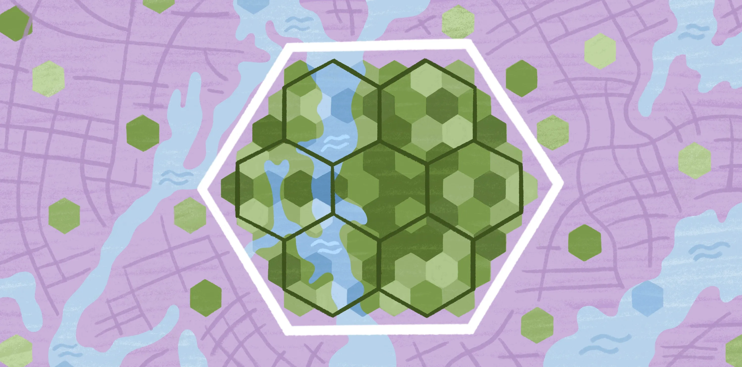
2. Choose your geography
Decide on the right boundaries based on the scale and purpose of your project. The geographic units — such as ZIP codes, census tracts, and county-level boundaries — define how demographic data is grouped and displayed.
For example, maps with census tracts work well for detailed analysis in urban zones. If you’re building a suburban retail complex, the information at this level can help you analyze household income and spending power. But for broader analyses, like assessing regional healthcare access, county-level data works better because it summarizes trends across larger areas.
Platforms like Felt let you upload spatial data like addresses and ZIP codes to define boundaries and visualize demographic layers.
3. Select your variables
Think about what you want to learn from the data and choose indicators that match your goals. If you’re exploring market potential, look at variables like population growth and income levels to spot areas with rising demand and spending power. Or, if you’re studying inequality, map household size alongside a neighborhood’s racial and ethnic composition. This can reveal socioeconomic disparities, such as neighborhoods with large households but a limited number of schools or healthcare facilities.
4. Create your map
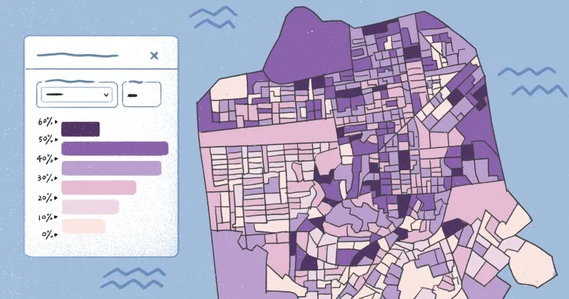
Upload your demographic data into Felt and pair it with your geographic boundaries using matching codes like FIPS from the Census. Then, choose how you want to view this information, such as a choropleth map that shows income by tract. With Felt’s “Upload Anything” feature and built-in geocoding, data visualization has never been easier.
5. Customize and analyze
Now you’re ready to fine-tune your map with customizations:
- Make patterns stand out by adjusting color ramps and styles.
- Use quantiles and equal intervals to classify your data.
- Add legends and labels for greater context and clarity.
- Bring in interactive elements to make your map more engaging.
You can also apply filters and compare layers. For example, you can toggle between population density and income levels or overlay race and ethnicity distributions to see where patterns align and diverge.
Felt’s spatial analysis tools let you clip specific zones, filter information by any attribute, and uncover insights like which tracts have high growth but low income. Thanks to Felt, you can create visuals that uncover trends across racial groups and geographic areas that directly shape business strategy and policy decisions.
Best practices for accurate demographic mapping
These tips help ensure you design informative demographic maps for the U.S. and beyond.
Normalize your data
Raw counts alone, like total population, can make large or densely populated areas look more significant just because they have more people. To fix this, use rates or percentages instead of raw totals.
For example, map population density (people per square mile) or the percentage of households earning over $100k rather than the total number. Normalizing your data puts every location on the same scale, so patterns are easier to interpret.
Choose the right color scale
The right color choices make it easy for your readers to interpret your map. Use gradients that emphasize differences without exaggerating them. A subtle blue-to-red scale works well for median income, while a green gradient suits population growth or housing density.
Too many colors can confuse the reader, so keep the palette simple. Felt lets you experiment with diverging and sequential color scales so your map is easy to understand at a glance.
Provide clear context and legends
Your map should tell a complete story, not leave readers trying to guess what they’re looking at. Include legends, labels, and titles that define what each color or shape represents. Say you’re mapping race and ethnicity across a metro area. You’ll need to specify if the percentages are by city, ZIP code, or another geographic unit.
Clear context also means always citing your sources. Indicate whether the statistics come from census data or a local survey to show your information is reliable.
Avoid bias
Maps can mislead if the data or presentation is biased. Be careful not to cherry-pick variables or geographic areas just to support your point of view.
Focusing only on high-income neighborhoods can make a city seem wealthier than it is and hide disparities in nearby areas. A better approach is to include a mix of indicators — like population trends and income levels — to give an accurate picture of the community. This helps you design maps that reflect the full diversity of the areas you’re highlighting.
Visualize and share demographic insights with Felt
Demographic mapping brings data to life by sharing the story behind the statistics. With the help of Felt’s advanced tools, teams can:
- Upload and map data instantly: Whether it’s from the census, local surveys, or your spreadsheets, you can quickly visualize information without any complicated formatting.
- Customize your map’s look: Use color scales, apply filters, and set geographic boundaries to help readers interpret the statistics you’re visualizing.
- Collaborate on live maps: Share results with a single link so everyone on the team can get updates in real time and work together to create plans and policies.
Try Felt today and see how easy it is to turn demographic data into better decisions for your business and community.
FAQ
What are the most common types of demographic data?
Demographic data paints a picture of who lives in a community and what their needs might be. The most common types to consider include:
- Age
- Income
- Education
- Race and ethnicity
- Household size
- Employment and population growth
How do you choose the right map type for demographic data?
The right map type is whichever one helps readers understand and interpret your data. Choropleth maps are a good choice when you want to show percentages or rates across areas, while dot maps work well for visualizing distributions and densities.
What’s the difference between raw and normalized data?
Raw data shows totals like population and income, but they can create misleading results and make larger areas seem more important than they are. Normalized data adjusts for size using percentages or rates so you get fair comparisons of each region.
Can demographic data mapping be done without GIS software?
Felt lets you map demographic data without using complex GIS software. You can upload spreadsheets, link them to geographic boundaries, and then create interactive maps to enhance collaboration.
Compare Felt using AI