.jpg)
What are isoline maps, and how do they visualize spatial data?
Most geographic patterns don’t change all at once. Instead, they shift gradually. Elevation rises or drops, temperature tapers off, and travel times stretch or shrink depending on distance and terrain. Isoline maps make sense of these changes by visualizing gradients and spotting variations in the landscape.
Understanding the meaning of isolines helps explain why these lines are effective at showing how conditions change across space. Let’s take a closer look at how isoline maps work. We’ll review the different types and how they’re used in GIS workflows for real-world mapping and analysis.
What is an isoline map?
Isolines connect points sharing the same value. They turn equal values — like rainfall, temperature, or elevation — into continuous lines across a map, so it’s easy to see patterns at a glance. Isoline and topographic maps show up in a number of industries:
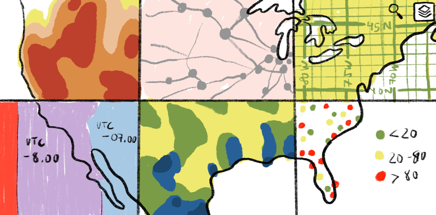
- Cartography: Contour lines depict elevation changes and reveal the shape of the land.
- Geography: Isohyets map rainfall to show how precipitation varies across regions.
- Meteorology: Isotherms and isobars track temperature and pressure patterns.
- GIS analysis: Isolines chart travel times and service areas to gauge accessibility.
Isoline maps are a type of thematic map used to highlight gradients in geographic data. By turning dense data sets into simple lines, they help teams identify trends and spatial relationships that might otherwise go unnoticed.
How do isoline maps work?
Isoline maps transform raw data into clearly defined lines. Researchers collect measurements from a geographic region, then use interpolation to estimate values where data isn’t available. They set isoline intervals to determine how far apart the lines appear on the map. Closely spaced lines indicate steep changes, while wider spacing shows gradual variation.
Modern GIS tools automate the entire process. Advanced mapping software generates accurate isolines using elevation models and environmental measurements. This removes the need for manual calculation and ensures the lines reflect real spatial patterns.
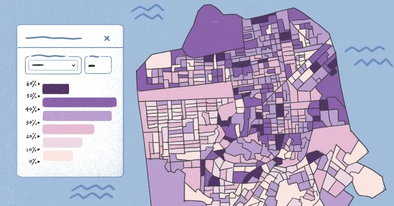
Platforms like Felt take this a step further. Teams can upload raster or vector data, explore isolines interactively, and style them using color-by-value, size-by-value, or categorical mapping.
4 types of isoline maps
Isolines represent many types of spatial data, depending on their source and use case. Here are the most common isoline maps used in GIS workflows.
Contour maps
Contour maps connect points of equal elevation to show the shape and slope of the land. Hiking maps use contour lines to illustrate steep trails versus gentle slopes. This makes topography easier to interpret.
Planners and engineers use contour maps to understand how landforms shape movement and transport when making decisions for urban development. They can use interactive GIS platforms like Felt to toggle terrain layers, zoom in on features, and analyze multiple data sets simultaneously.
Isotherm maps
Isotherms map points with the same temperature. Meteorologists rely on isotherm maps to track heat waves, cold fronts, and seasonal variations across a geographic region. With interactive mapping, analysts can overlay time periods and compare temperature shifts to get a more detailed view of changing conditions.
Isobar maps
Isobars link points of equal atmospheric pressure. They help researchers track storms and predict wind patterns. These maps also show how pressure systems move across land and water. The leading GIS tools can animate isobar layers and combine them with temperature or precipitation data for a real-time look at changing weather systems.
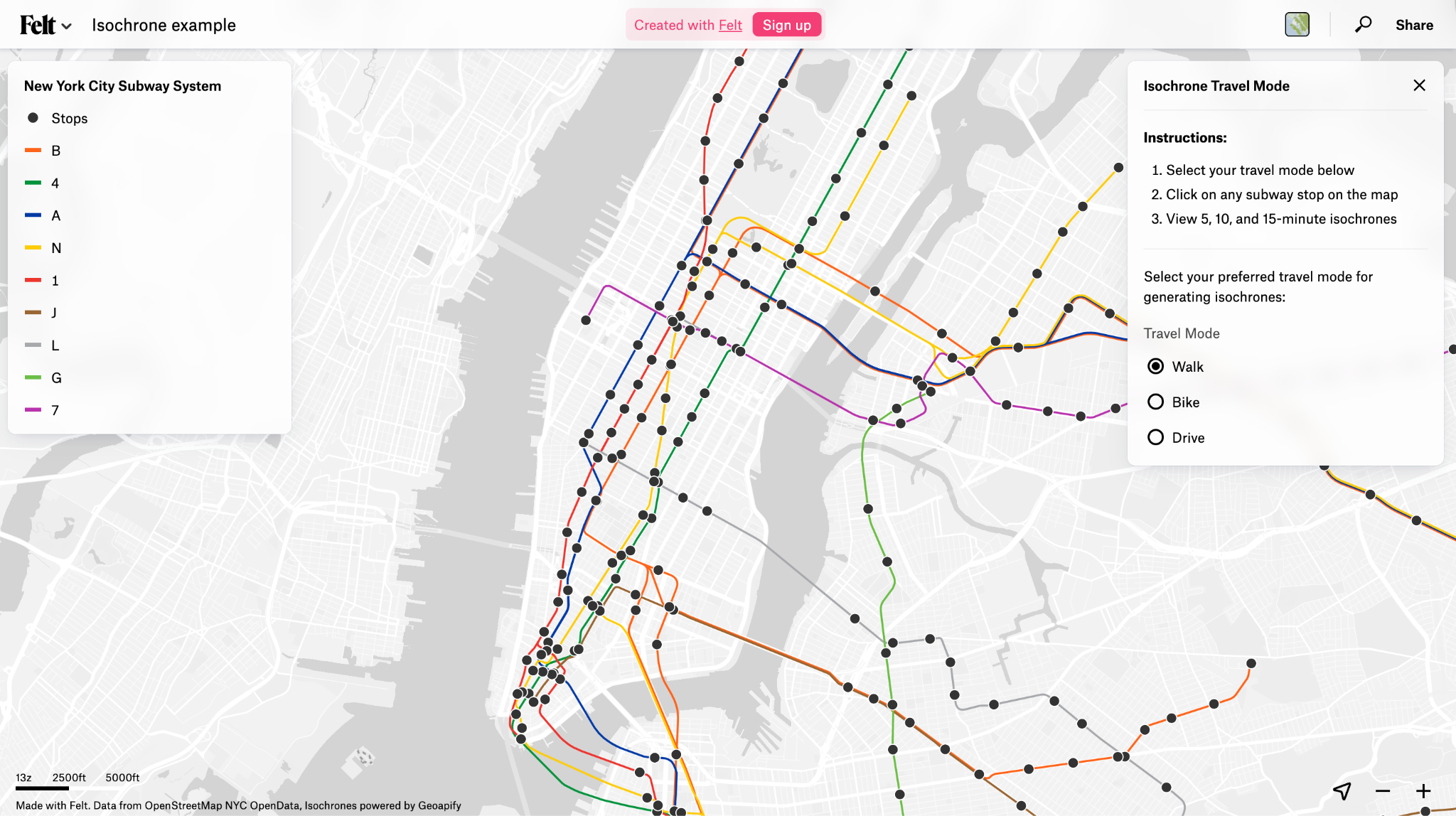
Isochrone maps
Isochrones connect places that share the same travel time from a starting point. Urban planners and transportation analysts use isochrone maps to see how far people can travel in 10, 20, or 30 minutes using different modes of transport.
Isochrone maps reveal gaps in access and highlight areas that need stronger mobility options. This helps teams compare travel patterns and assess accessibility to find the best locations for community services like schools and health clinics.
What are isoline maps used for: 5 common use cases
Isoline maps help us understand complex data and make smarter spatial decisions. Here are examples of isoline maps in everyday use cases.
Terrain analysis
Hikers use contour lines and isoline mapping to visualize mountains, valleys, and slopes on the trail. Planners and engineers use them to assess construction projects and develop land management strategies. Interactive GIS tools let you toggle elevation layers and measure gradients directly on a map, so you can simulate terrain changes and plan routes more effectively.
Weather forecasting
Isotherms and isobars help meteorologists see pressure systems and temperature distribution. This helps them monitor storms and heat waves that may require urgent action. By layering rainfall and temperature data, forecasters can also anticipate severe weather events like flash floods or tornado outbreaks. GIS platforms animate these changing conditions and illustrate atmospheric patterns, which enhances forecasting accuracy.
Environmental monitoring
Isolines help scientists track pollution levels, groundwater depth, and air quality across broad geographic areas. These maps show variations that reveal environmental hotspots and pinpoint places at risk of flooding or drought. Using this information, researchers can make targeted, data-driven recommendations for conservation efforts and water resource management.
Urban planning and transportation
Urban planners and transportation analysts use isochrones to improve neighborhood accessibility. In Felt, teams can create isochrone maps that layer travel-time data with population density and land use to guide resource allocation. These maps also help authorities with emergency planning by showing how quickly responders can reach critical areas.
Agriculture and forestry
In agriculture, elevation contours reveal flood-prone farmland. Rainfall and soil moisture isolines highlight parcels at risk of drought. Forestry managers use temperature and precipitation isolines to monitor wildfire risk and assess forest health — particularly in areas vulnerable to deforestation. These spatial trends help analysts prioritize interventions that reduce the impact of environmental hazards.
Turn spatial data into interactive maps with Felt
Modern spatial analysis calls for interactive mapping tools that generate and share isoline visualizations. Felt supports this work, helping you upload spatial data and large raster files right in the browser. You can style terrain layers using color-by-value or categorical mapping, then adjust as your analysis evolves. Once your map is ready, you can edit and share it in real time for smooth cross-team coordination.
Felt merges visualization and collaboration in one place so you can uncover spatial patterns and present findings without relying on static outputs. Start a free trial to see how Felt makes spatial analysis accessible and engaging for your whole team.
FAQ
What’s the difference between isoline maps and heat maps?
Isoline maps use lines to connect points with the same value, highlighting how elevation or temperature changes across the landscape. Heat maps work differently, using color intensity to show where values are more concentrated or dense. Isolines make it easy to see exact thresholds, but heat maps give you a quick, visual sense of hotspots.
What data sets are used to generate isoline maps?
Isoline mapping relies on data sets with continuous values, such as elevation models, temperature readings, and air pollution levels. You can use isolines to visualize any data that changes gradually over a surface.
What challenges arise when creating isoline maps?
Creating accurate isoline maps requires careful data collection and interpolation between points. This can get tricky if measurements are sparse or unevenly distributed. Choosing appropriate intervals is also important because too few lines can hide detail, and too many can clutter the map.
Compare Felt using AI


.jpg)