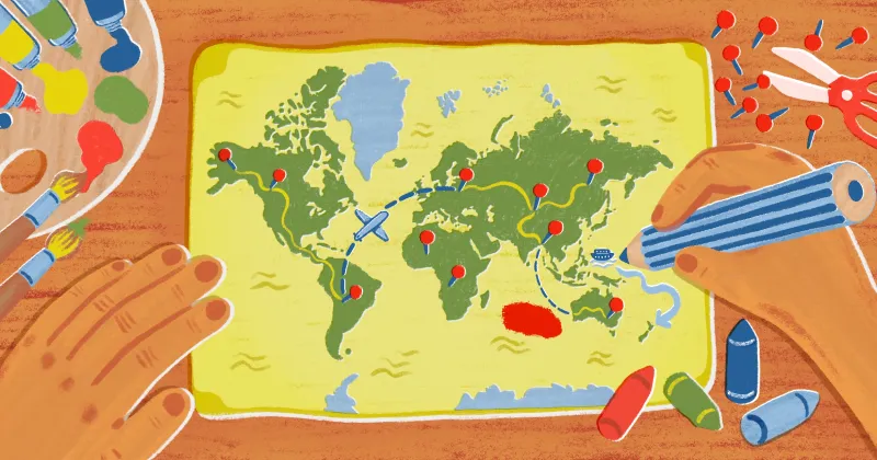
Understanding thematic maps and how they visualize data effectively
Maps don’t just show us geographic features — they also help us understand patterns. A thematic map focuses on a single subject and illustrates how it varies across locations.
Unlike a reference map, which provides general location context, thematic maps visualize trends like population density and income levels. They’re ideal for turning raw data into a visual representation, helping cartographers compare regions and reveal relationships between places and themes.
Read on to learn about the most common types of thematic maps and how different approaches influence meaning.
What is a thematic map?
A thematic map visually represents a single dataset or idea across a geographic area. Rather than showing all features or themes of a location, it highlights how one variable changes from place to place. Examples include internet access, literacy rates, and wildfire risk.
Thematic maps reveal spatial patterns and relationships that might not be immediately obvious in tables or spreadsheets. Placing bivariate or multivariate data directly in geographic context makes patterns easy to understand and compare.
Organizations use thematic maps to tell data-driven stories, especially when a visual narrative helps inform decisions or shape public understanding. They differ from general reference maps, which provide a broad overview of geographic features like roads, landmarks, and boundaries. While reference maps answer, “Where is this?,” thematic maps answer “What’s happening here?”
Main types of thematic maps
Thematic mapping makes spatial data easier to interpret, but they also let you choose a visualization that matches your information and the questions you’re trying to answer. Here are the main types and examples of thematic maps to consider, along with common uses for each.
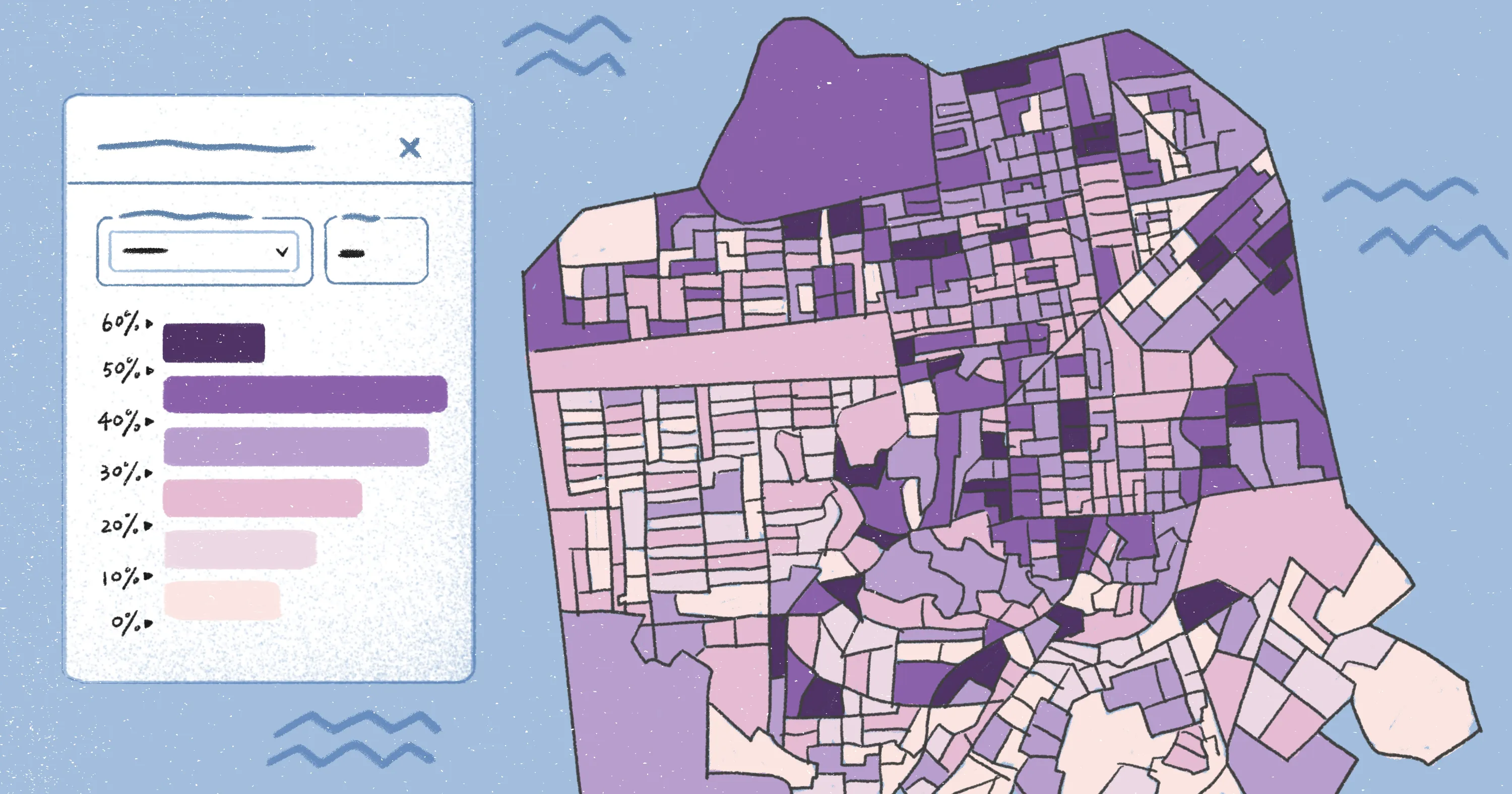
1. Choropleth maps
A choropleth map colors geographic areas according to a value. It’s the format most people recognize from newsrooms and government dashboards because it shows how a metric varies across administrative units, like states, districts, and municipalities. Choropleth mapping relies on data grouped by areal unit, so comparisons make sense across regions.
Choropleths work best for standardized or comparable values — percentages, rates, and index scores — where it’s fair to compare one region to another. For example, it can show vaccination coverage by district after a statewide campaign. Each district is shaded from light to dark, revealing variation. This lets you spot pockets of low coverage, even if the state’s overall rate looks high.
However, choropleths can be misleading when mapping raw totals instead of rates, because large areas may appear more significant due to size rather than actual values. They also hide variation inside each polygon, making it hard to see localized patterns. For instance, a district with a dark shading suggests a high-coverage area, but it might still contain low-coverage neighborhoods and communities.
2. Proportional symbol maps
Proportional symbol maps use symbols of different sizes — usually circles — to represent data values. The size of each symbol reflects the magnitude of the variable.
Unlike choropleths, proportional symbol maps don’t rely on administrative boundaries. Instead, they focus on intensity at individual points. Examples include the number of passengers through an airport, total student enrollments in a school, or crimes reported in an area.
For example, a disaster management unit can show the number of emergency calls received at each center during a cyclone — placing circles on the map at each center and scaling them to the volume of calls. Coastal centers will show much larger symbols, reflecting where pressure on services was the highest.
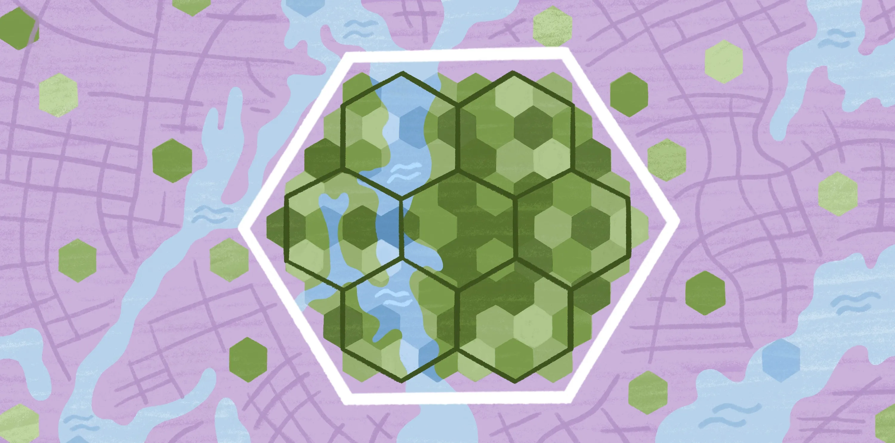
3. Dot density maps
Dot density maps — or dot distribution maps — use individual dots to represent a fixed quantity, such as one dot = 500 people. You can distribute dots within an area to show where that quantity is more concentrated, like a map showing bus stops in a particular area.
These maps show internal variation within a polygon. For example, a district might have a high population overall, but more people might reside along a highway or coastline. Dot placement helps visualize where activity actually occurs.
However, cartographers randomly place dots within boundaries, so they’re representational and not exact. If the dot value is too small, the visual becomes cluttered. If it’s too large, you lose detail. As a result, dot maps are ideal for a visual sense of distribution rather than precise numbers.
4. Isoline or contour maps
Isoline maps, also called isopleth or contour maps, connect points of equal value with lines. They’re ideal for continuous variables that change gradually across locations, such as temperature, elevation, and air quality.
These maps tell you where values increase or decrease and how conditions spread across an area. For example, an isoline map can visualize rainfall patterns across a region, helping planners assess flood risk.
However, they usually depend on interpolation, which means you’re estimating values between known points. If the underlying data is uneven, the lines can give a false sense of precision. Many overlapping lines might also be less intuitive to view and understand than a shaded map.
5. Categorical maps
Categorical — or qualitative — thematic maps show types or classes instead of amounts. Each category has its own color or pattern — for example, party A vs. party B vs. party C, or protected vs. unprotected areas. They’re commonly used in urban planning, showing residential, commercial, and industrial zones in a city. This helps planners identify zoning conflicts or opportunities for development.
That said, categorical maps show types, not amounts, so you can’t tell how much of something exists in an area. If you track too many categories simultaneously, the colors overlap and become hard to distinguish.
6. Flow maps
Flow maps visualize movement between places, like people, goods, and vehicles. Lines connect origin and destination, while the line thickness represents its volume. Tables and spreadsheets can tell you how many people traveled from one place to another, but a flow map shows the entire network at a glance. It also adds context — such as where traffic converges and which areas are underserved.
However, flow maps appear cluttered if you try to show every movement at once. Lines can overlap, and thick flows hide smaller connections, even if they’re important. Like proportional symbols, the lines prioritize larger numbers, so less common or emerging flows are easier to miss.
Designing effective thematic maps
Even a well-designed thematic map can confuse people if it’s hard to read. Here are common principles and cartographic choices to help you design maps that are easy for anyone to use.
Choose the right color palette
Color is an attention-grabbing element, so it should match the data type you’re showing:
- Sequential palettes (light to dark): Work best for values that increase, like income or rainfall.
- Diverging palettes (one color to neutral to another color): Highlight values above and below a midpoint.
- Qualitative colors: Emphasize categories, especially where each is distinct.
The wrong palette can exaggerate small differences or hide important ones, so pick colors with enough contrast, use color in one direction, and don’t mix too many colors unless you’re mapping categories.
Normalize and classify data carefully
A common mistake in thematic mapping comes from highlighting the raw numbers, which can be misleading. Large regions may appear dominant simply because they cover more area and not because the values are higher. Normalizing data — adjusting values by population, area, or other relevant factors — ensures comparisons reflect actual differences.
Classification is how you group values into logical ranges. This makes patterns easier to interpret and ensures similar areas appear visually consistent. Other cartographic techniques — like cartograms or bivariate maps — offer even more precision when you’re working with complex datasets.
Provide a clear legend and context
A thematic map needs a legend that explains symbols, units, and data sources. Without context, people could misinterpret colors or think differences in value are bigger or smaller than they actually are. To avoid any confusion, add a visible legend in a corner with the data year and source and mention ranges with their corresponding colors or lines. A legend with plain labels is better than one that assumes technical knowledge, making it easier for everyone to understand.
Keeping the base map simple also helps the thematic layer on top stand out, so people focus on the information and not the background.
Keep accessibility in mind
Not everyone sees color the same way, and many people view maps on their mobile devices rather than a large monitor. The best thematic maps work for color-blind users, small screens, and people who aren’t experts at geographic information systems.
For greater accessibility, use enough contrast to differentiate elements, don’t rely on color alone to show meaning, and avoid complex symbols. A map should be technically correct, but it should also be easy to read and understand.
Design smarter thematic maps with Felt AI
Thematic maps are powerful because they highlight patterns that numbers alone can’t show. When you design an idea clearly using the right software — with the right colors and geographic context — it becomes much easier to explain trends and tell stories with geography.
Felt AI helps teams create thematic maps quickly and collaboratively. You can upload spatial information, apply auto-generated stats, and select color palette suggestions. Team members can leave comments directly on the map and adjust cartographic elements in real time.
Try Felt AI to turn complex data into thematic maps for your audience.
Compare Felt using AI


.jpg)