Understanding choropleth maps and how to design them responsibly
Choropleth maps are among the most effective tools for data visualization, using color and shading to represent variations in data across geographic regions. They show how values like population density, income levels, and election results vary between areas like counties and districts.
These maps reveal trends that raw data from tables and charts might hide. But the designer’s choices directly shape a map’s clarity and credibility. Features like color scales and classification methods can subtly influence interpretation.
Let’s take a closer look at what choropleth maps are, when to use them, and how to construct them responsibly so they’re accurate and insightful.
What is a choropleth map?
An easy way to define a choropleth map is as a thematic map that uses shading to represent data values across geographic regions. Each country, state, or district is color-coded based on a specific variable to help you visualize spatial patterns at a glance.
Choropleth maps excel at showing normalized data like rates and percentages. They’re often used to map geographic variations that might otherwise go unnoticed. Common examples include maps showing unemployment rates, disease incidence, and voter turnout.
To avoid misleading results, choropleth maps shouldn’t use raw totals. Larger regions naturally produce bigger numbers, which can create a false sense of significance. Normalizing data ensures fair comparisons across diverse geographies.
How choropleth maps work
By transforming complex datasets into clear visual summaries, choropleths make it easy to spot patterns that define the geographic character of a dataset. While they look simple, there’s a thoughtful process behind how they’re built. Here are the key steps that bring choropleth maps to life.
Data association
Every choropleth map begins by linking data to defined geographic areas. For example, pairing census data with district outlines reflects demographic patterns. Once you connect spatial data with the right regions, the map reveals patterns and trends that would otherwise stay buried in a spreadsheet.
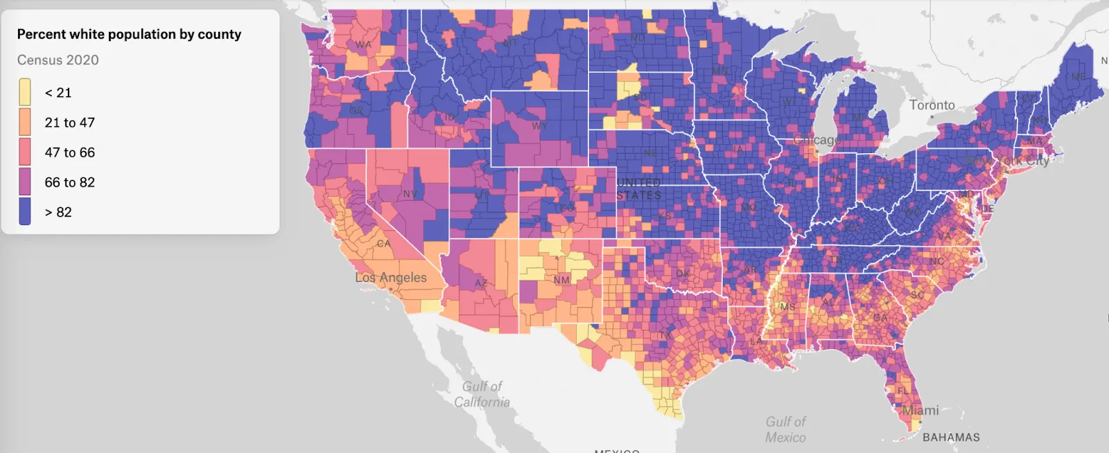
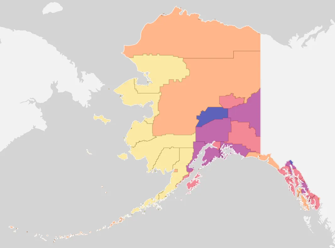
Source: Map created in Felt
Alt text: A choropleth map, detailing the percentage of the U.S. population that is white by county.
Accuracy is essential, as misaligned boundaries and incorrect datasets can distort the map’s message. Reliable data quality lays the foundation for trustworthy visualization.
Classification and color scaling
After you associate data with specific geographic regions, the next step is to group those values into smaller categories. Common methods for data classification include equal intervals, quantiles, and natural breaks. Each shapes how viewers understand and interpret the map.
With classification in place, you can then use colors to represent categories. Sequential color scales — moving from light to dark or cool to warm hues — are ideal for showing lower and higher values. Poor or inconsistent color choices might exaggerate differences and obscure spatial patterns. A balanced palette helps viewers distinguish each category.
Normalization
Since geographic areas vary in population and size, most choropleth maps use normalized data. Instead of mapping totals, they display values as rates, averages, and percentages to provide a more accurate view.
An example of a choropleth map using normalized data is one that tracks the spread of COVID-19. Rather than plotting total cases, a responsible choropleth map showing COVID cases per 100,000 residents provides a fairer comparison across regions.
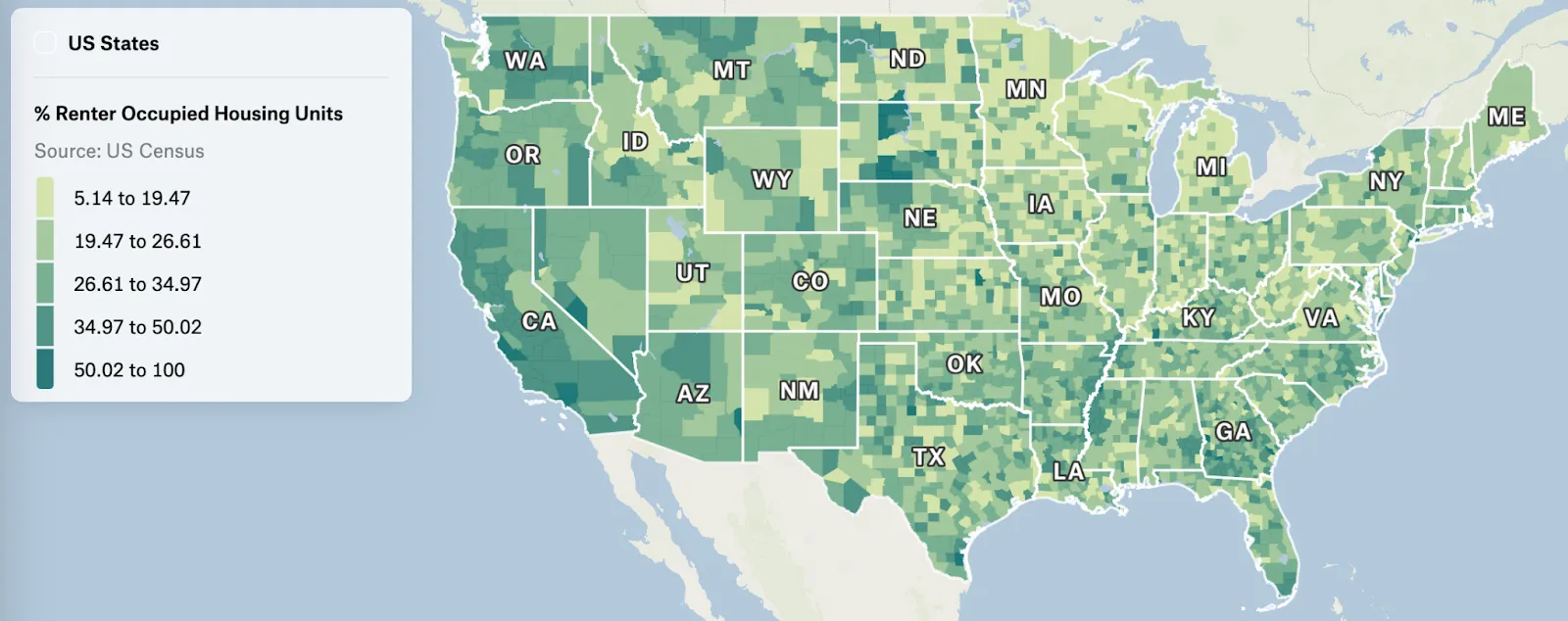
Source: Map created with Felt
Alt text: A choropleth map using a green color scale, showing the percentage of renter-occupied housing units out of units total in the U.S.
Normalization prevents large or densely populated regions from appearing more significant simply due to scale. When you combine normalization with sound data association and color scaling, you create a choropleth map that accurately reflects spatial data and geographic trends.
Designing effective choropleth maps
An effective map ensures clear and ethical communication. These best practices will guide you in designing choropleth maps that avoid common data visualization pitfalls.
Choose an appropriate color scheme
Map colors represent data and influence how viewers interpret spatial patterns, so your palette should always match the variable type. To create an immediate sense of magnitude, use a sequential color scale for continuous data like population and income.
Diverging color scales, on the other hand, use contrasting hues and are better for highlighting deviations from a central value. The opposing colors, like red-to-blue or purple-to-orange, make it easy to spot differences above and below the midpoint. Practical uses for this include election results, unemployment rates, and health indicators like disease rates.
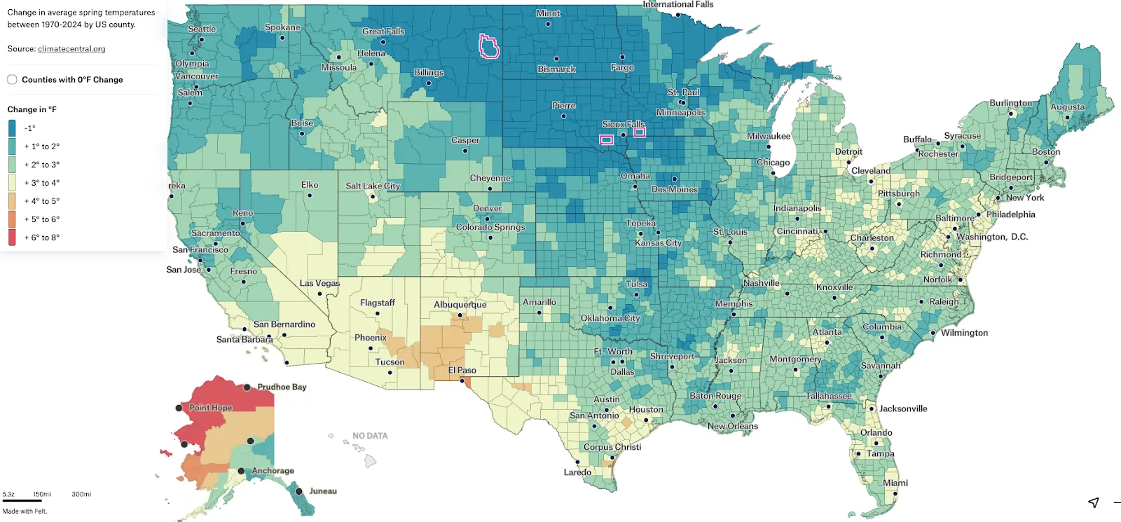
Source: Map created with Felt
Alt text: A choropleth map with a diverging color scale, showing the change in temperature across the U.S. from 1970 to 2024.
For most thematic maps, intense shades mark the extremes, while lighter colors represent values near the center. Try to select hues that support readability and accurately reflect the data range.
Label and provide a clear legend
Map legends explain how colors correspond to data values, and labels ensure each geographic area is identified correctly. Place legends near the map, use simple language, and avoid unnecessary jargon to make interpretation straightforward. In addition, include labels for key regions and note details like the data source and date range to enhance transparency. Thoughtful labeling turns a static map into an engaging story about geographic variation.
Avoid misleading visual scales
Choropleth maps can be misleading if the visual scale doesn’t match the data. Inconsistent classification and uneven intervals can exaggerate small differences and hide notable trends.
It’s important to keep classification uniform across related maps to allow fair comparisons between regions. Use the same geographic projection throughout, as distorted shapes and areas can alter perception of spatial patterns. Proper scaling ensures map readers have an accurate representation of the data.
Use accessible color palettes
Accessibility is key when creating thematic maps for a broad audience. Choose color palettes that are legible for all viewers, even people with color vision deficiencies. In general, avoid red-green contrasts and make sure shade differences are distinguishable even in grayscale. Tools like ColorBrewer and Adobe Color can test your map for visibility.
Designing with accessibility in mind helps everyone see spatial data accurately, regardless of visual ability or map type. By prioritizing inclusion, choropleths become more informative and equitable.
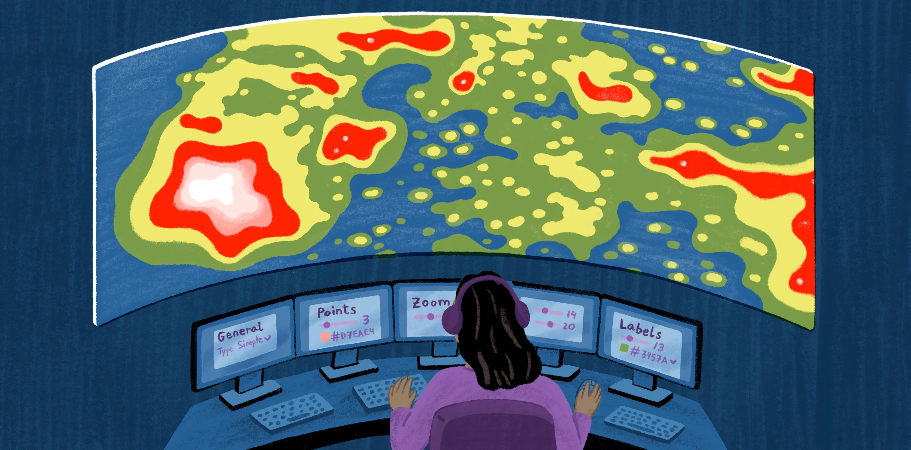
Visualize smarter with Felt AI
When designed correctly, choropleth maps turn raw numbers into clear geographic insights. Felt AI streamlines this process. It builds accurate color scales and legends, ensures proper normalization and geographic projection, and enables teams to collaborate and adjust maps in real time.
With Felt’s mapping software, creating choropleths is faster and more intuitive. Explore how Felt helps your team visualize spatial patterns with confidence and precision.
FAQ
What type of data works best for choropleth maps?
Choropleth maps work best with normalized data such as rates, averages, and percentages. This data ensures differences between geographic areas reflect meaningful patterns and not just population size or area.
What’s the difference between a heat map and a choropleth map?
A choropleth map colors predefined geographic regions based on data values. A heat map uses color intensity over a continuous area to show concentrations or density. Choropleths focus more on states and counties, while heat maps visualize spatial patterns without fixed boundaries.
Why should data be normalized in choropleth maps?
Normalization adjusts spatial data to account for differences in population size and area, using averages and percentages instead of raw totals. This prevents larger geographic regions from appearing more significant simply because they have more people or space.
Can choropleth maps display multiple variables at once?
Choropleth maps show more than one variable at a time through bivariate or multivariate designs. By combining different color schemes and visual cues, these variations allow you to explore how multiple datasets interact across the same geographic areas.
Compare Felt using AI