Heat map generators: How to choose the right tool for your team
Generating a heat map is relatively simple — but the real challenge lies in choosing the right platform. The term “heat map generator” covers a wide range of tools built for very different jobs. Some create website behavior overlays, while others turn spreadsheets into color-coded matrices.
Working with the wrong heat mapping tools doesn’t just limit functionality. It can prevent you from producing a map at all. And once you create a project, you’ll need a platform that lets you style, share, and edit it your way.
In this guide, we’ll take a practical look at heatmap software, including how to select the right tool for your use case and which capabilities matter.
What’s a heat map generator?
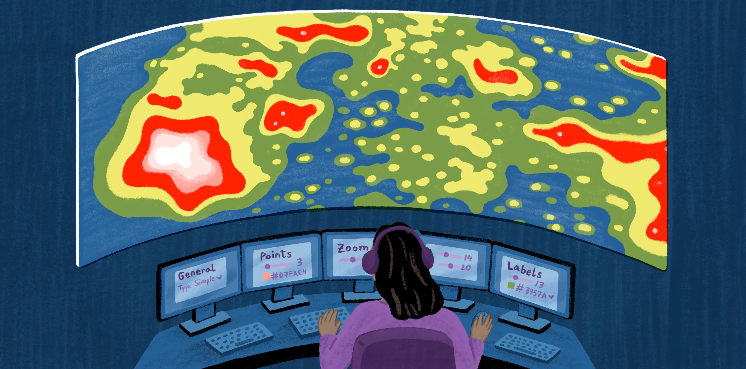
A heat map generator turns data into a color-coded map that lets viewers understand information at a glance. These tools use colors and gradients to highlight patterns in depth and intensity, such as population density and interaction points.
These tools do more than apply a color scale to a data set. They aggregate, normalize, and render information so it becomes a coherent, usable layer. This gives people an approachable way to understand the real world. Rather than studying a spreadsheet, you can look at varying shades of color to understand data patterns.
Different generators accommodate different data models. Some use point-based data, like latitude and longitude coordinates. Others handle boundary-based data, where values correspond to predefined regions like ZIP codes and districts. There are also heat mapping tools that measure digital, interaction-based data, like clicks and scroll depth.
Heat map generators can be a part of many different types of platforms, including geographic information systems (GIS) and analytics suites. They might also be standalone SaaS tools.
Types of heat maps you can generate
No matter how polished the software is, if it doesn’t support your specific data model, it can’t produce the right results. Here are the most common types of heat maps, the data they require, and the tools that make them.
Density heat maps
Density heat maps measure event frequency within an area and display that intensity as a continuous surface. To build these, you’ll need:
- Raw coordinate data or large volumes of event-location pairs
- Generator capable of spatial density calculations
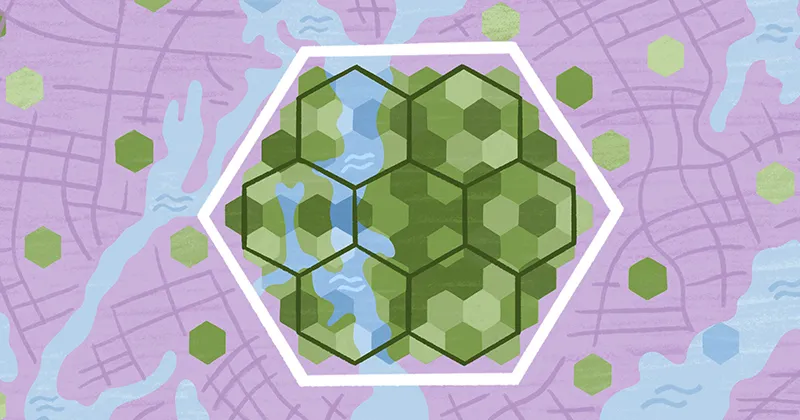
H3 visualization maps
More advanced systems use hexagonal aggregation to group and summarize data into cells. This makes comparisons clearer for large-scale spatial analysis. To create these heat maps, you’ll need:
- Point-based data or tabular data sets with measurable values
- Generator capable of statistical and geospatial processing
Choropleth heat maps
Choropleth heat maps color predefined geographic regions, from ZIP codes to sales territories, based on aggregated values. To generate these maps, you’ll need:
- Boundary files such as GeoJSON or shapefiles
- Tabular data matched to those boundaries
- Generator capable of boundary-based mapping and attribute joins
Hierarchical heat maps
Hierarchical heat maps visualize multi-level data in a matrix layout, where color scales represent values across rows and columns. Though they’re maps by name, they usually look like a table of cells. Here’s what you need to generate them:
- Structured tabular data sets plus clearly defined rows and columns
- Generator capable of matrix-style visualization and grouped aggregation
Webpage heat maps
Webpage heat maps overlay user behavior directly onto a digital interface. They show how visitors interact with a website, highlighting clicks, scroll depth, and attention patterns. To create these, you’ll need:
- Interaction tracking data collected via analytics platforms
- Live site or page layout reference
- Generator capable of integrating with web analytics or behavior-tracking systems
6 best heat map generator tools
Here are six of the top heat map generators and their standout features.
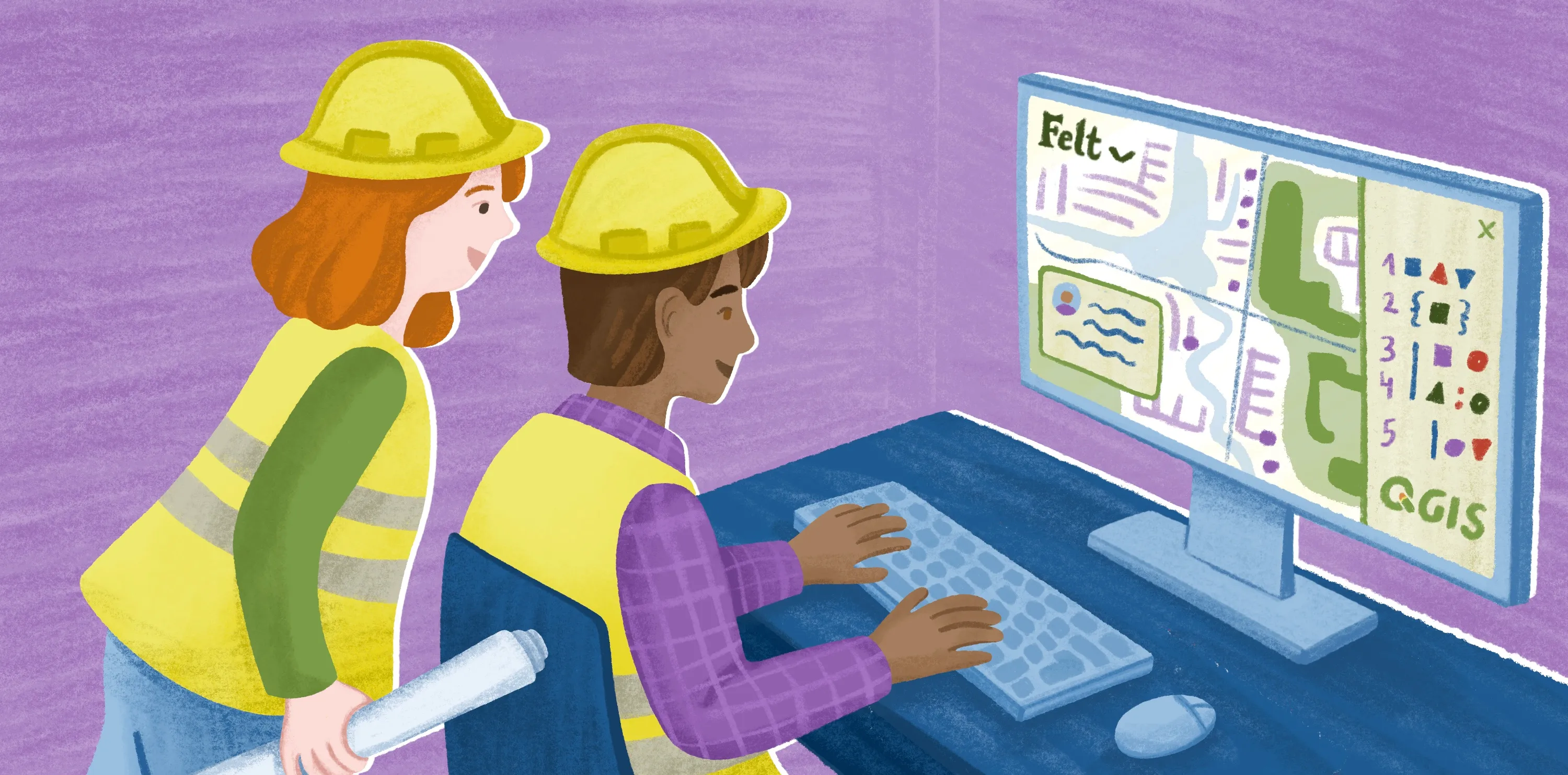
1. Felt
Felt is a cloud-native, AI-powered GIS platform that makes creating heat maps and analyzing spatial data simple. It's perfect for teams that need to visualize data, collaborate on maps, and share their findings all within one seamless workflow.
Strengths:
- Creates H3, choropleth, and density heat maps
- Generates maps from any file type
- Handles geospatial workflows, not just map generation
- Supports real-time collaborative editing and quick link sharing
- Lets teams examine heat map layers in depth
- Allows people to translate natural language into spatial workflows
Limitations:
- Doesn’t generate webpage and hierarchical maps
2. Maptive
Maptive is a SaaS mapping platform that turns spreadsheet data into geographic visualizations. It generates heat maps and supports other spatial techniques, including location plotting and boundary analysis.
Strengths:
- Allows Excel and CSV data importing
- Supports choropleth and density heat map creation
Limitations:
- Doesn’t generate H3, hierarchical, or webpage heat maps
- Limited spatial analysis compared with full GIS software
3. ArcGIS Online
Esri’s ArcGIS Online is a tool that generates geographic heat maps from spatial data sets. Unlike the traditional ArcGIS Pro for desktop, it’s cloud software, so teams can share maps with links and edit them live.
Strengths:
- Provides GIS capabilities
- Integrates with common geospatial tools
- Supports H3, density, and choropleth heat map creation
Limitations:
- Poses steeper learning curve for new users
- May be more powerful than most teams need for simple heatmapping
- Doesn’t create hierarchical and webpage heat maps
4. Google Maps Platform
Google Maps Platform is a set of APIs and SDKs that lets developers build geographic visualizations, including density and choropleth heat maps. Teams primarily use this tool to embed maps in websites and custom applications.
Strengths:
- Creates density and choropleth heat maps
- Uses Google Maps basemaps
- Enables custom development and embedding
Limitations:
- Doesn’t support H3, hierarchical, and webpage heat maps
- Not designed as a standalone analysis environment
5. Hotjar
Hotjar is a platform that analyzes user behavior on webpages. It provides features like heat maps, session recordings, and surveys to gauge site performance.
Strengths:
- Builds webpage heat maps
- Implementation through JavaScript tracking codes
- Enables insight sharing
Limitations:
- Focuses on website behavior data
- Can’t generate geographic-based heat maps
6. Microsoft Clarity
Microsoft Clarity is a website analytics tool that captures user interactions through heat maps and session recordings. It provides basic analytical features, though it lacks advanced functions, like user surveys and A/B testing.
Strengths:
- Offers free access
- Creates webpage heat maps
- Integrates with Microsoft analytics tools
Limitations:
- Lacks depth of dedicated UX research platforms
- Only supports website interaction data
How to choose the right heat map generator
Here are some of the top criteria to look for when picking a geographic heat map generator:
- Data compatibility: Choose software that uses your distinct data. For example, if you need geographic heat maps, make sure the tool imports CSVs, GeoJSON, and shapefiles.
- Scale and performance: Consider your average data scale. If you’re working with thousands of data points and extensive geographic regions, pick a platform known for processing large amounts of information without slowing down.
- Styling and control: Opt for a tool that allows personalization. You might want to customize colors, choose aggregation methods, and layer multiple unique datasets.
- Sharing and collaboration: Think about who’s going to use your generator. Features like group editing, link sharing, and on-map comments make it easier to work with every stakeholder.
- Workflow integration: Choose a tool that fits the way you work. Browser-based map software provides quick access and broader integration. On the other hand, desktop platforms are more rigid and require lengthier set ups.
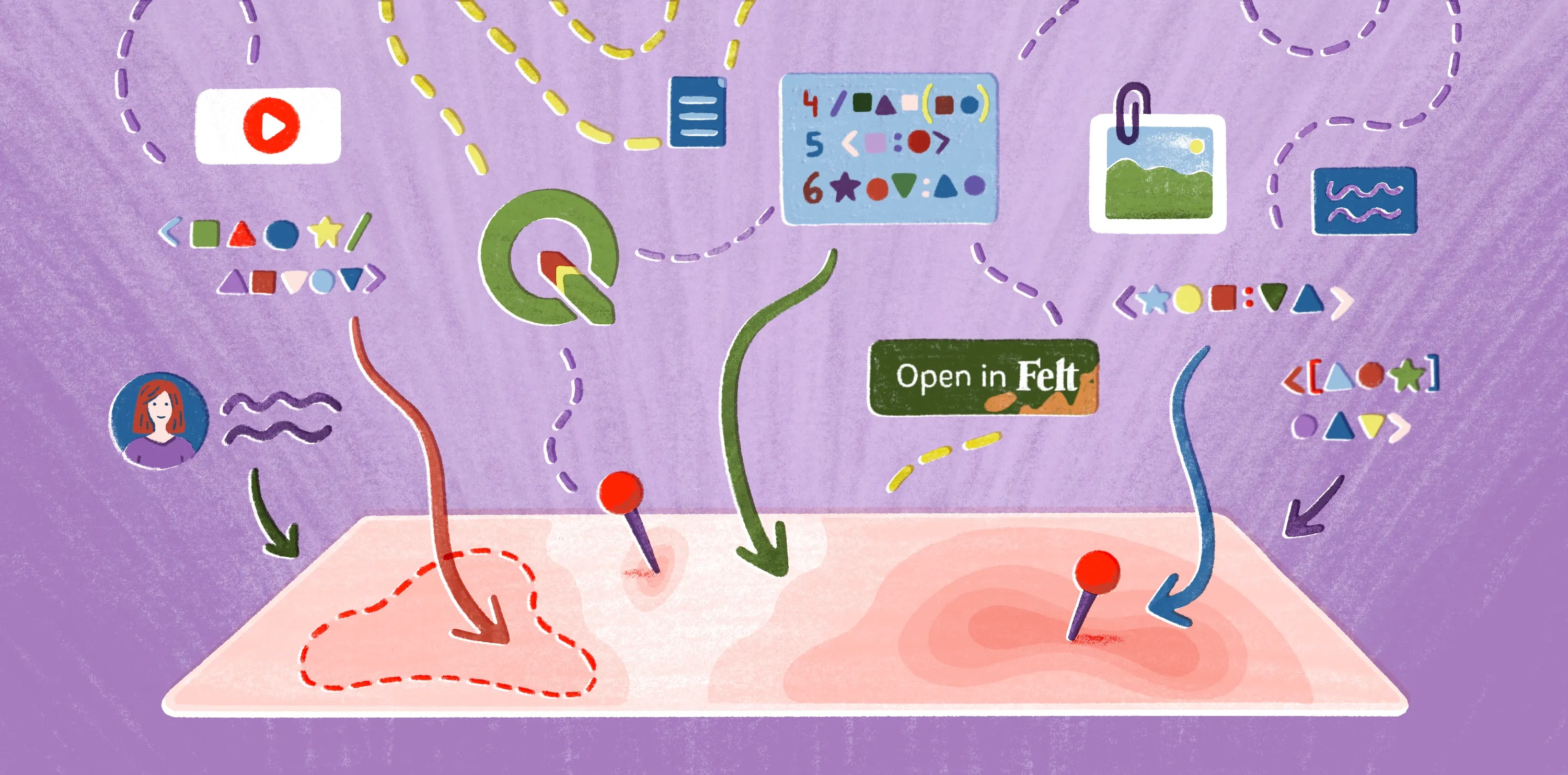
Create interactive, custom heat maps in Felt
Some tools treat the heat map as the final product, and once it's generated, it often becomes a static, disconnected file. Making updates, collaborating with others, and digging into the data can mean exporting the map again or starting the process from scratch.
Choosing a GIS mapping platform over a simple generator helps you treat your maps as living assets. Felt enables this dynamic approach. Our software supports real-time collaboration and AI-assisted analysis so it’s easier to edit maps as insights evolve.
With Felt, you can create live heat maps right in your browser, getting in-depth GIS functionality without the complexity of legacy tools. Simply upload your data, then layer and style it. Bring your team into your project effortlessly — Felt lets you share the results with a simple link, collaborate in real time, and leave on-map comments.
Create your first map with Felt, and see how these visualizations fit into your geospatial workflows.
Compare Felt using AI