Wildfires are becoming more and more common across the globe and their existence can have a severe impact on air quality. This dashboard monitors current U.S. wildfires, smoke activity and air quality using live sources from the National Interagency Fire Center and the National Oceanic and Atmospheric Administration.
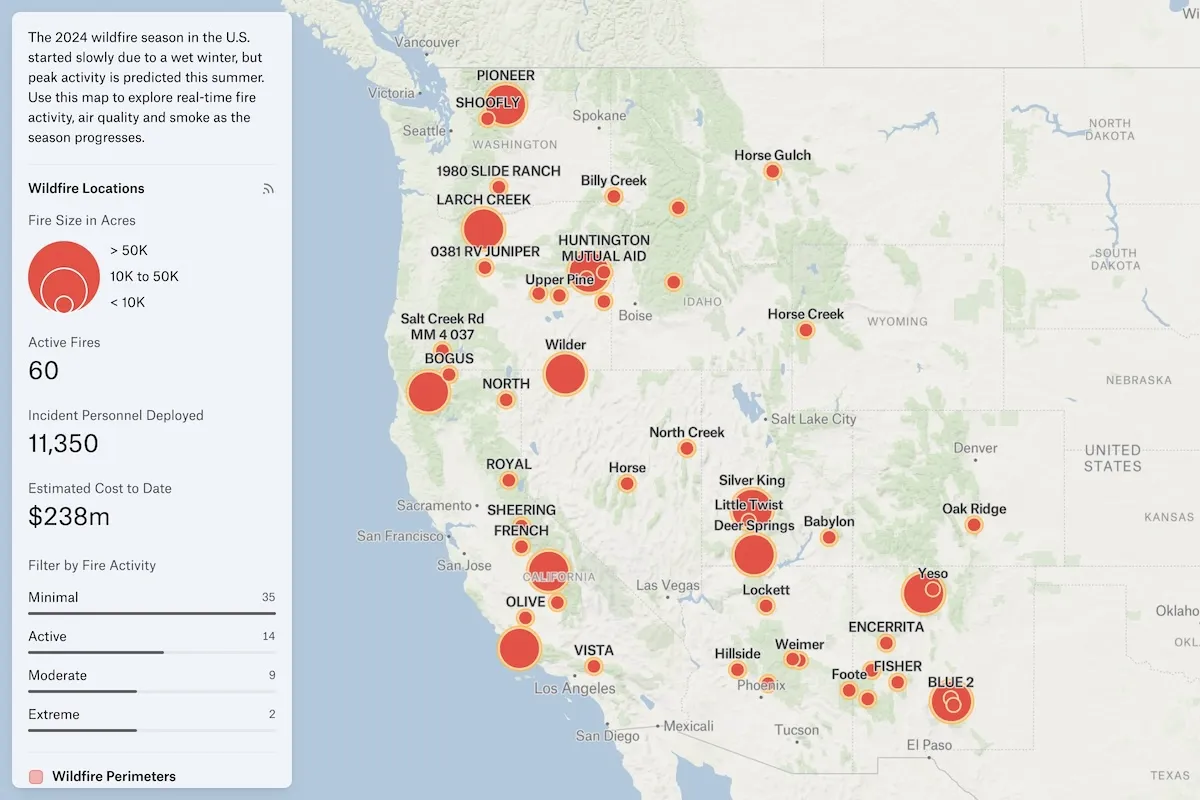
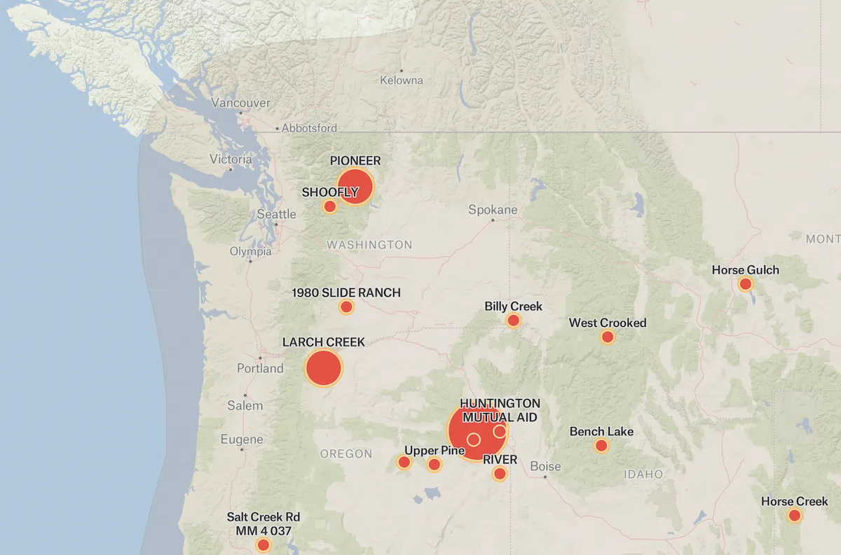
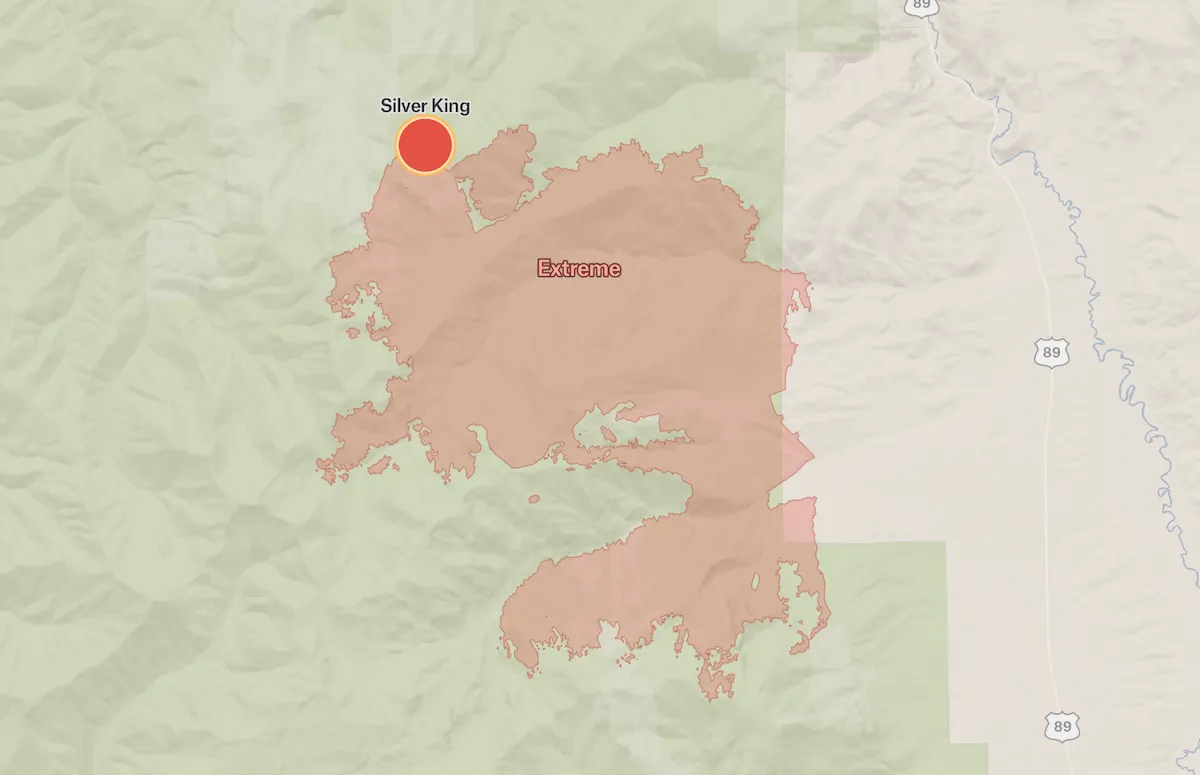
To explore active wildfires on the map, start by using the "Search wildfire locations" feature to find specific fires by name or location, or simply pan and zoom across the map to view all current incidents. The fire size legend helps you quickly identify the scale of each incident—small dots represent fires under 10,000 acres, medium circles show fires between 10,000 and 50,000 acres, and large circles indicate major fires exceeding 50,000 acres. Click on individual fire markers to view detailed information including acres burned, incident personnel deployed, and estimated costs, as shown in the interface displaying 8 active fires with 261 personnel and $193 million in costs. Use the "Measure areas" tool to calculate distances between fires and populated areas, or to estimate the size of smoke plumes and evacuation zones. Filter the map by fire activity level—selecting "Minimal" shows 7 fires with limited growth, while other filters can display active, contained, or controlled incidents. Toggle the "Smoke Density" layer to visualize air quality impacts and see which communities are experiencing smoke from nearby fires. Check the "AirNow Air Quality Index" layer to monitor real-time ozone and particulate matter levels, helping you understand health risks in affected areas. The individual fire breakdowns (like the Flat Fire at 23,357 acres or Derby Fire at 5,452 acres) provide crucial information for tracking which incidents pose the greatest threats. Consider cross-referencing this map with weather forecasts showing wind patterns and humidity levels, as these factors heavily influence fire behavior and smoke dispersion. Additionally, layer in evacuation zone maps, road closure information, and topographic data to get a comprehensive view of how fires are impacting infrastructure and communities. By combining these tools and data layers, you can make informed decisions about travel, outdoor activities, and personal safety during active fire seasons.
Wildfires are mapped using a combination of satellite imagery (including NASA and NOAA satellites), aerial surveillance from aircraft and drones, ground reports from firefighters, infrared detection systems that identify heat signatures, and GPS technology. This data is compiled into real-time mapping systems that show fire perimeters, intensity, direction of spread, and threatened areas.
Several highly regarded wildfire trackers include: InciWeb (official incident information system), the NIFC (National Interagency Fire Center) Active Fire Mapping Program, NASA's FIRMS (Fire Information for Resource Management System), Cal Fire's incident map for California, and various apps like Watch Duty. The "best" depends on your location and needs, though government sources like InciWeb tend to be most authoritative.
Forest fires are caused by a combination of factors including human activities (campfires, discarded cigarettes, power lines, arson), natural causes (lightning strikes), and increasingly, climate change conditions that create more favorable fire conditions through prolonged droughts, higher temperatures, earlier snowmelt, and drier vegetation. Poor forest management and decades of fire suppression that allowed fuel buildup also contribute.
.webp)