Heat maps with ZIP codes: How businesses visualize geographic trends
Location data reveals valuable insights, but those insights are hard to see in large spreadsheets. Rows of ZIP codes and customer records often hide geographic patterns that matter for teams across many functions, including sales, service, and planning. Without a clear spatial view, important trends stay buried in the data.
Heat maps help solve this challenge. They turn raw location data into an easy-to-understand visual format. With heat maps, teams can surface trends and identify high-performing areas, underserved markets, and regional opportunities. Many cloud-native mapping platforms allow you to upload data directly from spreadsheets and automatically generate visualizations based on ZIP code information.
This guide explains what you need to know about heat maps with ZIP codes, including how to create them and the tools you can use to build your own.
What is a ZIP code heat map?
A ZIP code heat map helps businesses visualize data from CSV files or Excel spreadsheets, so it’s easier to see patterns and trends at a glance. These maps display ZIP code data using color, shading, or intensity to show:
- Sales volume by market
- Customer density and distribution
- Revenue performance across territories
- Service requests and support activity
- Operational coverage and resource allocation
Choropleth maps are often confused with heat maps. These maps shade ZIP codes according to a specific value, such as total revenue or number of customers. Darker colors usually represent higher values, while lighter colors show lower values.
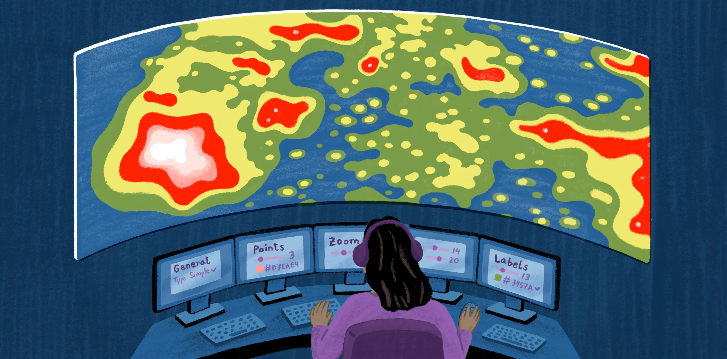
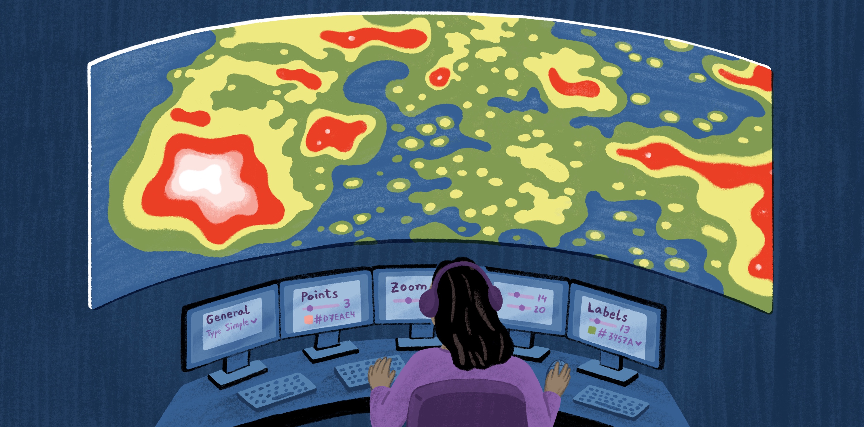
A true heat map works differently. Rather than coloring predefined areas, it visualizes the density or concentration of individual point locations. The map might show where deliveries or service calls cluster within a city, regardless of ZIP code boundaries.
This distinction matters because each method answers a different question. Choropleth maps work best when you want to compare metrics across ZIP codes. True heat maps identify hotspots of activity. Many organizations use both versions to get a complete picture of their geographic data.
When creating choropleth maps, normalize values whenever possible. Comparing raw counts by ZIP code can produce misleading results because populations vary from one area to another. Metrics like sales per capita, customers per household, or service requests per 1,000 residents provide a more accurate view of performance.
ZIP codes also have structural limits. The United States Postal Service designed ZIP codes as mail delivery routes, not for geographic analysis. Most mapping platforms rely on ZIP Code Tabulation Areas (ZCTAs), which approximate regions for geographic analysis and provide consistent boundaries for visualization.
Whether you use a choropleth or a true heat map, tools like Felt support both types of data visualization and generate maps for geographic analysis.
How do ZIP code heat maps work?
Heat maps with ZIP codes follow a straightforward process:
- Upload your data: The process starts by importing a spreadsheet or CRM export with the ZIP codes and metrics you want to analyze, like sales figures or customer records.
- Match records to ZIP codes. The mapping platform associates each record with its corresponding ZIP code area, creating a geographic framework for analysis.
- Apply visual styling. The software assigns colors or shading based on the values in your data set, making the differences between ZIP codes easy to see.
- Visualize geographic patterns. The resulting map indicates where performance is strongest, where demand is concentrated, and where opportunities may exist.
Mapping software often provides additional tools to help teams explore data in greater detail, so you can:
- Filter by region or territory
- Compare metrics side by side
- Layer business data with demographic insights
- Analyze trends to spot changes in performance
- Generate customized views for stakeholders
For example, a sales team could use Felt to visualize revenue by ZIP code and use filters to focus on a territory where recent sales performance has declined.
How to create a heat map with ZIP codes
Here’s how to make a ZIP code heat map in Felt, using data from a CSV or Excel file.
Step 1: Upload ZIP-level business data
Start with a CSV or spreadsheet that stores ZIP codes and the data you want to analyze. Depending on your goals, this could include metrics like sales volume or customer counts. For accurate matching, use a dedicated ZIP code column and format the cells as text to preserve any leading zeros.
Once your file is ready, create a new map in Felt and upload the spreadsheet as a new layer. Felt automatically recognizes the ZIP code fields and prepares the data for mapping.
Step 2: Join your data to ZIP code boundaries
Connect your tabular data to a ZIP code boundary layer using Felt’s Join tools. The Join workflow lets you combine a map layer with a non-spatial attribute table based on shared values or overlapping geographies, all through simple dropdown menus. This step links each record to the corresponding ZCTA and creates a geographic layer you can visualize on the map.
Joining data to ZIP boundaries allows you to see how metrics vary by region. Felt handles the underlying spatial analysis, vector tiling, and processing directly in the browser, making the workflow fast and accessible.
Step 3: Apply choropleth or heat map styling
If you’re looking at values across ZIP codes, like revenue or sales totals, a choropleth map is likely your best option. These maps color each ZIP code according to the associated value, so you can quickly compare regional performance.
But if you’re working with individual locations, such as customer addresses and store visits, a true heat map may offer more insight. Heat maps focus on point density instead of ZIP code boundaries to reveal clusters and concentrations of activity.
After you've selected a visualization type, apply color ramps and classification settings to style your map. Adjusting colors and value ranges helps highlight geographic patterns and performance differences.
Step 4: Filter, analyze, and share findings
With your map in place, use filters to zoom in on specific regions. It allows you to work with geographic data and refine your analysis directly against your source data.
When you’re ready to share your findings, Felt helps you distribute a live ZIP code map to colleagues and stakeholders in just a few clicks. That way, everyone works from a shared source of truth.
Use cases for ZIP code heat maps
ZIP code heat maps support many everyday business decisions. The following examples show how organizations apply ZIP-level insight in practical ways:
- Sales analysis: Heat maps show where sales are strongest and where they’re underperforming. Examining areas by ZIP code helps teams prioritize outreach and effectively allocate resources like sales reps and marketing budgets.
- Market analysis: Heat maps visualize demand patterns and highlight underserved or emerging markets. These insights support expansion planning and campaign targeting.
- Territory management: Heat maps reveal uneven coverage, helping leaders reassign territories or adjust staffing where teams are overallocated or underresourced.
- Site selection: Heat maps help companies evaluate where to open new locations by analyzing customer density, demand hotspots, and market gaps per ZIP code.
In each use case, heat maps make it easier to interpret geographic data in real time. Teams can see how performance varies and take action to optimize coverage and resource allocation needs.
Challenges with ZIP code heat maps
Working with heat maps presents the following challenges, due to how teams share and analyze location data.
Data quality and formatting
Heat maps depend on clean, consistent data. If ZIP codes are incorrectly formatted, like missing leading zeros, mapping tools may fail to match them to geographic boundaries. Incomplete or inconsistent records can also distort the visualization, leading to inaccurate results.
Limited collaboration
Many traditional tools limit the ability to share, update, and iterate on geographic analysis. Exporting static map files slows decision-making and introduces versioning issues. As a result, teams struggle to stay aligned and revise heat maps when they receive new information.
Scaling geographic analysis
As data sets grow, managing ZIP-level data in spreadsheets becomes increasingly complex. Large files are hard to organize, slow to process, and difficult to interpret. This makes analyzing patterns across multiple layers or data sources a real challenge.
Felt AI helps teams filter and explore ZIP code data using interactive, AI-assisted workflows. Instead of managing spreadsheets manually, you can generate heat maps and layer data sets right on the map. With Felt, you surface insights faster and with fewer technical barriers.
Create ZIP code heat maps with Felt
Geographic data is most valuable when teams quickly turn it into shared understanding. With Felt, organizations can create and distribute ZIP code heat maps without the overhead of conventional GIS tools.
Felt is a cloud-native, AI-enabled mapping platform that empowers data and engineering teams who need spatial intelligence at scale. It replaces legacy GIS infrastructure and brings geographic analysis into modern enterprise workflows. Across more than 15 industries, Felt helps teams operationalize location data as part of everyday decision-making.
Rather than moving data between tools, Felt integrates with common cloud platforms:
- Snowflake
- BigQuery
- Databricks
- Postgres
- Redshift
- Amazon S3
- Azure Blob Storage
- Google Cloud Storage
These connections make it possible for users to work with ZIP code data where it already lives. This avoids having to extract data, transform it into a new format, and load it into another system. Teams can keep analysis aligned with source systems and maintain a single source of truth.
Felt also speeds up analysis with built-in AI assistance. Teams can explore ZIP code patterns and generate queries without writing code. For enterprise use, Felt includes SSO-based access, audit logs, and shared workspaces, ensuring teams collaborate securely and maintain a consistent view of geographic data.
Check out Felt’s library of regional data sets, which includes ZIP code maps for cities across the U.S. It’s a great way to see what’s possible by visualizing location data on an interactive map.
FAQ
Can ZIP code heat maps be combined with demographic data?
Many teams combine ZIP code heat maps with demographic data like population, income, and age to understand the factors driving geographic patterns and performance.
How often should ZIP code heat maps be updated?
Update ZIP code heat maps whenever the underlying data changes. Organizations refresh maps monthly, quarterly, or in real time to make sure decisions reflect current conditions.
What tools can be used to map ZIP code data?
Teams can create heat maps using GIS software, business intelligence platforms, and free ZIP code mapping tools. Cloud-native solutions, like Felt, allow you to upload spatial data and collaborate on interactive maps in a shared environment.
Compare Felt using AI




.jpg)